Quotes, Envelopes, and Packaging
Typography 1 - RISD - 2019
For this assignment, we were given four quotes by Beatrice Warde, Jan Tschicold, Phil Baines, and Bradbury Thompson. We were asked to find the appropriate typefaces to represent the tone of each voice after trying out different sans serif and serif fonts in different sizes.
Originally we were asked to create a book out of all the typesetting experimentations; which would be 48 pages in total. Later on, we were given the choice of either doing a book or creating a whole packaging system that these experimentations would fall into.
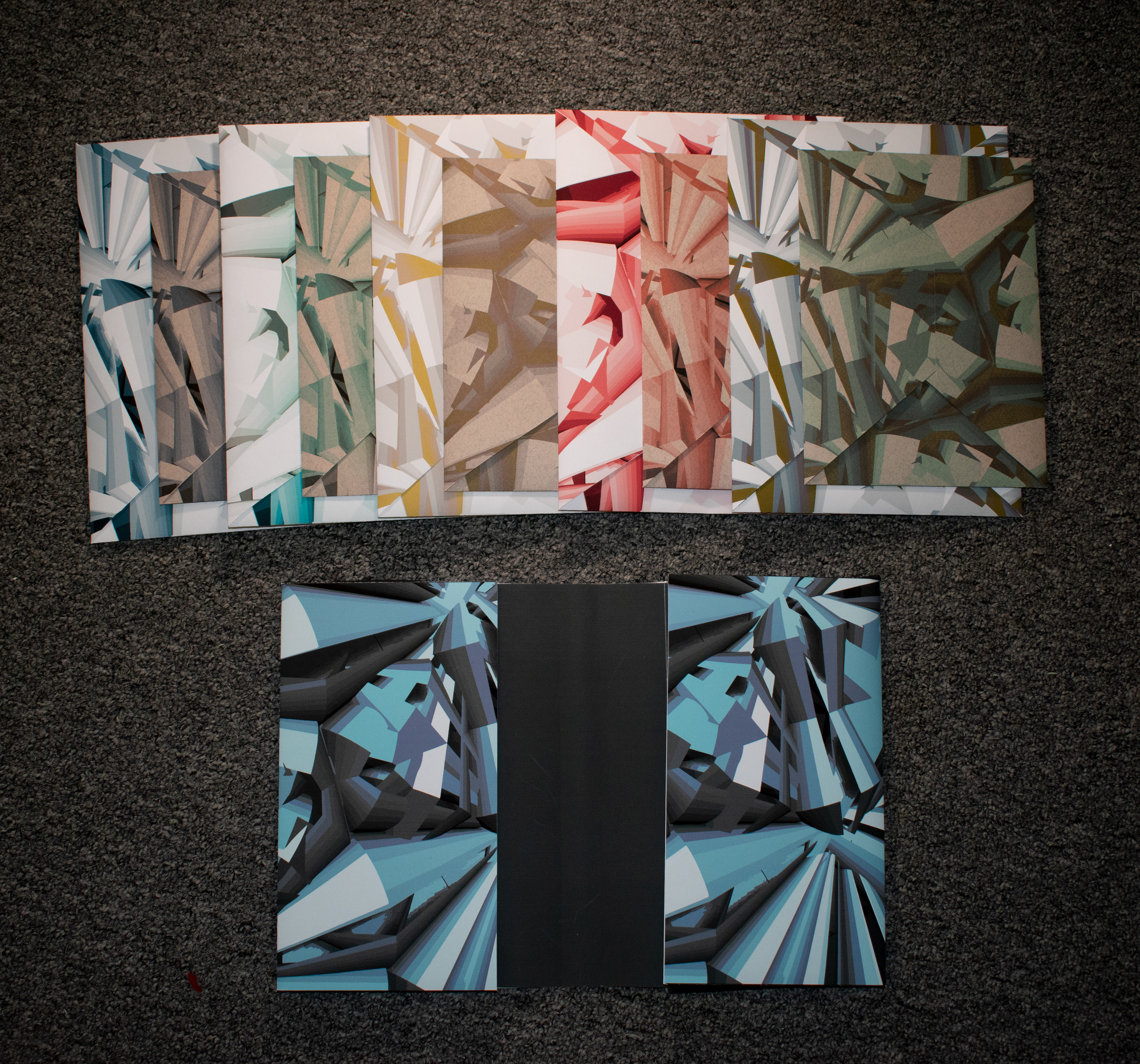
Folder with two-side pockets that I have designed & crafted
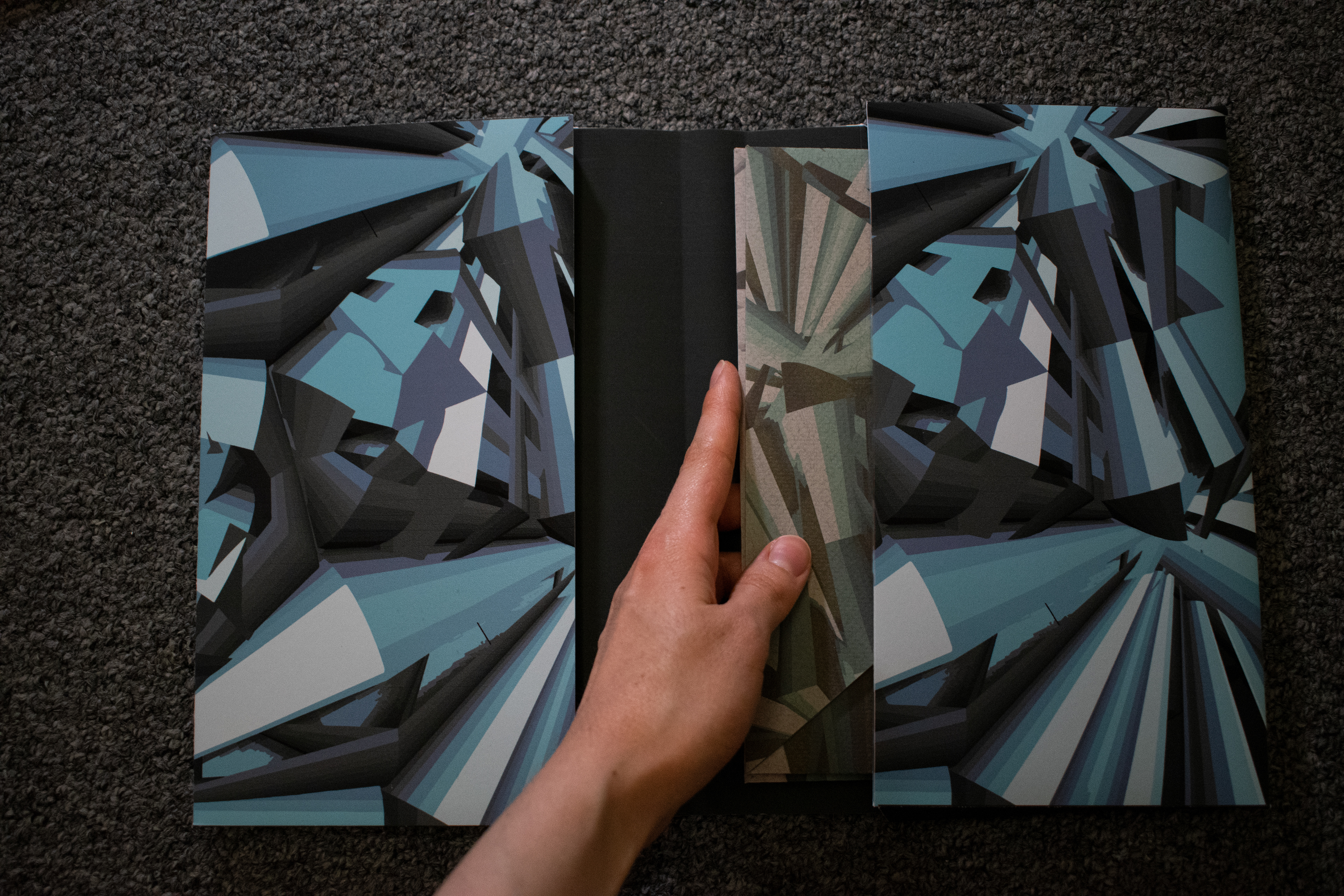
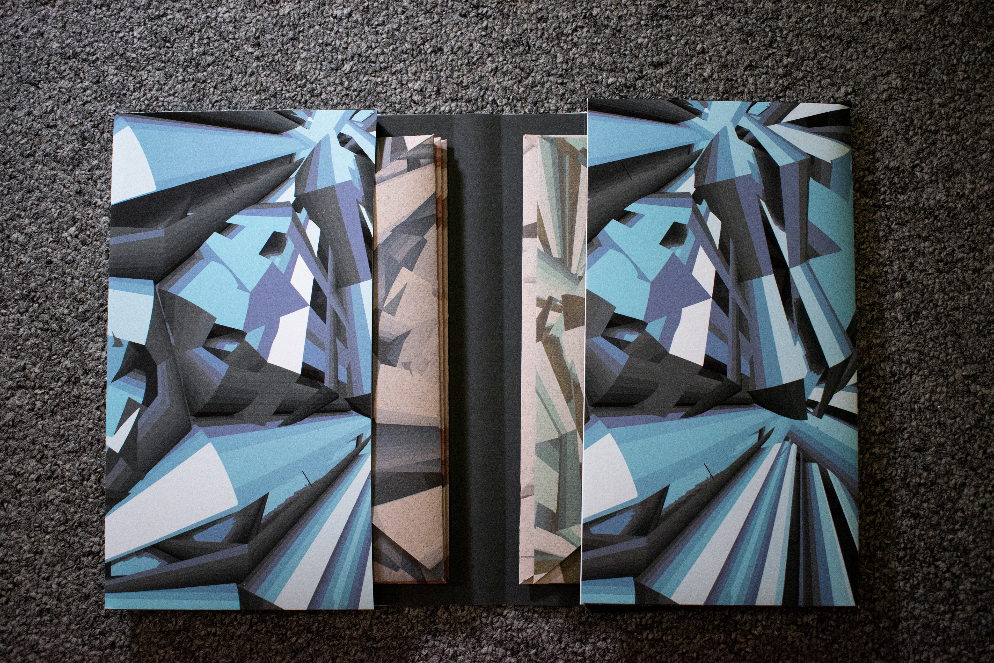
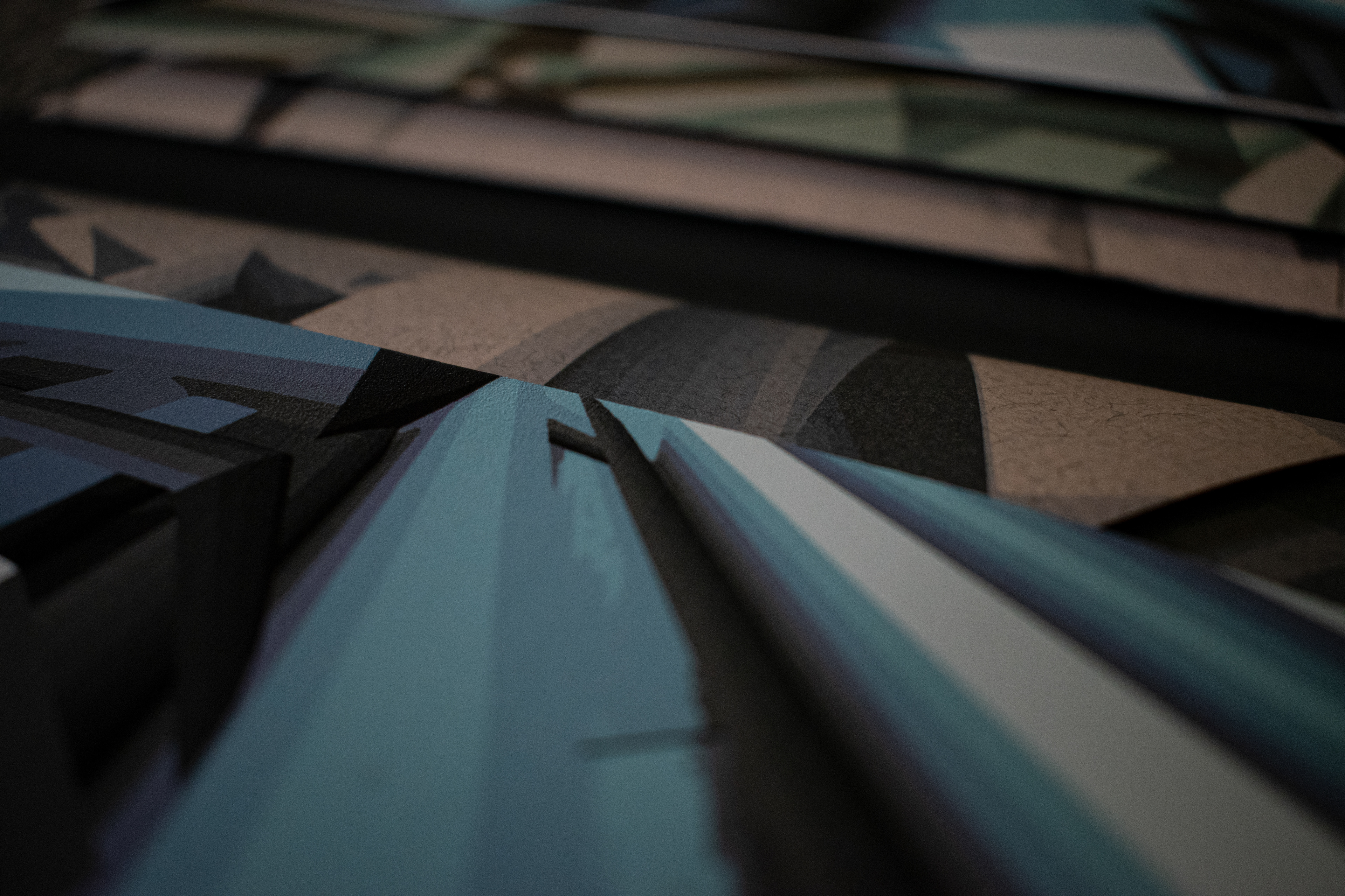
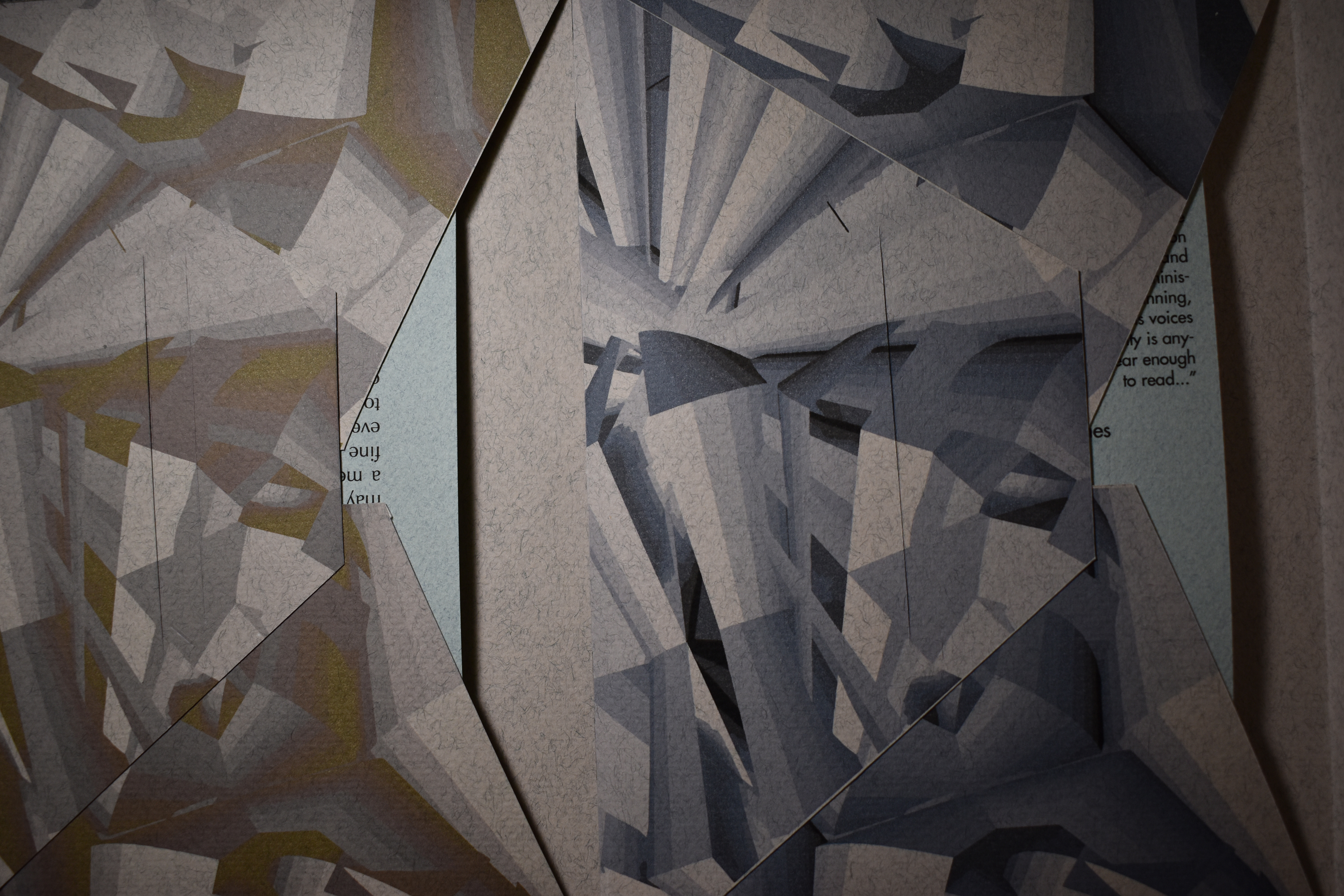
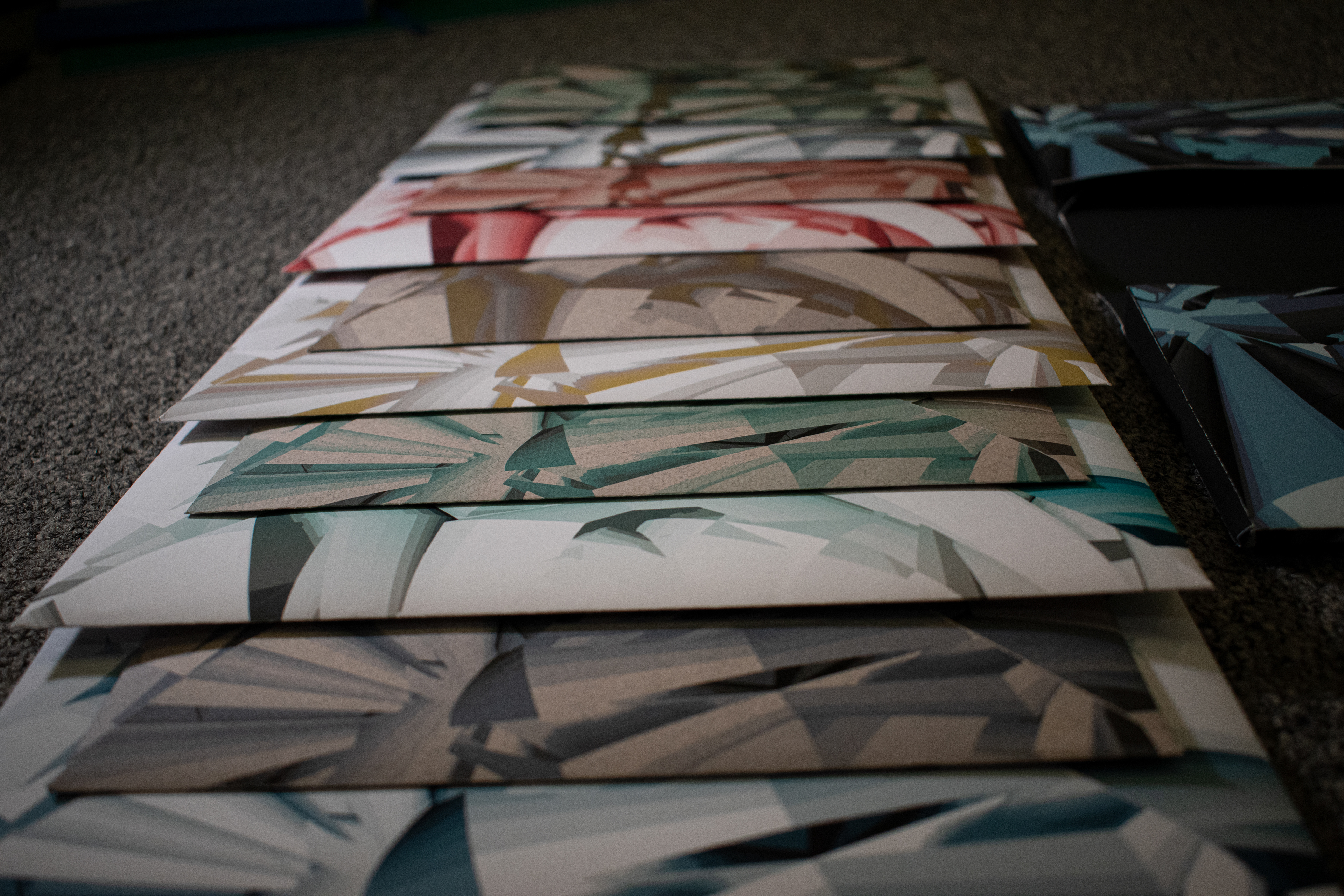
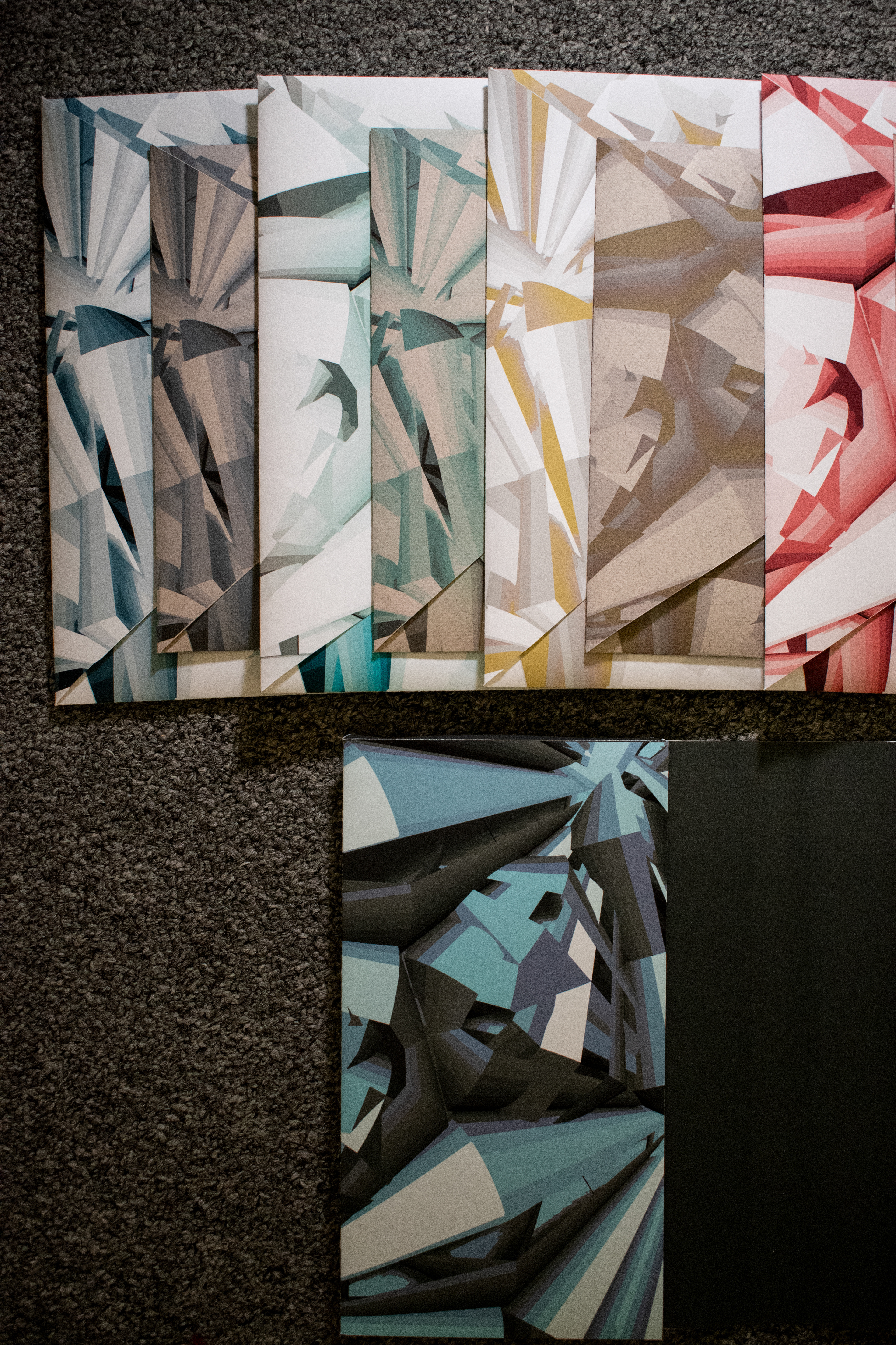
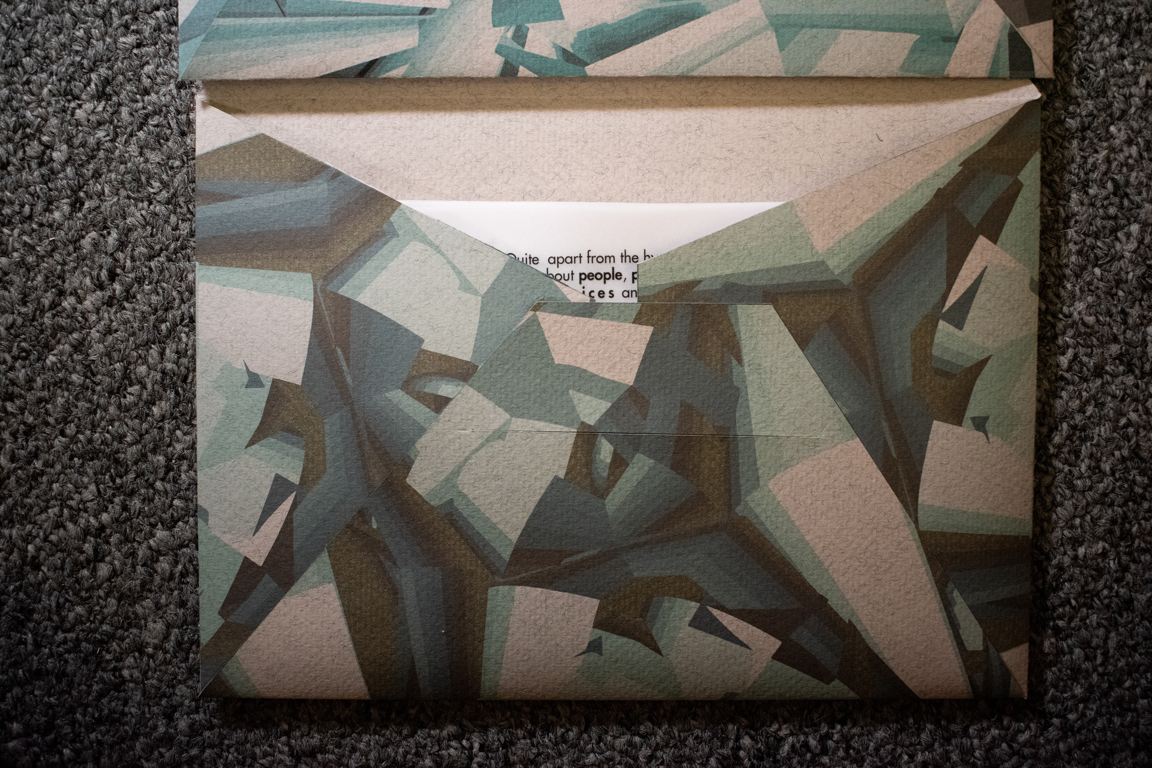
The images above illustrate the structure & view of the folder from the inside. All five of the small envelopes have
the type-setted quotes within them and are placed inside both pockets.
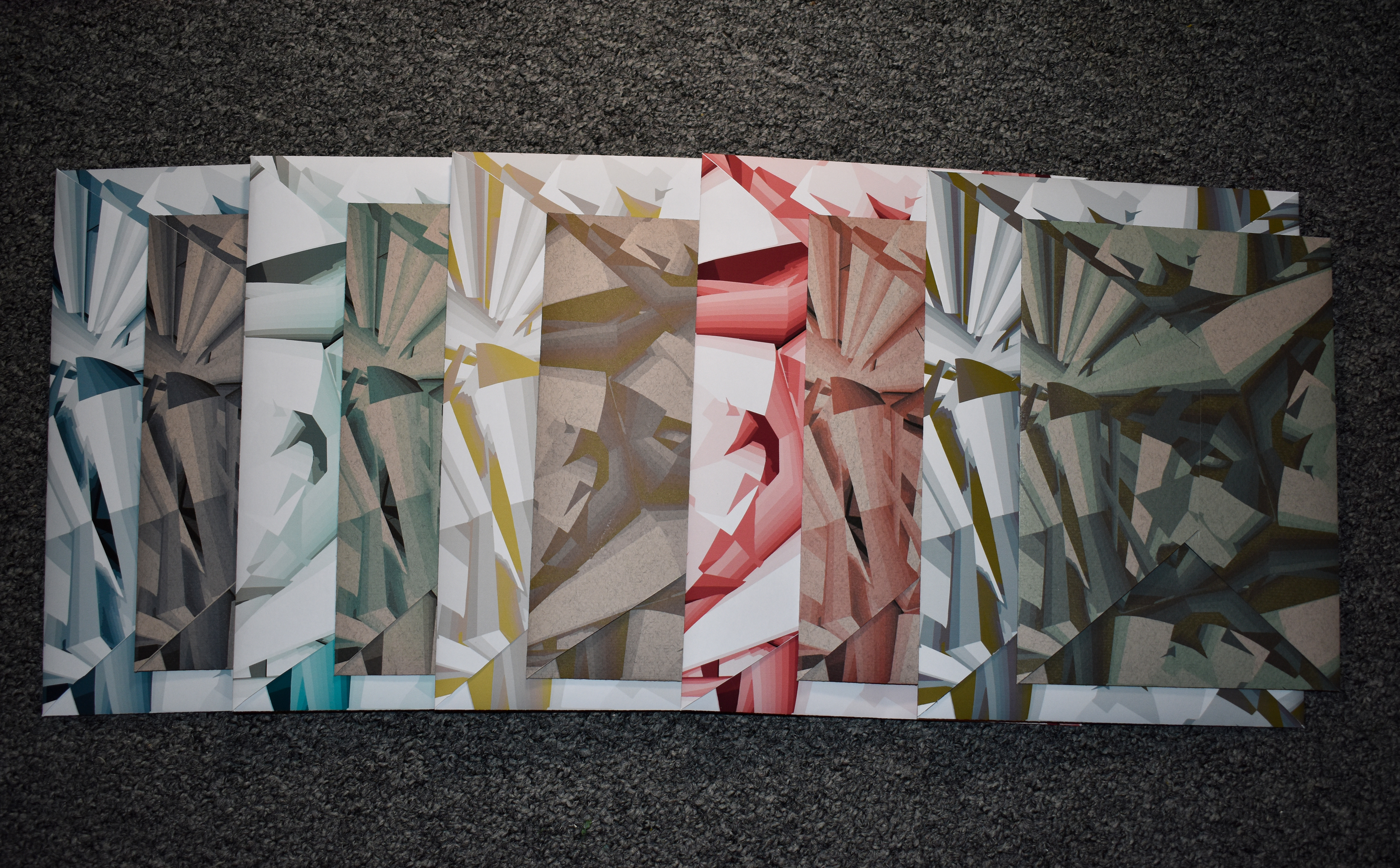
The pictures above exemplifies the different types of paper I've used to create my envelope designs; the power of texture and color depending on the type of paper used could be noted.
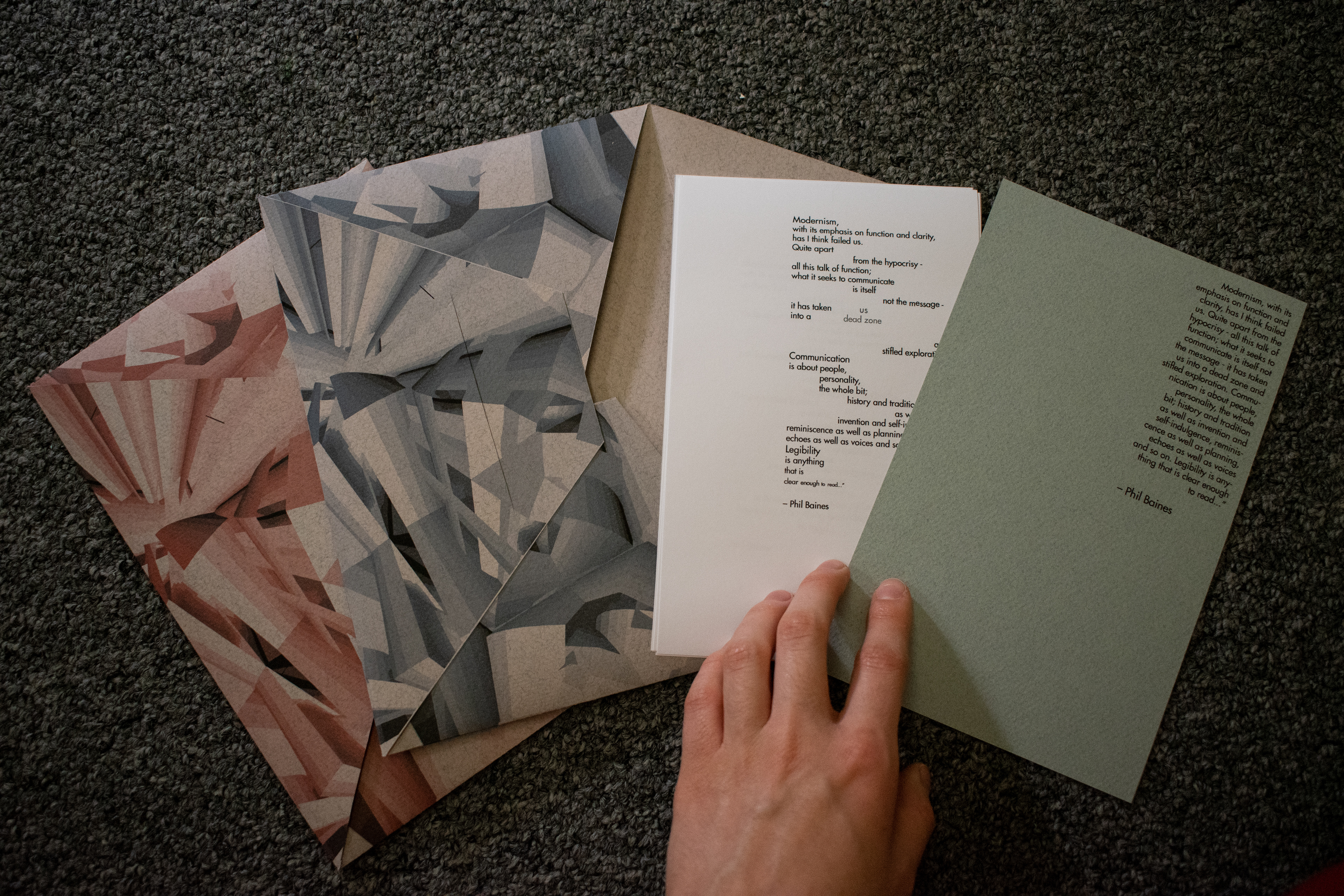
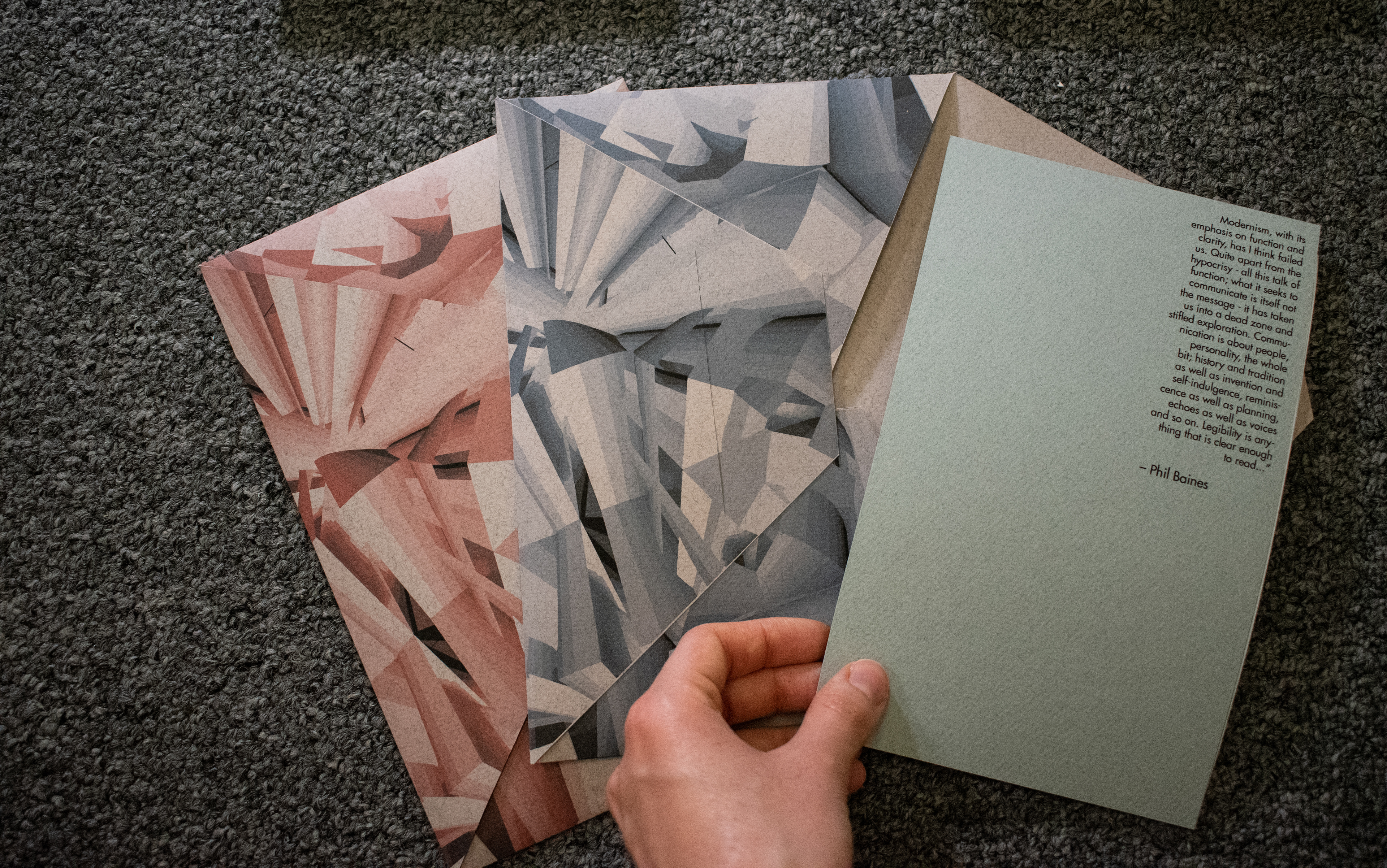
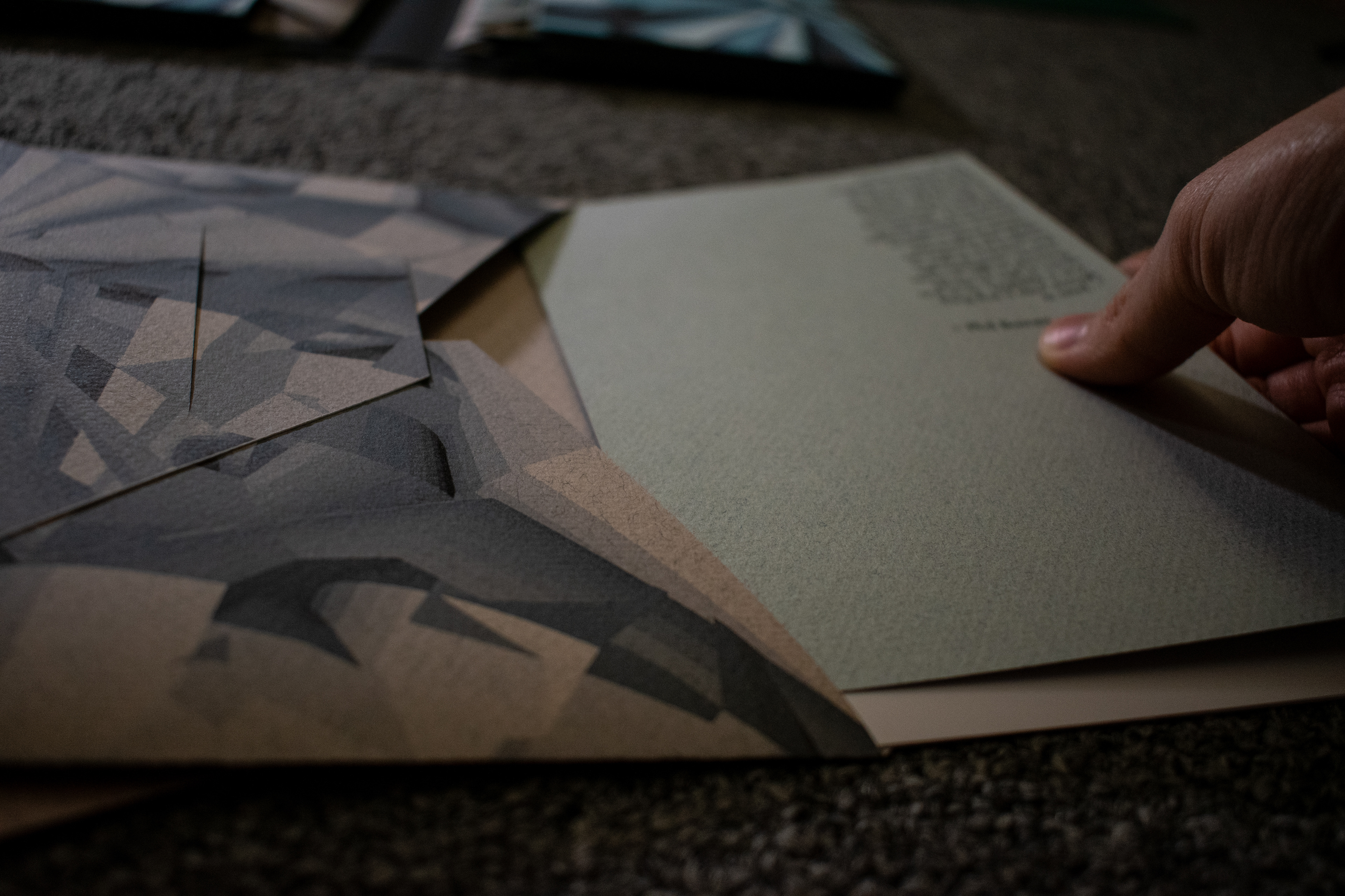
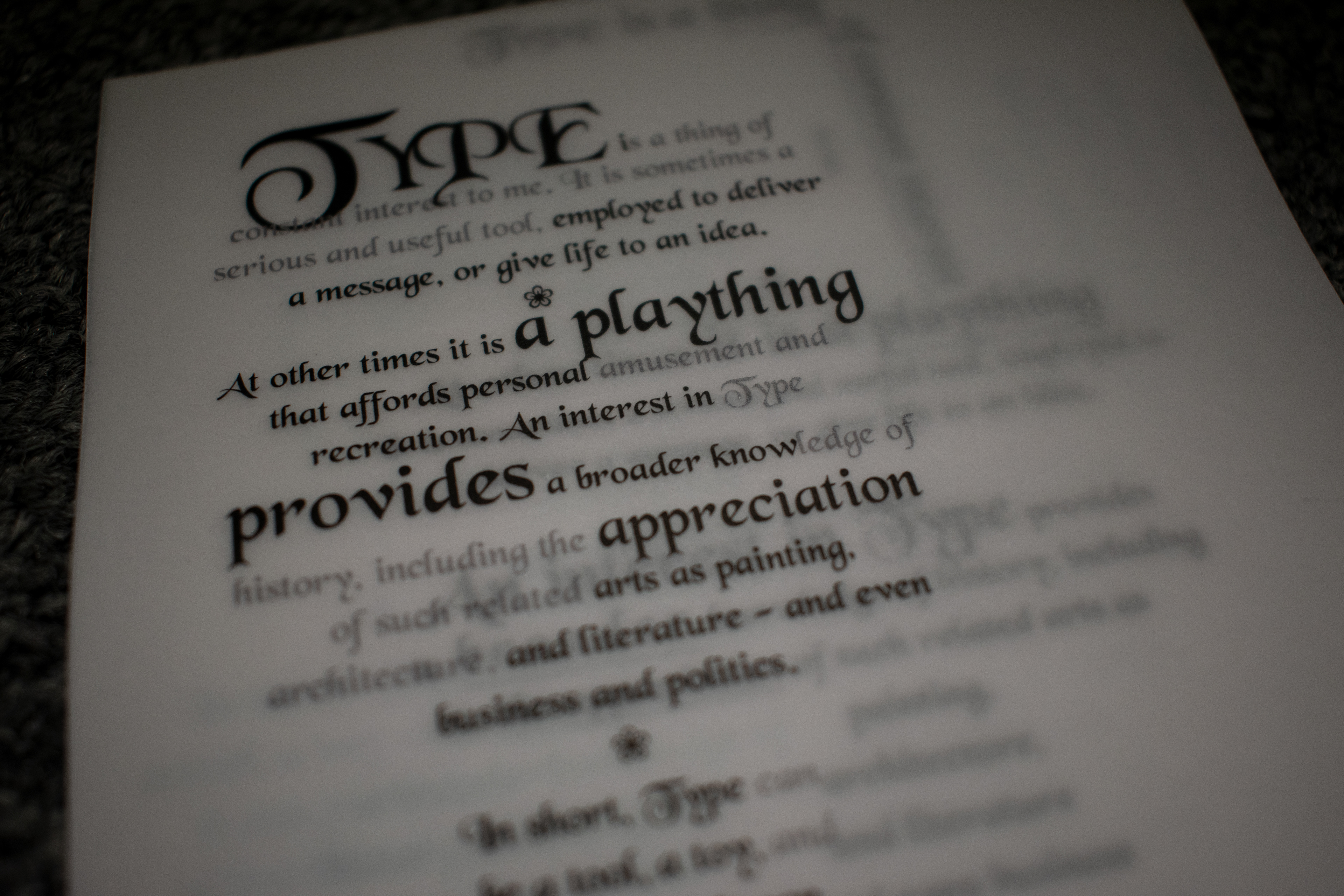
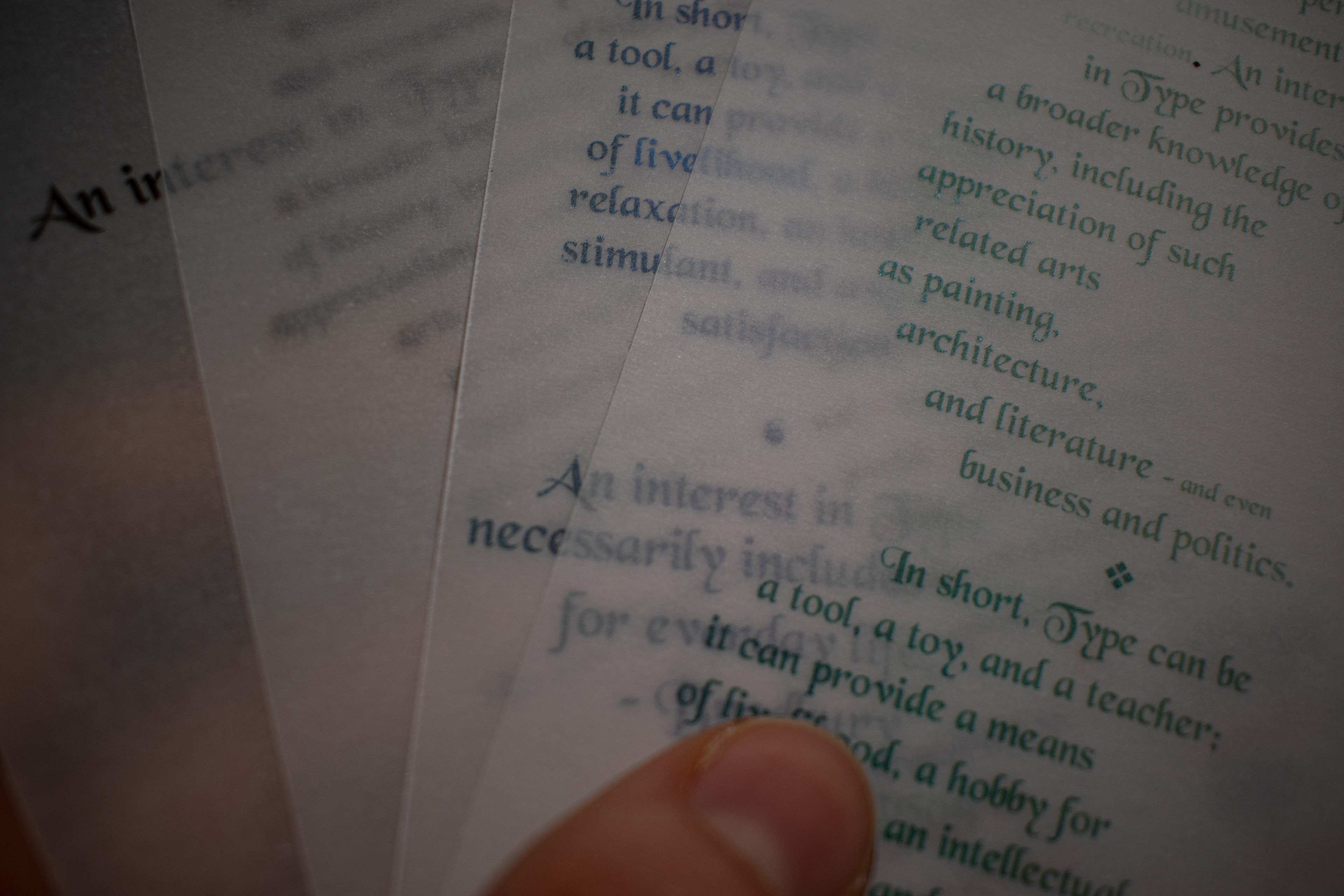

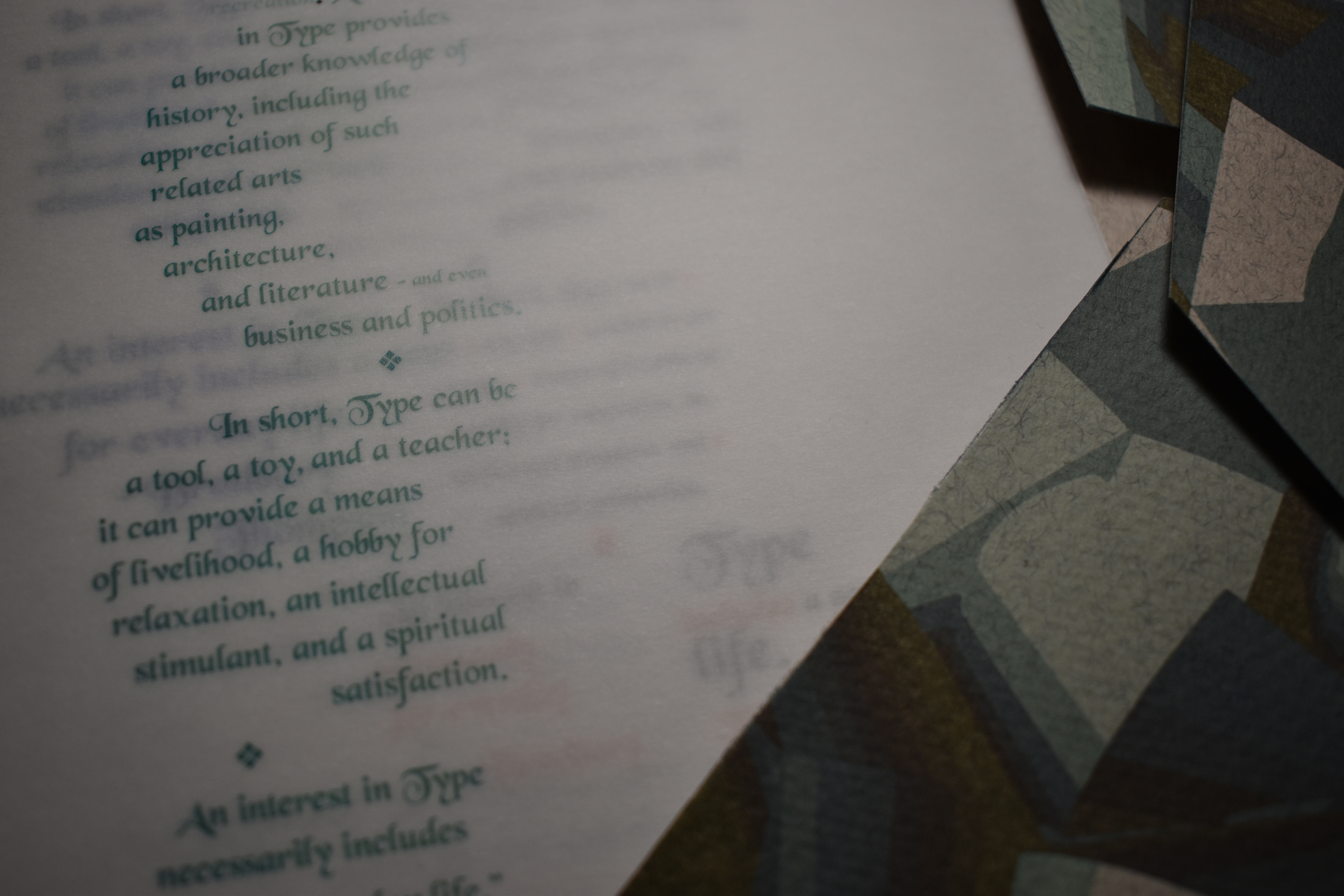
For this assignment, I experimented with the type of paper that I am using. I chose vellum so that it creates an element of layering; thus, I type-setted the quotes so that they interact with one another when placed on top of each other.
Through this process, I learned the importance of creating relationships between texts despite their different typesetting features.
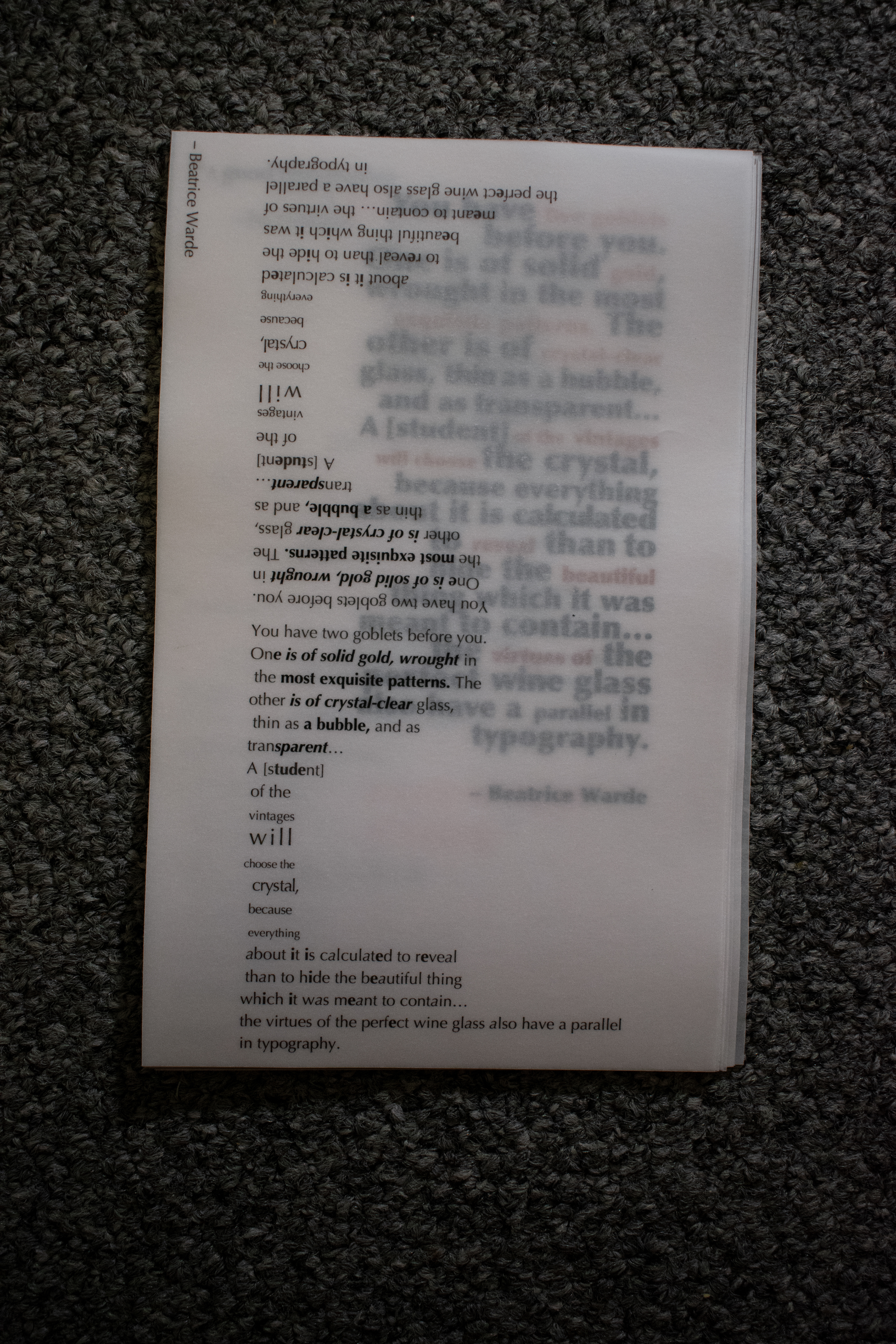
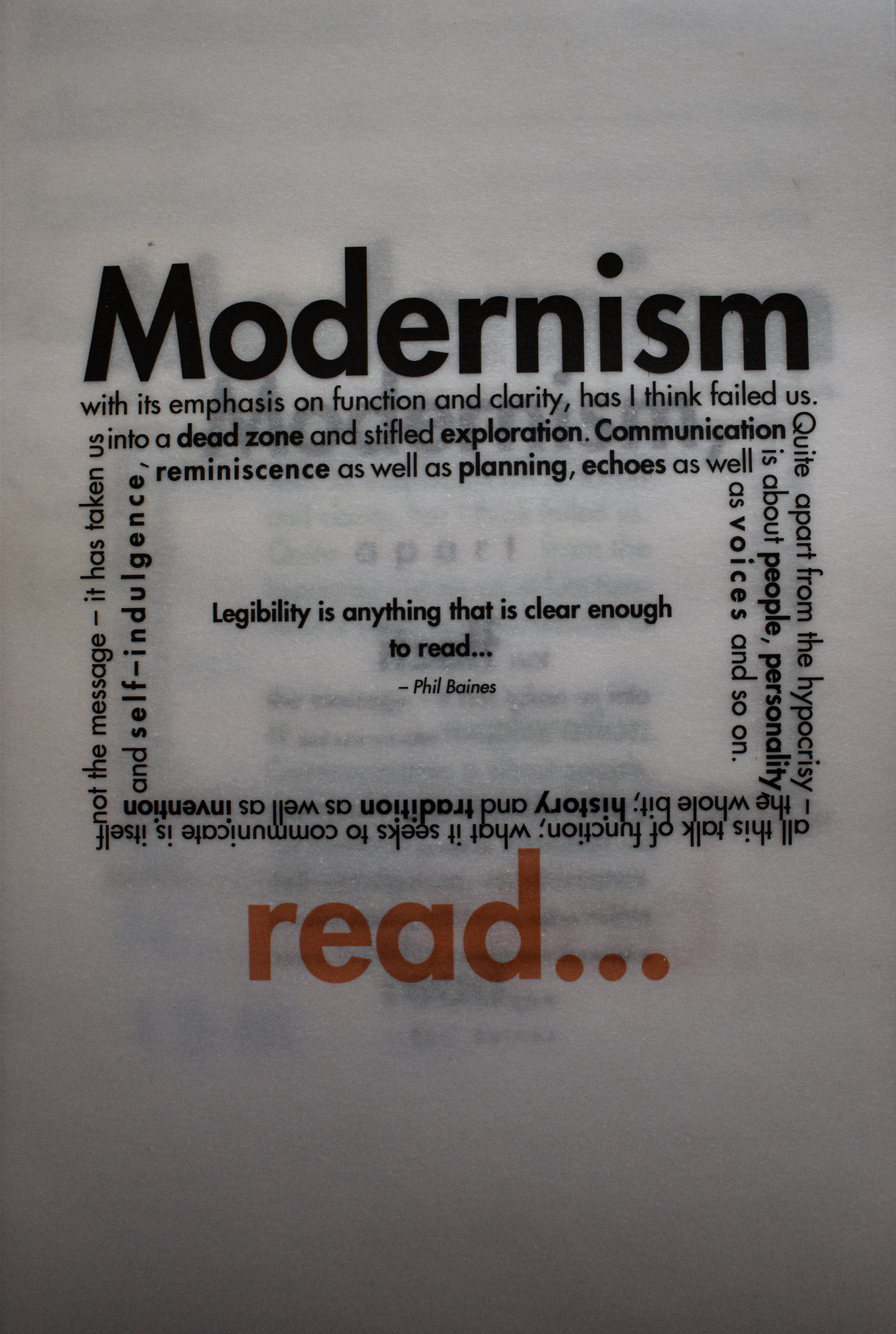
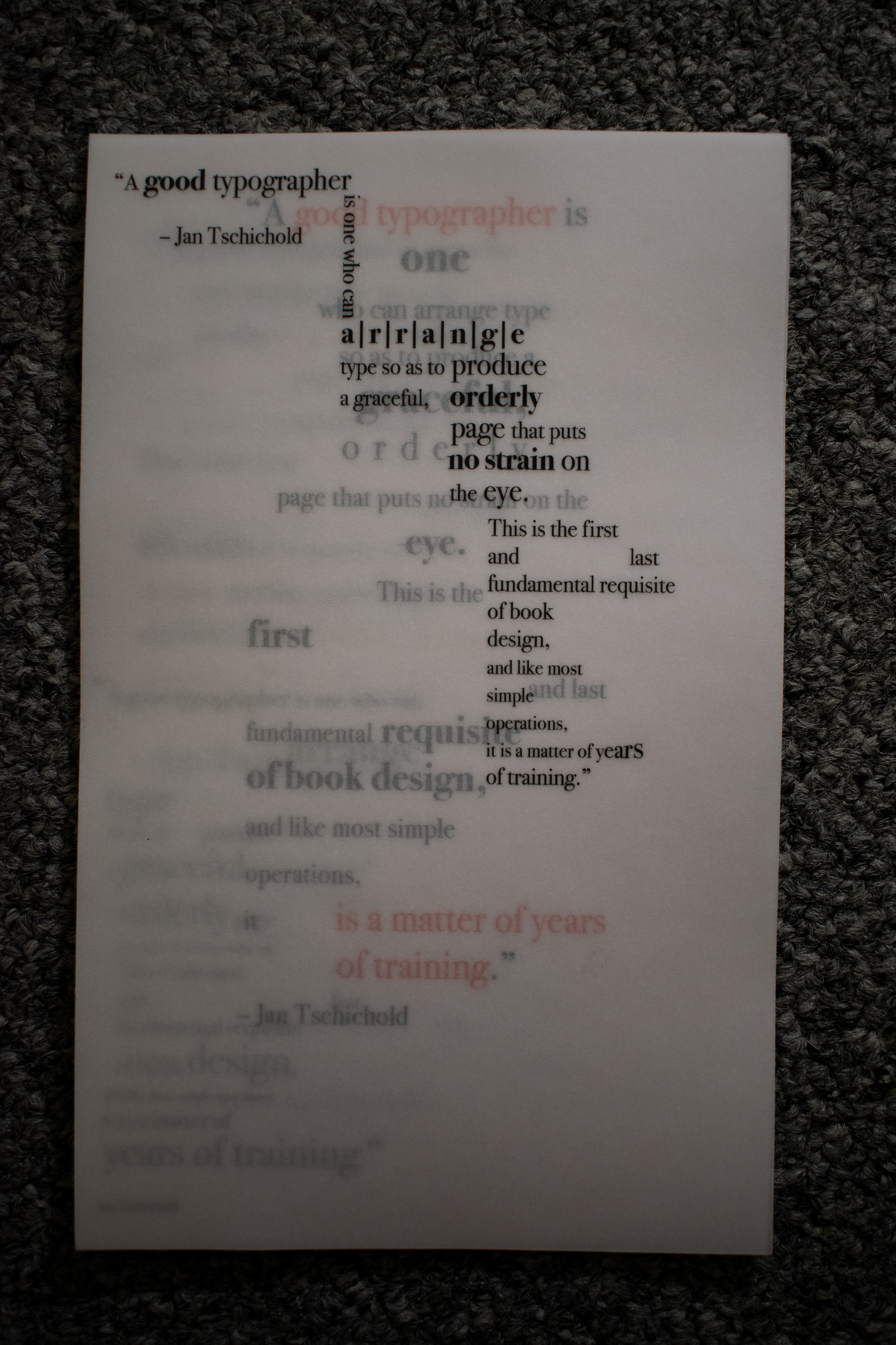
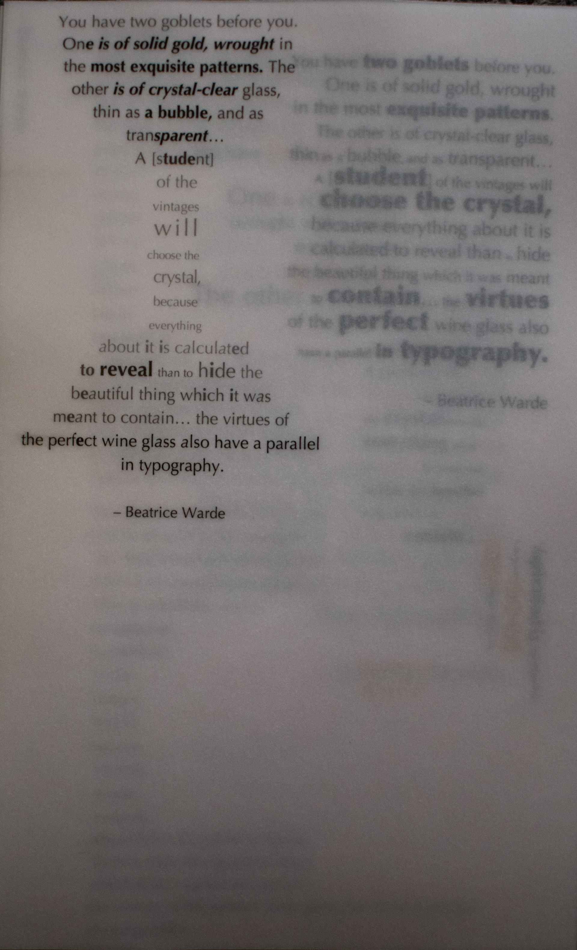
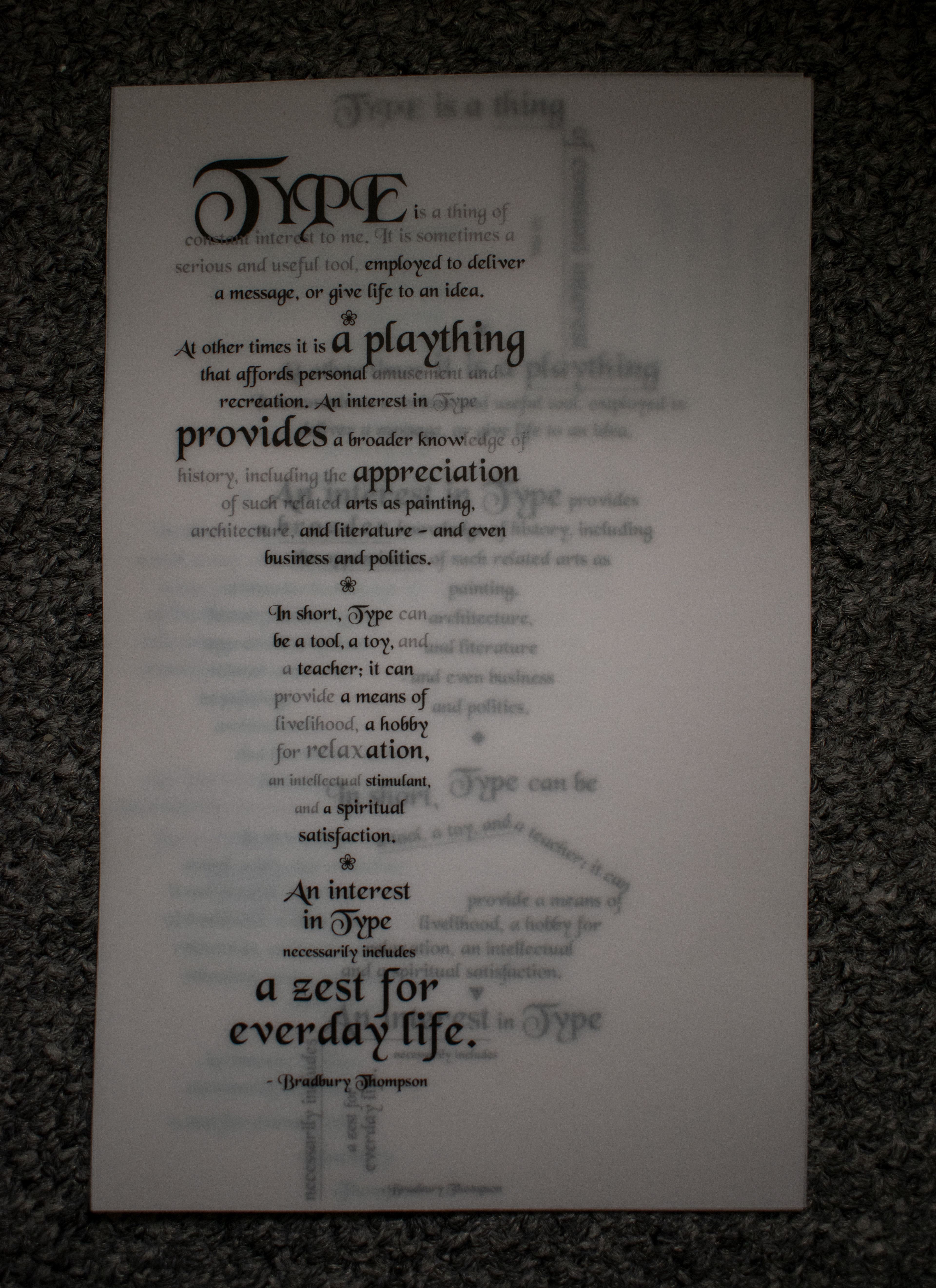
The second picture from the left shows the frontal view of all quotes when placed together. As for the other images, they are frontal views that express the translucency of vellum and its role in type play when each sheet is placed on top of one another.
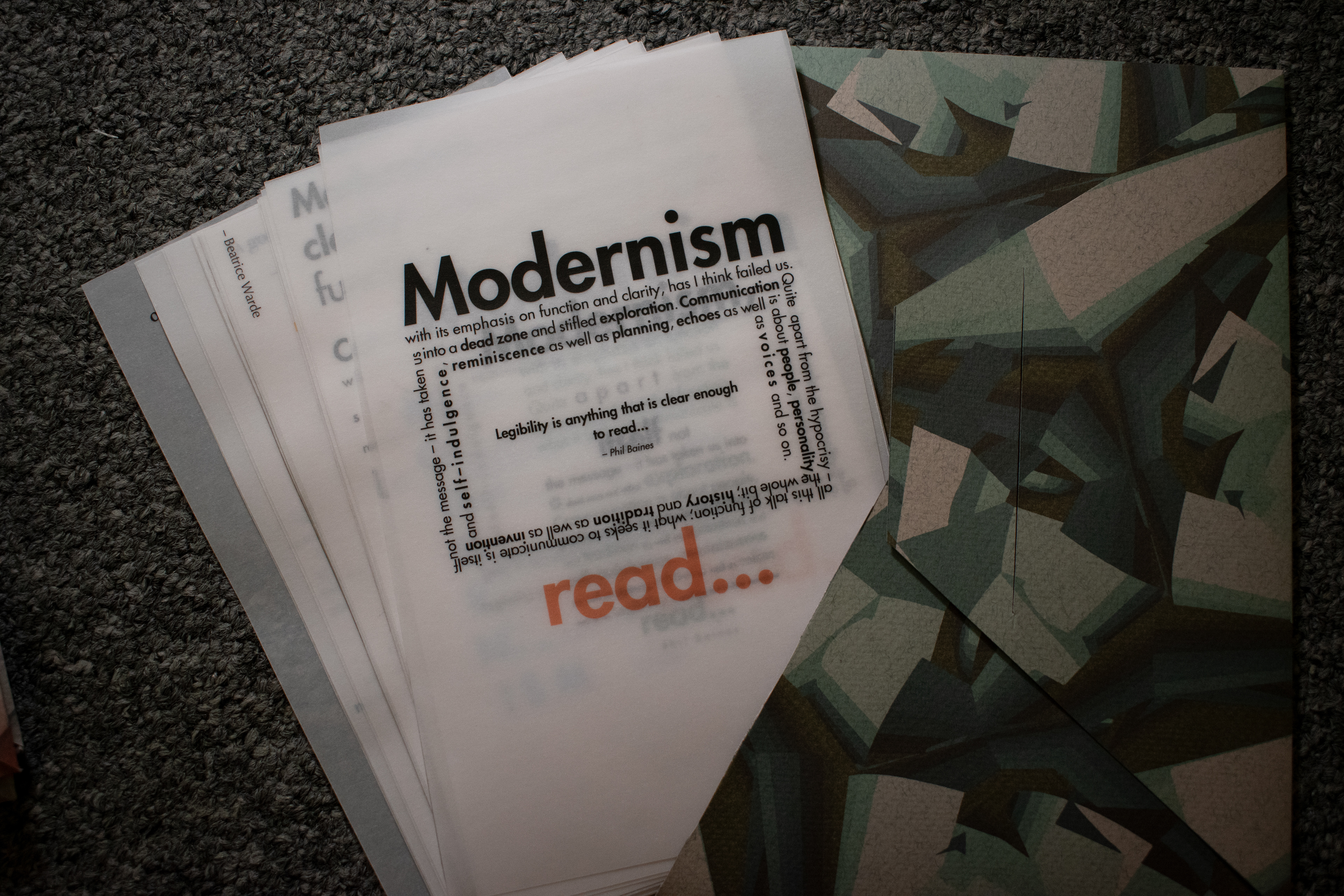
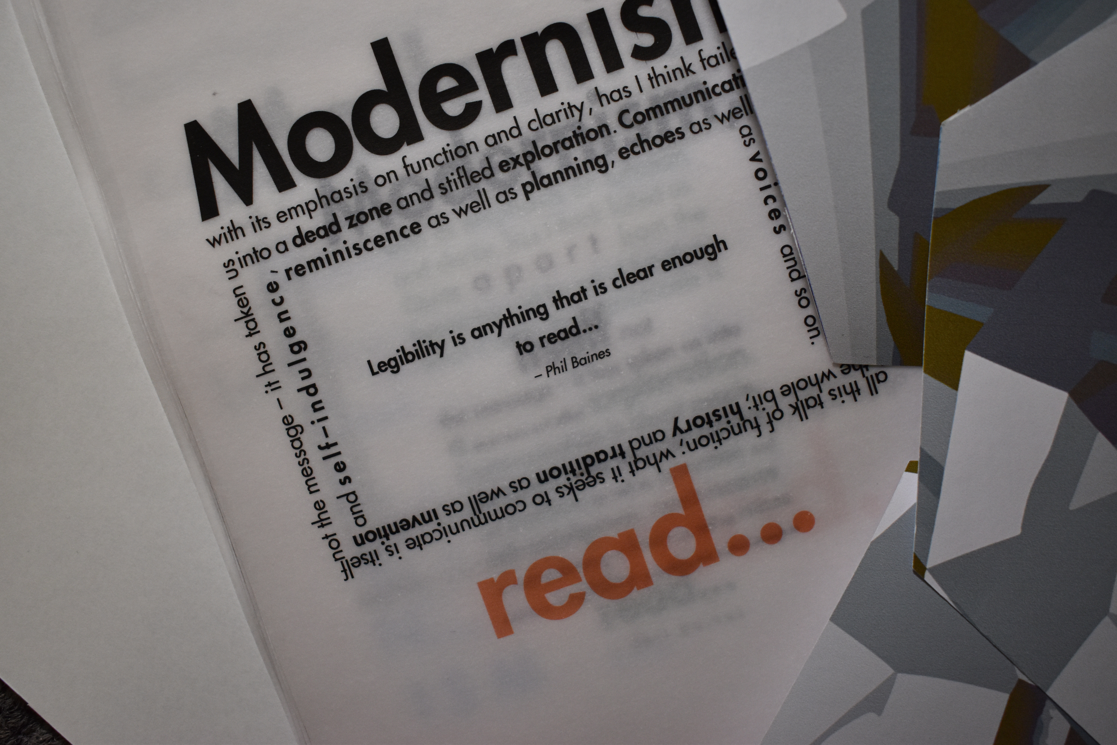
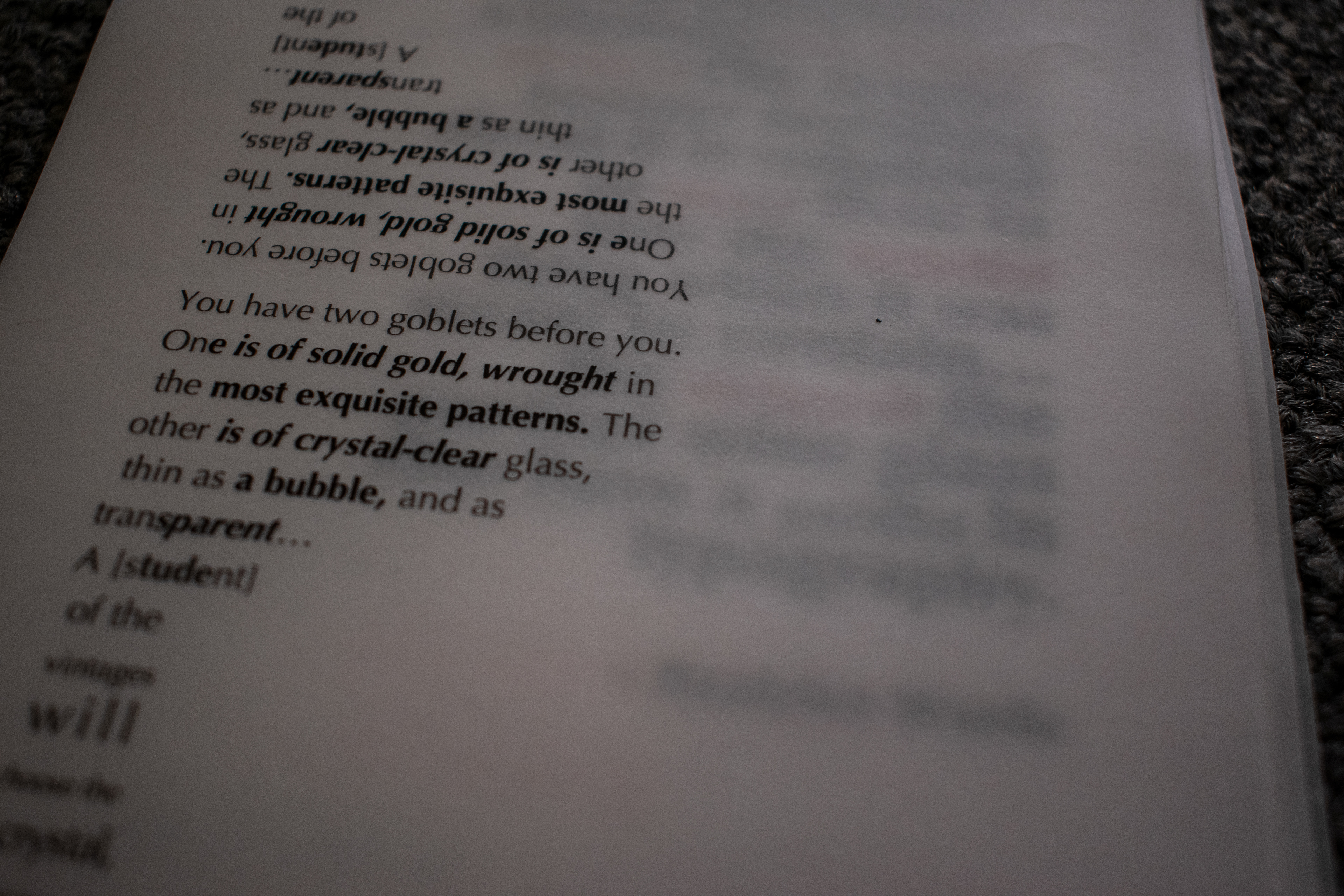

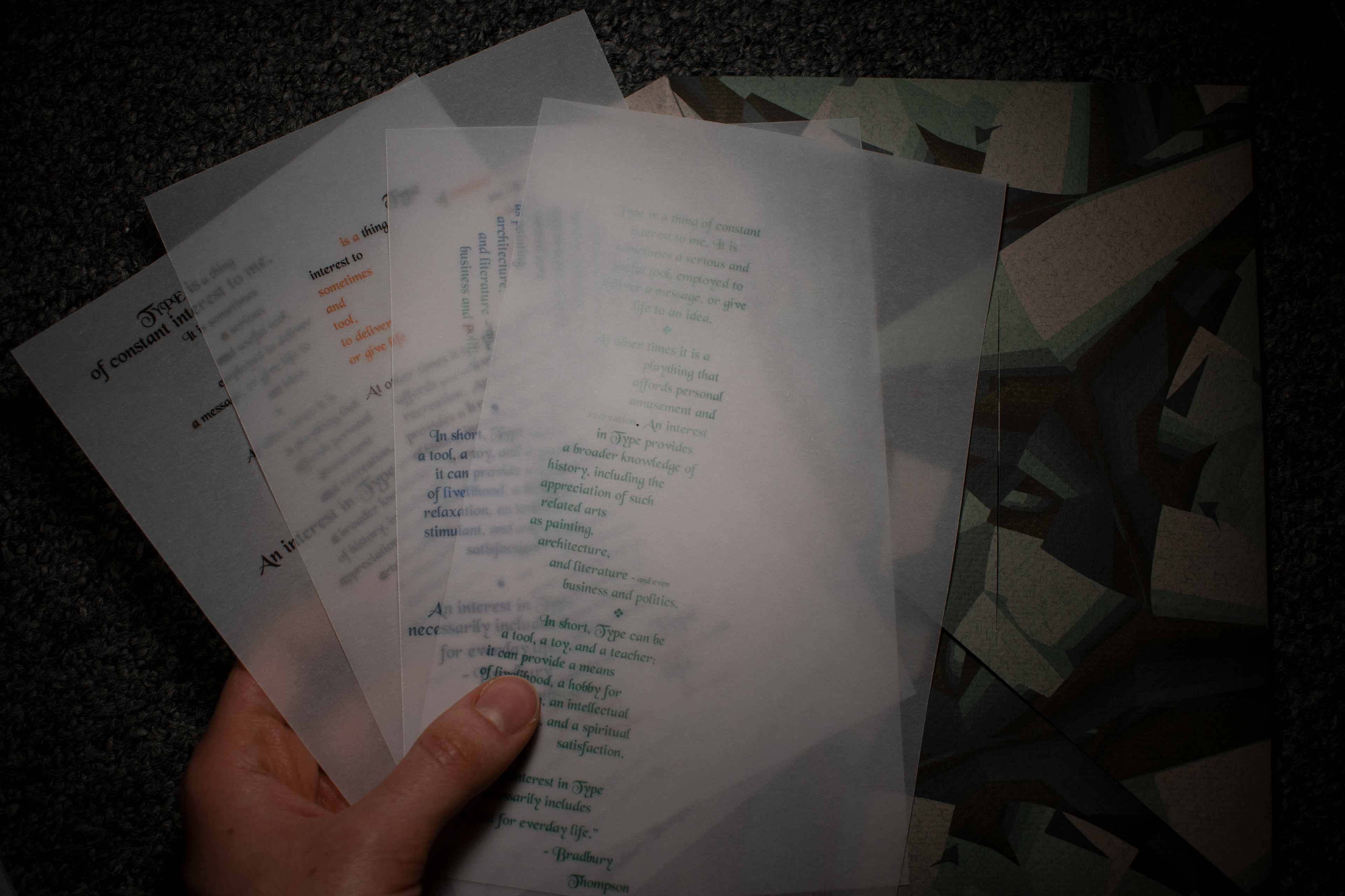
close up of my play with type and type-setting depending on the energy, voice, and message of the quote.
