Fall Term, RISD 2020
Course: Designing With Color
I chose two sets of colors that had an emotional significance to me (one culturally and the other on a personal level). After that, I created a full in-depth color palette that illustrates my color explorations.
I found the complement and split complement color for each one of my chosen colors and made an in-depth palette by mixing them together.
We were asked to choose a set of 2 colors that have an emotional significance to us but are not necessarily our favorite colors. We then had to discover their meaning and explore visual examples and the context of their use. I created tints and shades in 20% intervals (80,60,40,20) for the mixtures.
After that, I selected 3 sets of harmonious relationships (monochromatic, analogous, contrast [complementary])from my palette. The final product included one palette set.
My two sets of colors were green and blue; I chose that shade of green because it's reminiscent of the olive oil & green olives in my middle eastern culture. As for the color blue, I chose it because it perpetuates my associations of peace and serenity with the ocean tides.
As I started thinking of how I'd like to make use of my palette and create a final product, I recalled my decision to choose this shade of blue & reasoning. Since it's connected to the ocean tide, I wanted to create something that encapsulates the mesmerizing patterns and shapes created by the tides.
Since I love drawing connections between my physical life and world, I started thinking of elements that exist in relative space but are highly reminiscent of the ocean tide. I ended up thinking of Arabic coffee and the coffee remains in our cups.
Coffee remains have had a long history of attracting its beholder. Some cultures, including mine, do fortune telling through these coffee remains. Others, just admire the mystical stories and shapes created from the cryptic coffee lines and waves. The resemblance between both realm lead me to design a book. The book would serve as a diary of my personal experience with coffee. I'm not a coffee person, partly because I don't have any caffeinated drinks; thus, I wanted to showcase the experience of having coffee from the lens of a decaffeinated person.
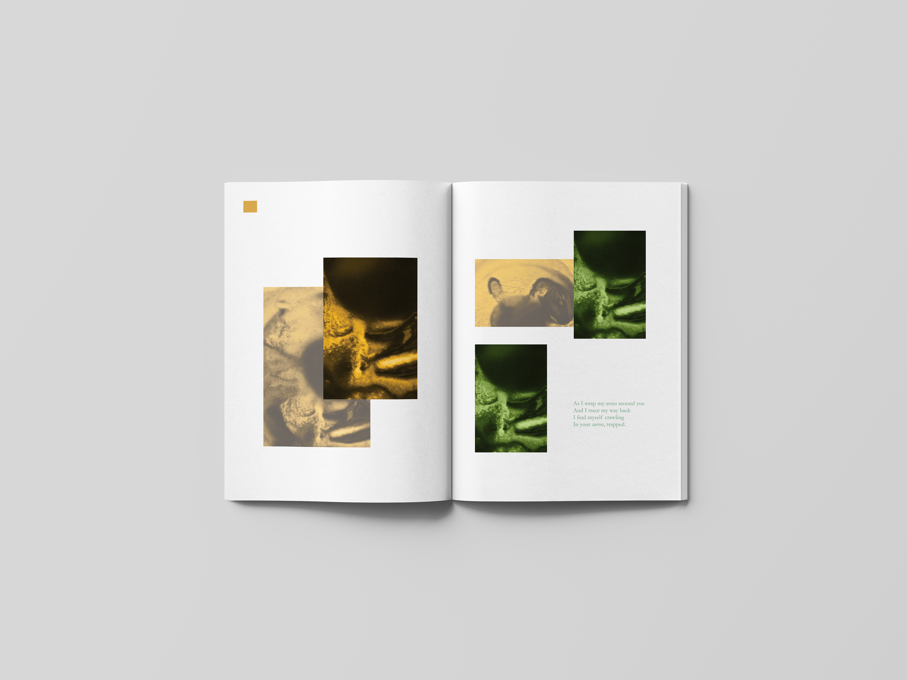
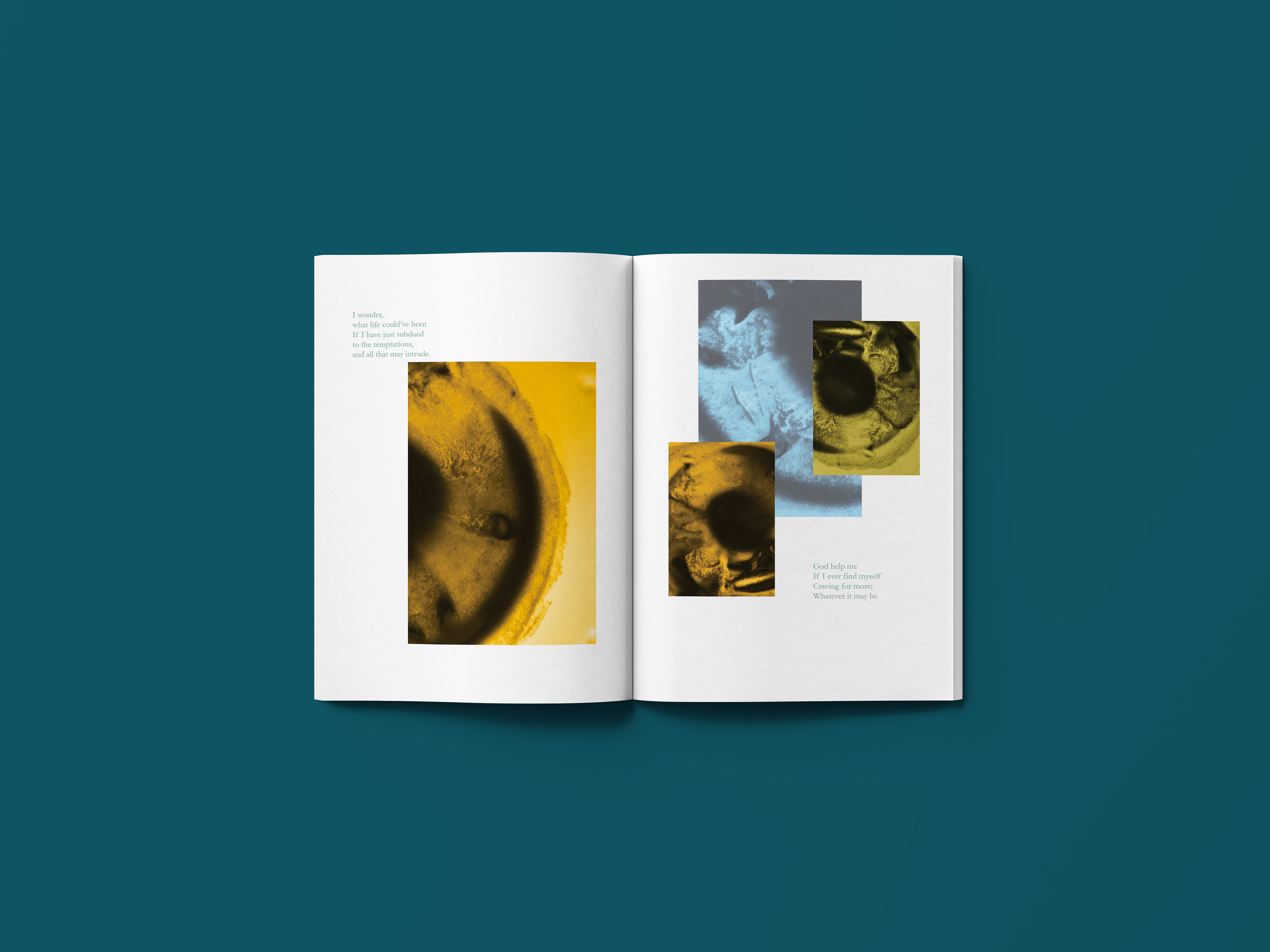
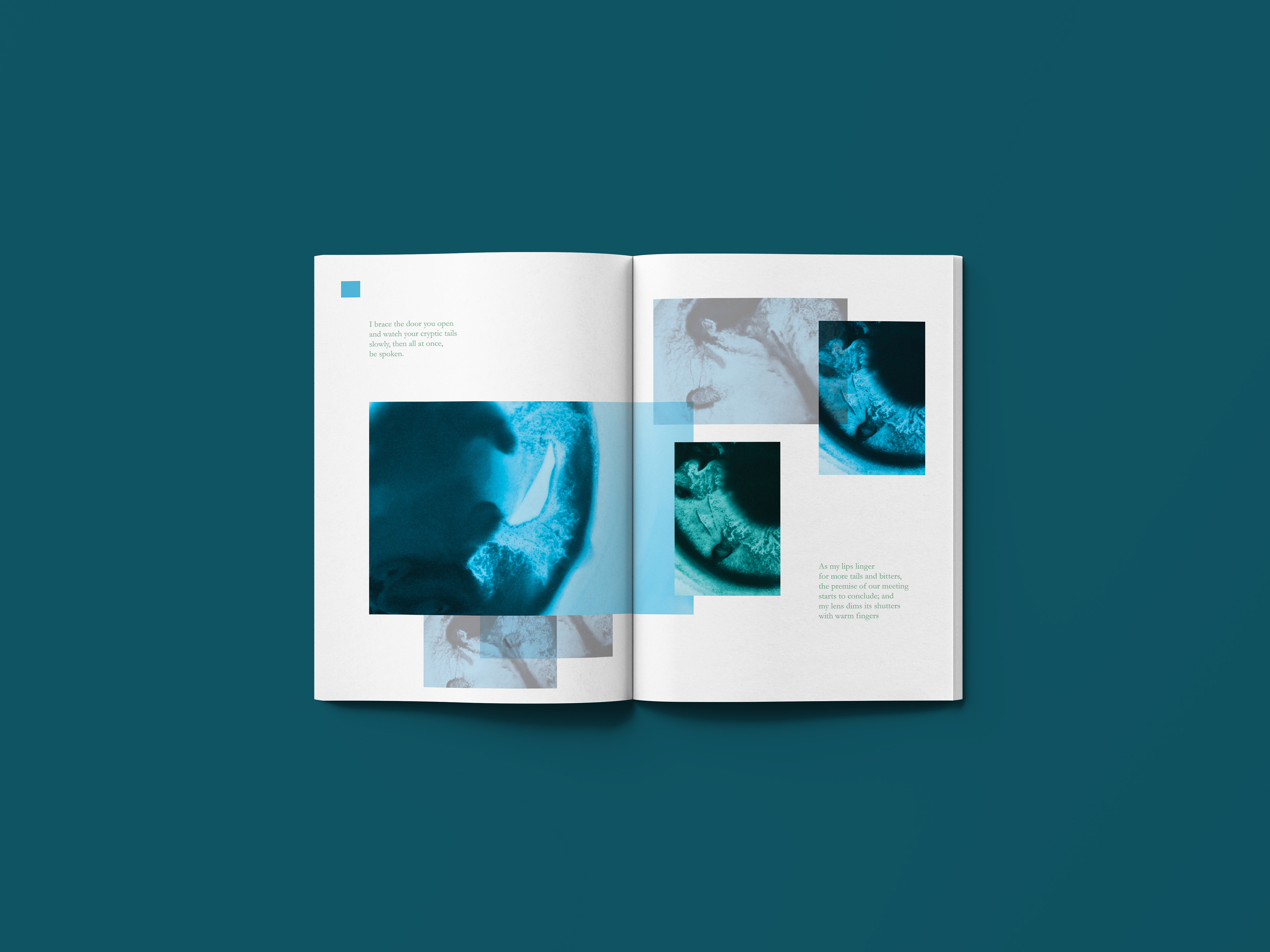
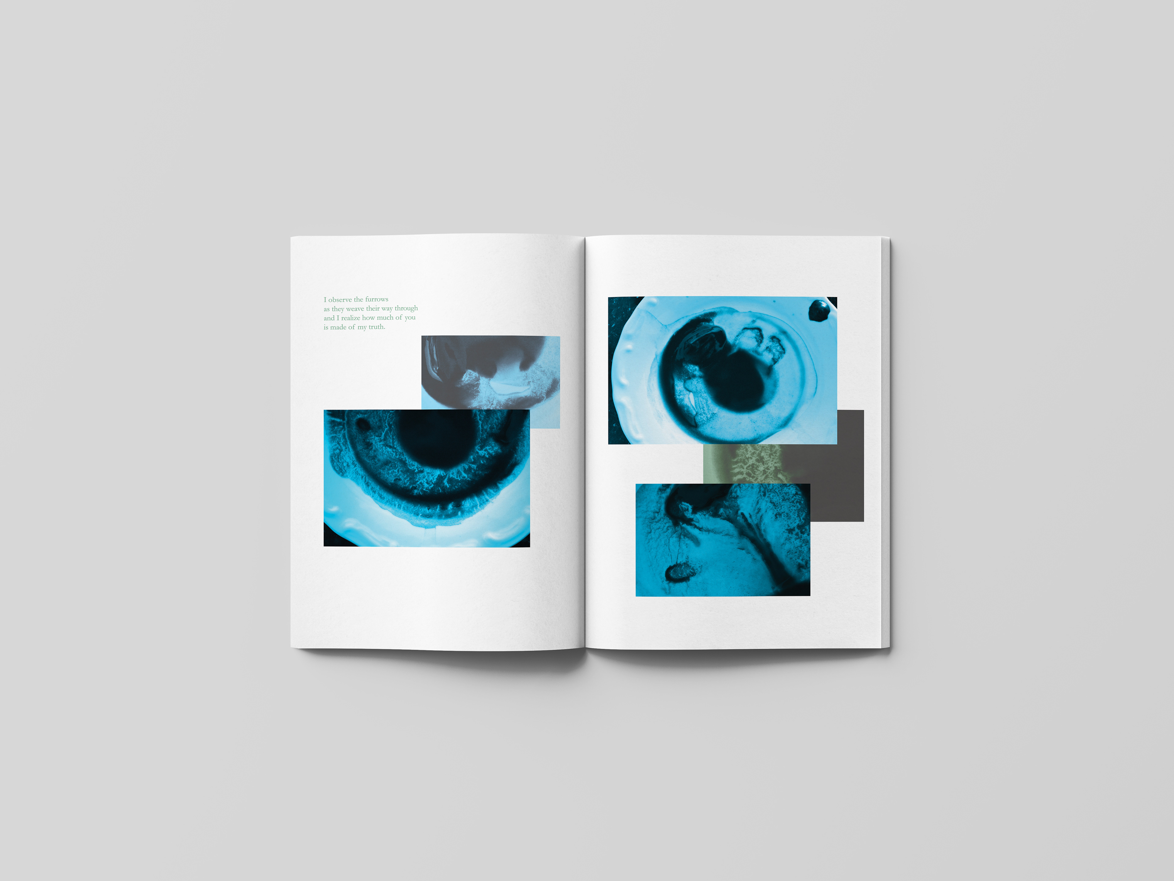
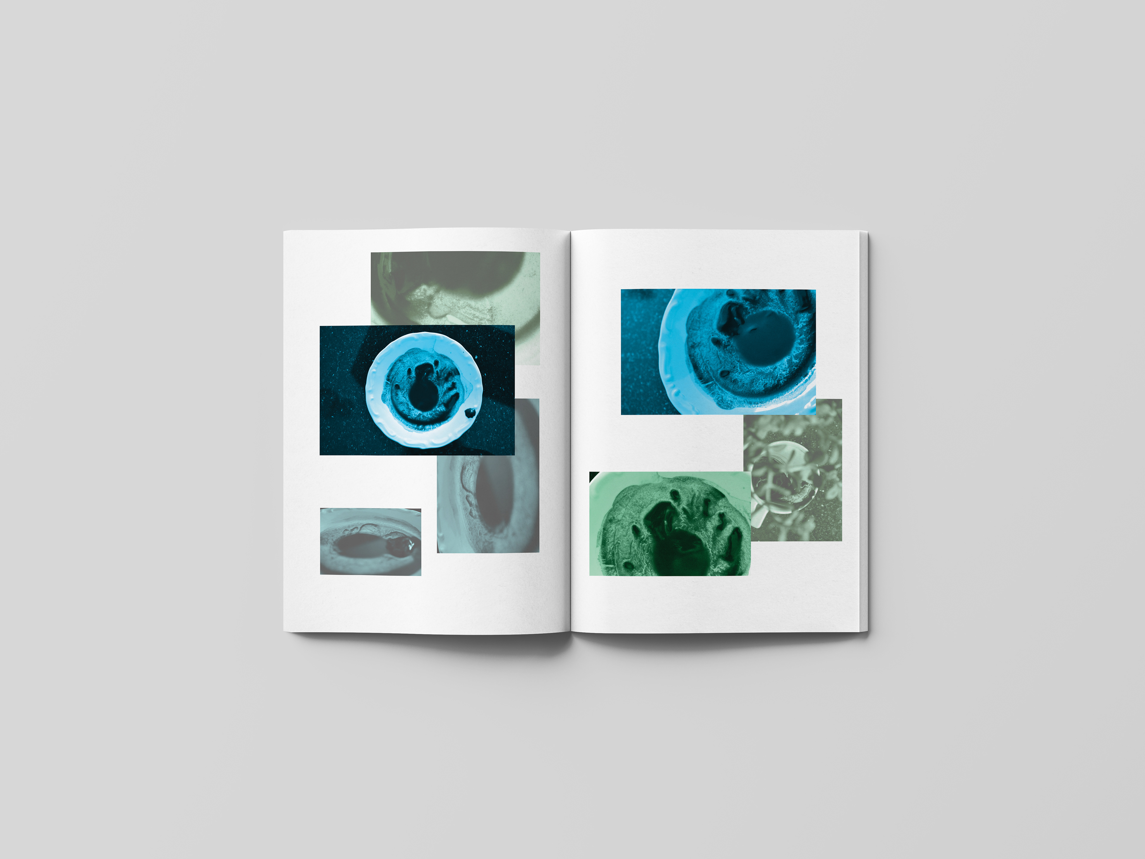
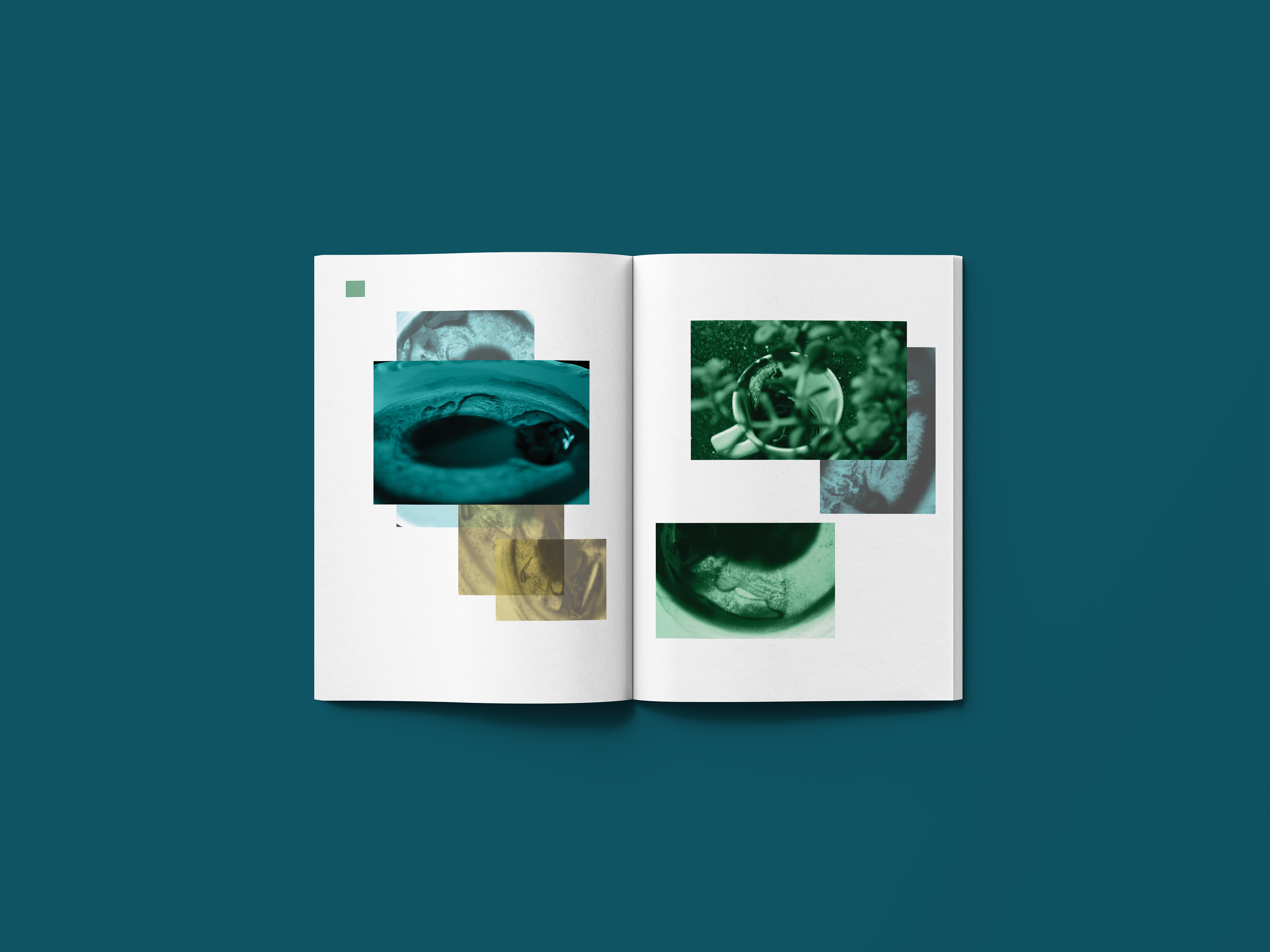
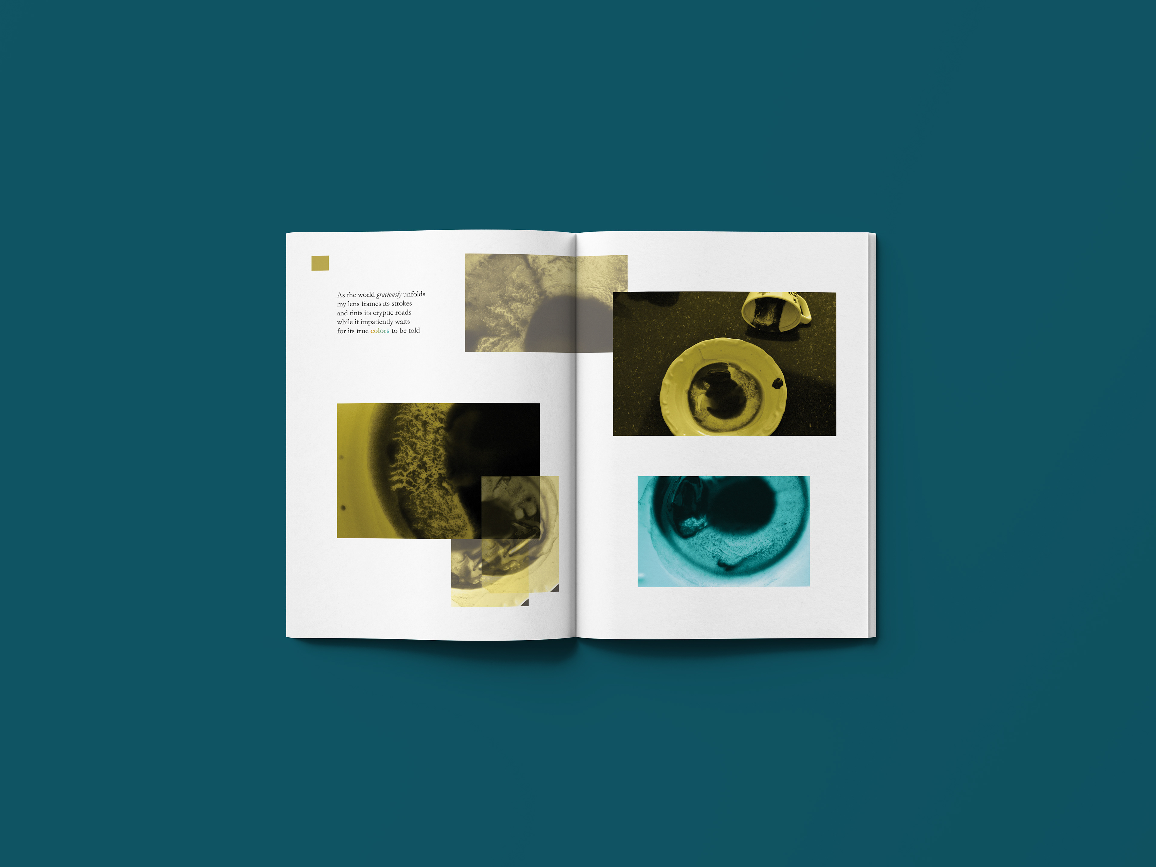
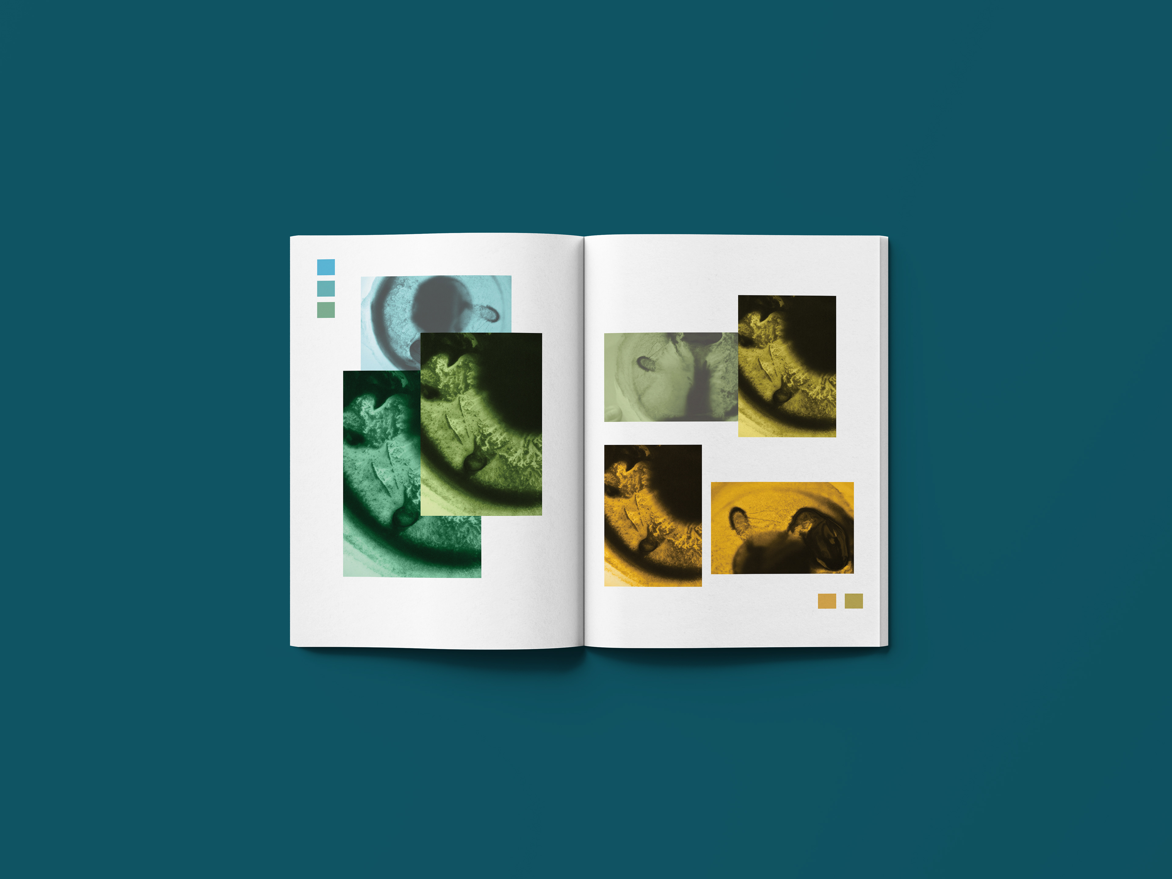
The book includes photographs that I've taken of coffee remains along with short poems that I've written about my personal experience with it. In my poems I personify coffee to illustrate the intimate relationship I've built with it in the process of taking photographs of it. As for the color of my photographs, it all stems from my final chosen color palette.
map out of my color palette (for both chosen color sets)
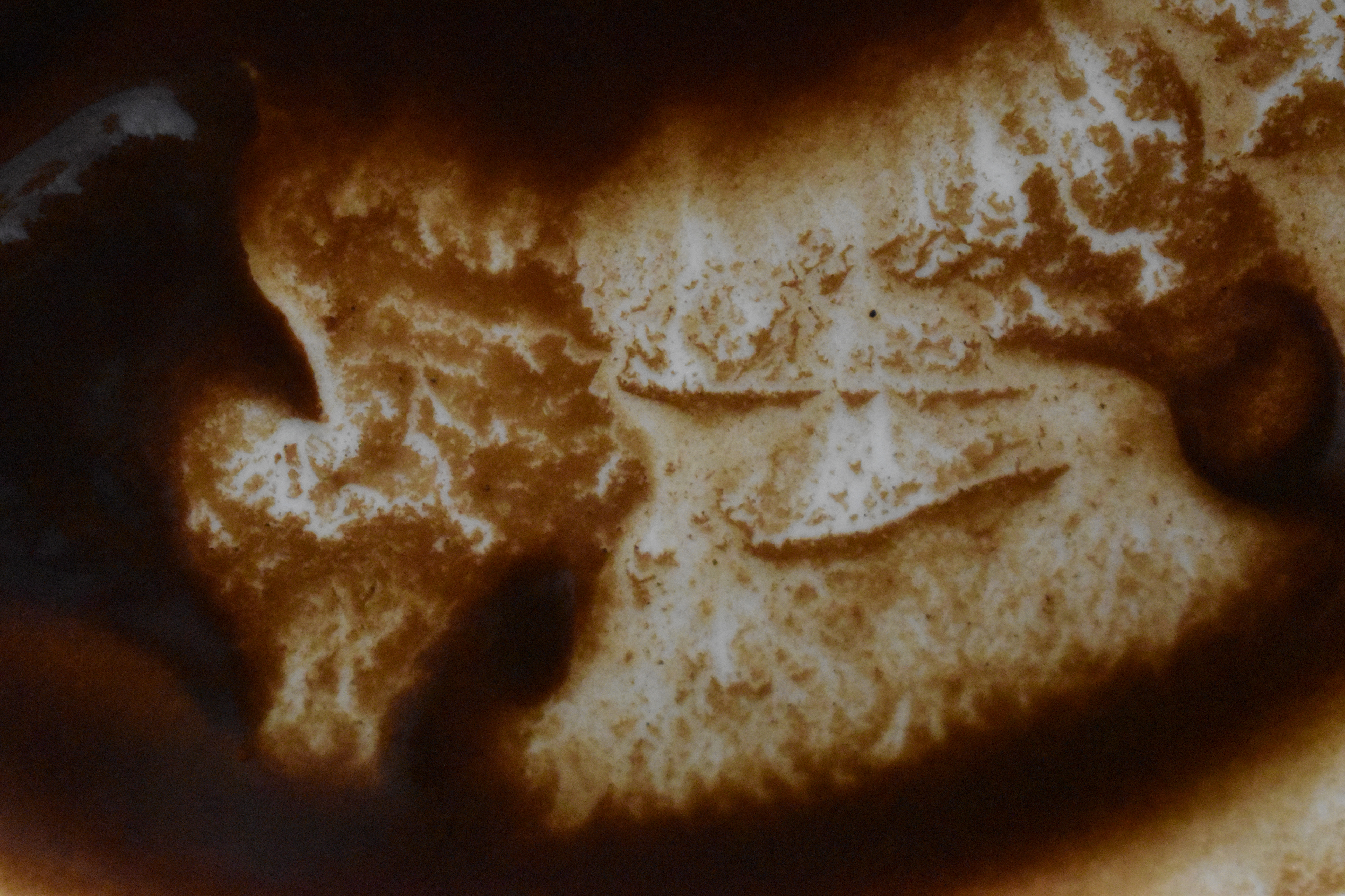
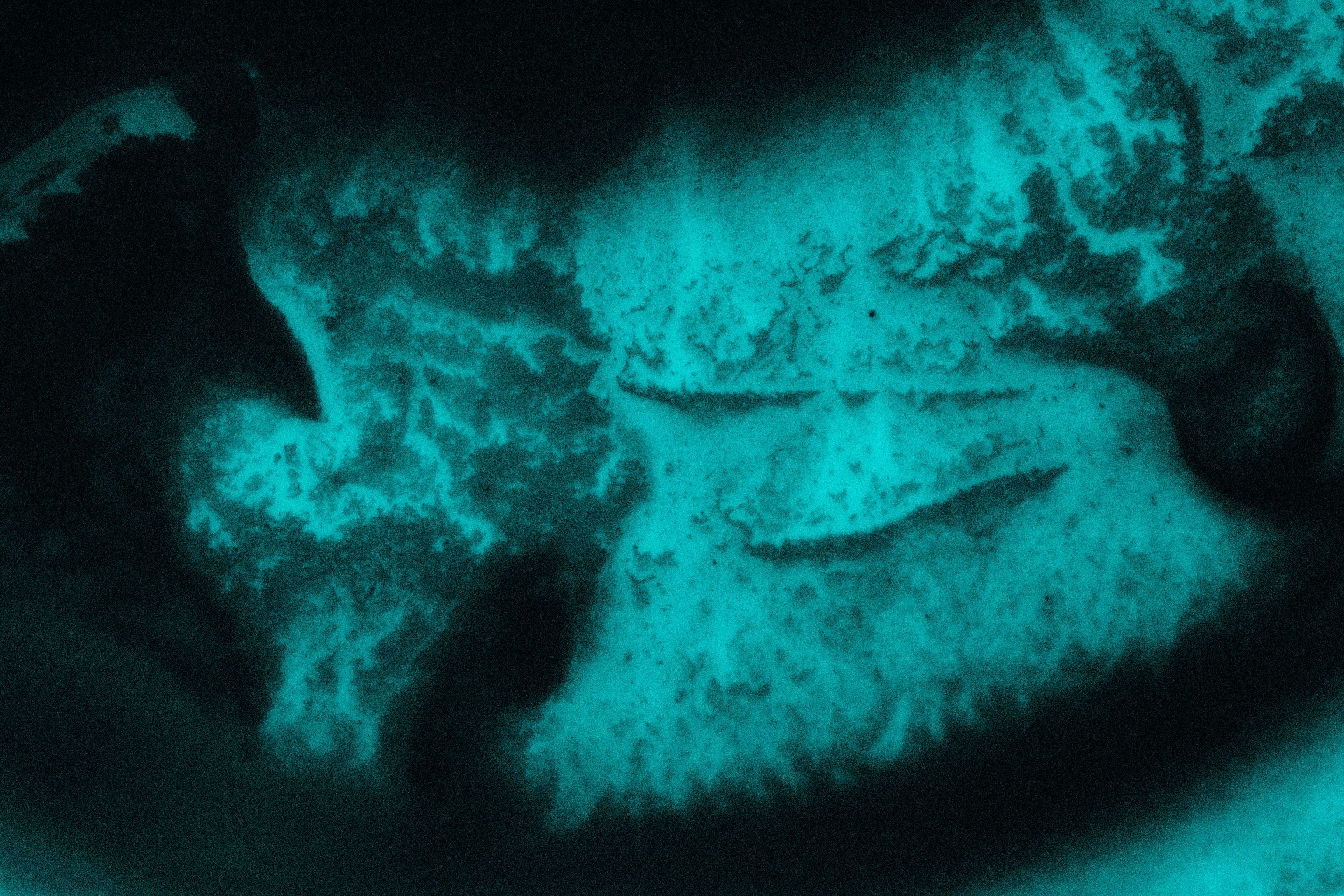
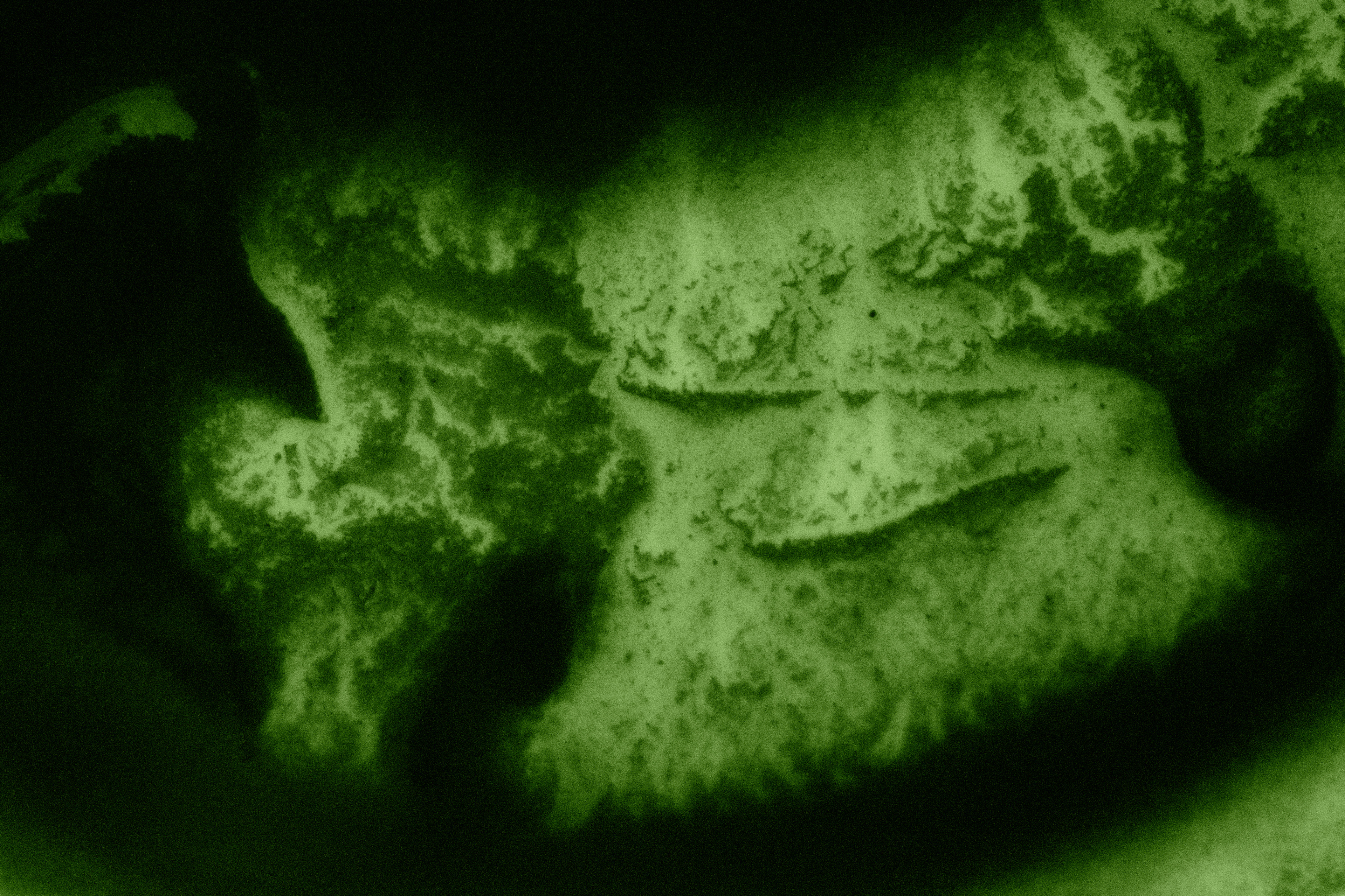
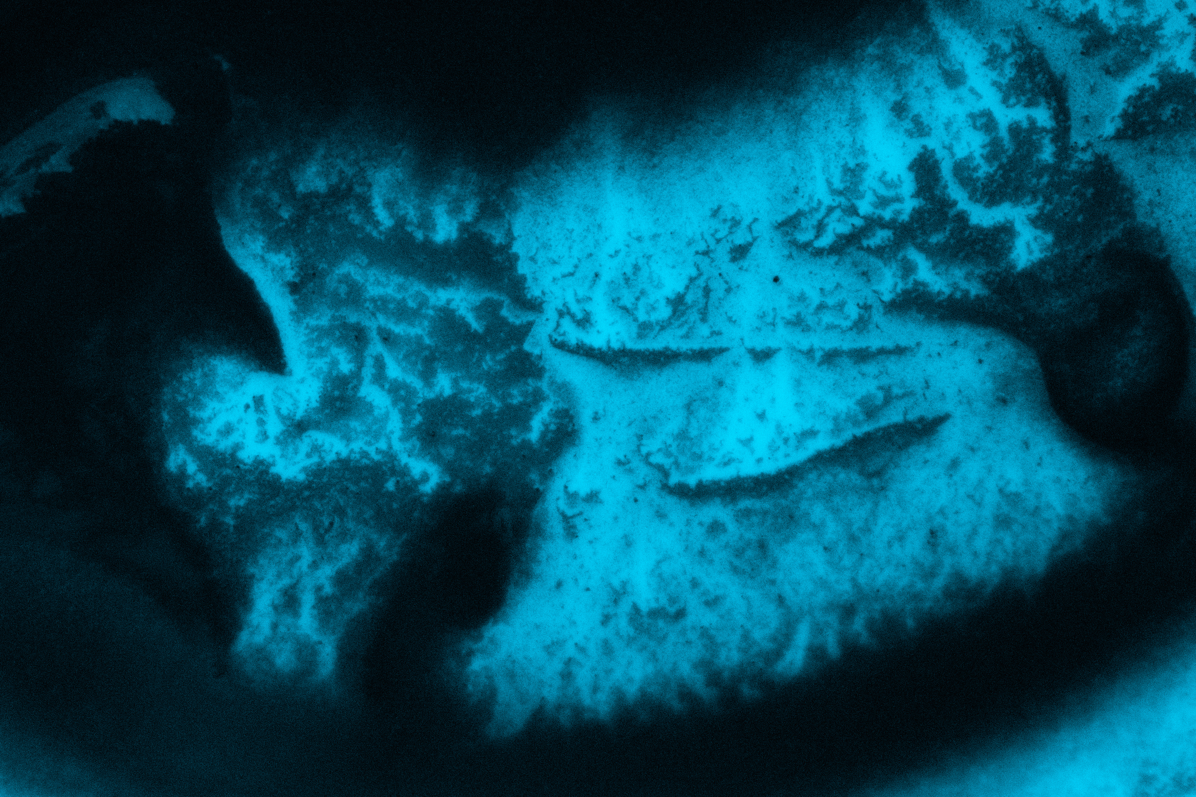
Far left image is the original photograph that I shot of coffee remains (before adding tints to it). The tinted images are stemmed from my final chosen color set.
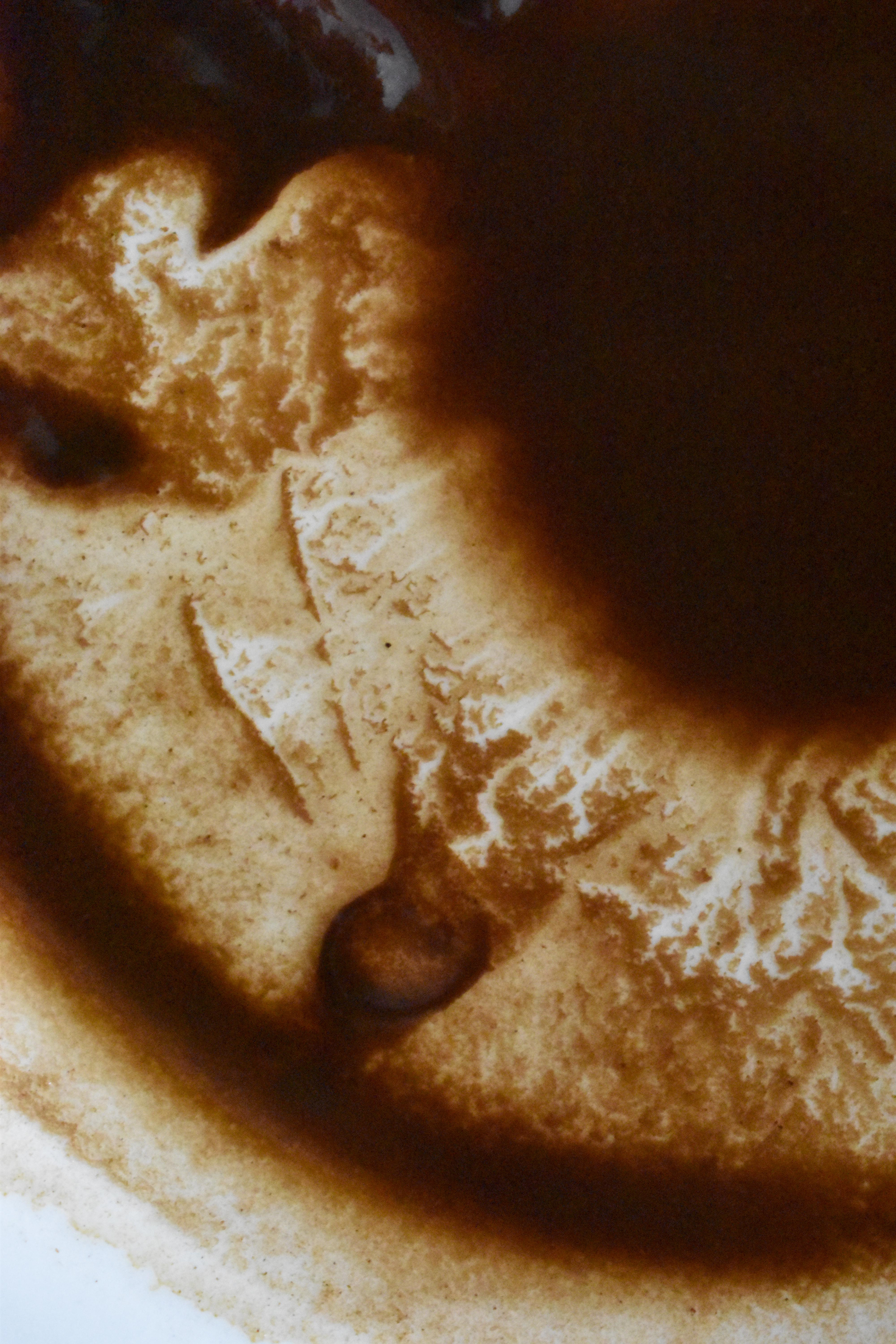

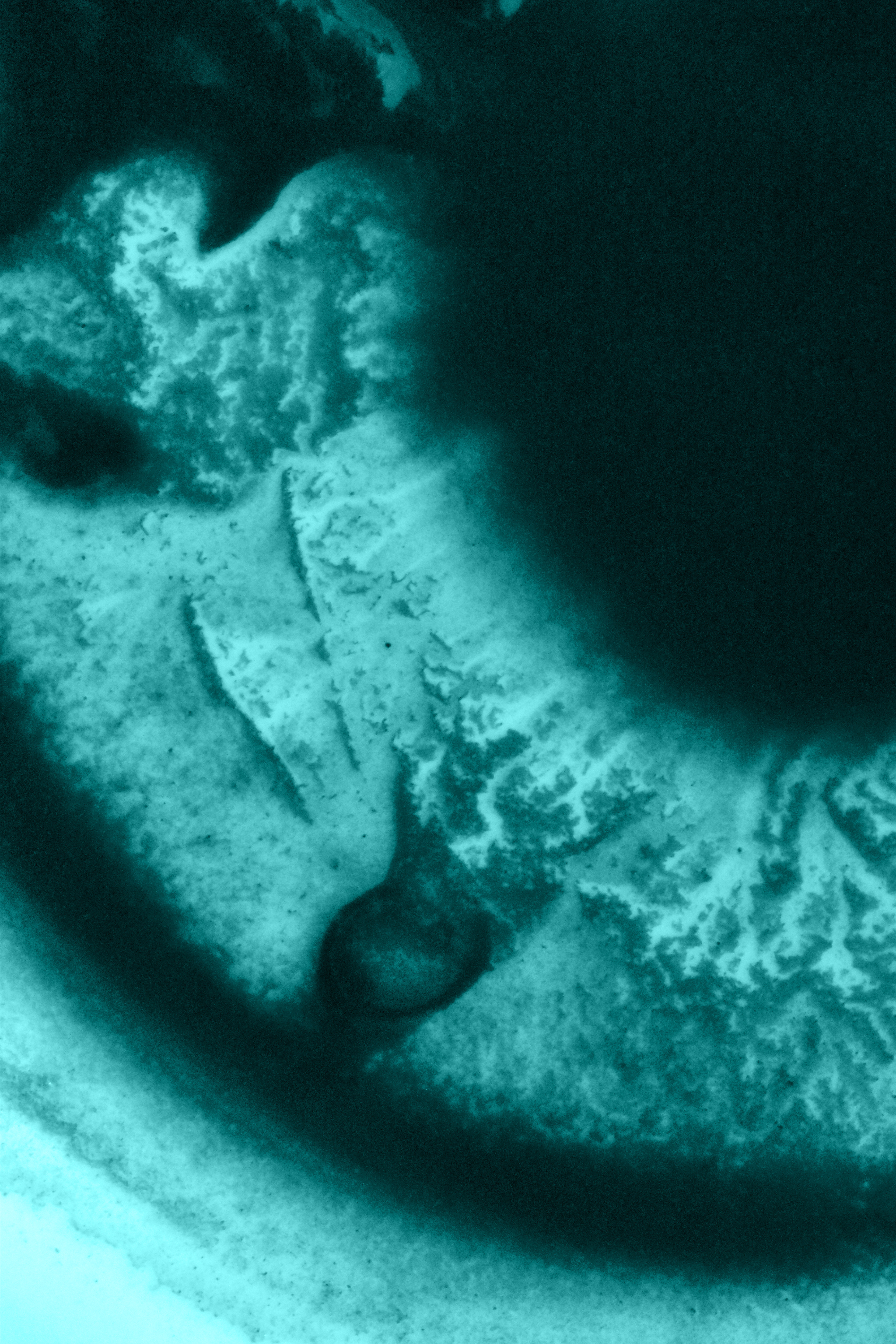
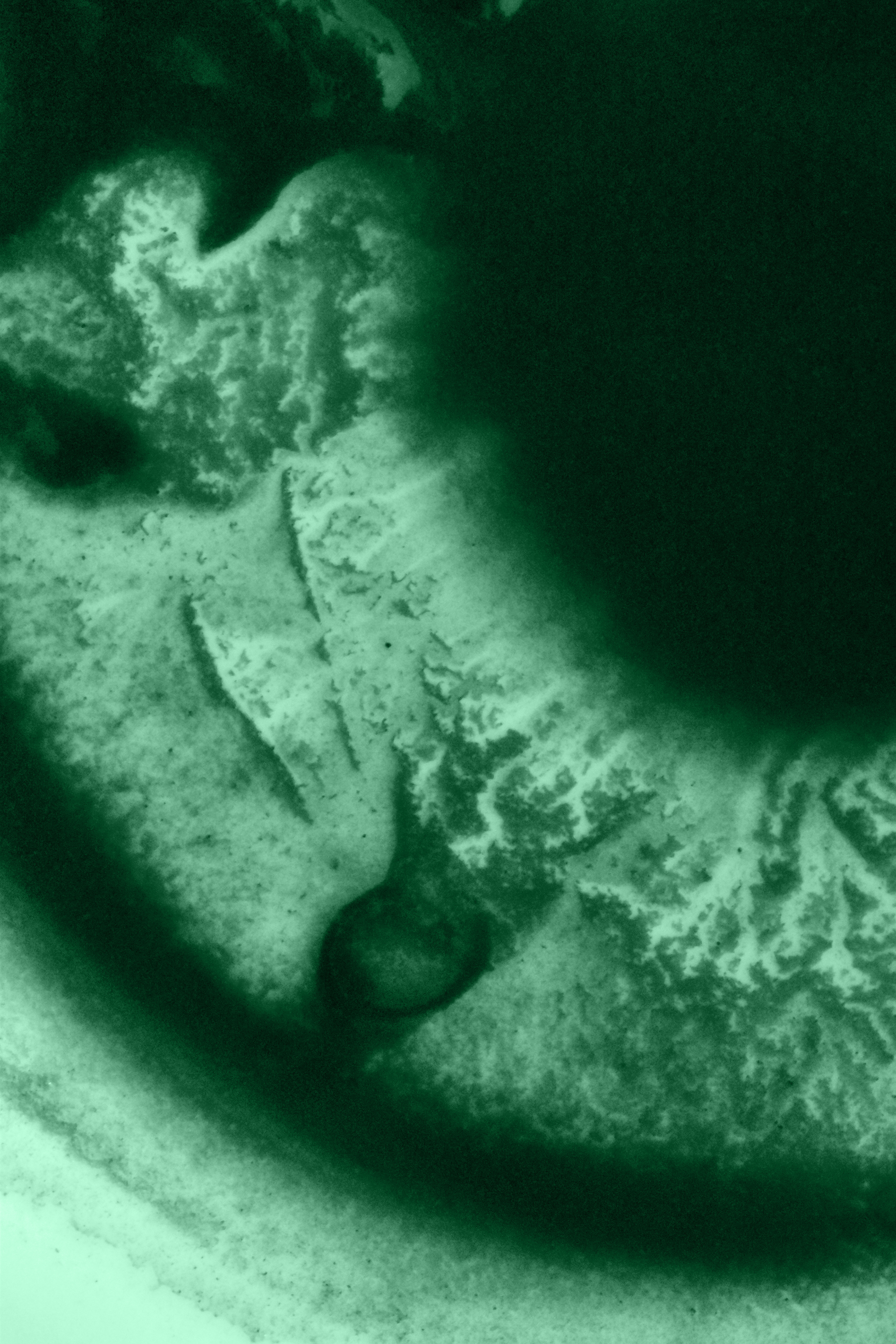
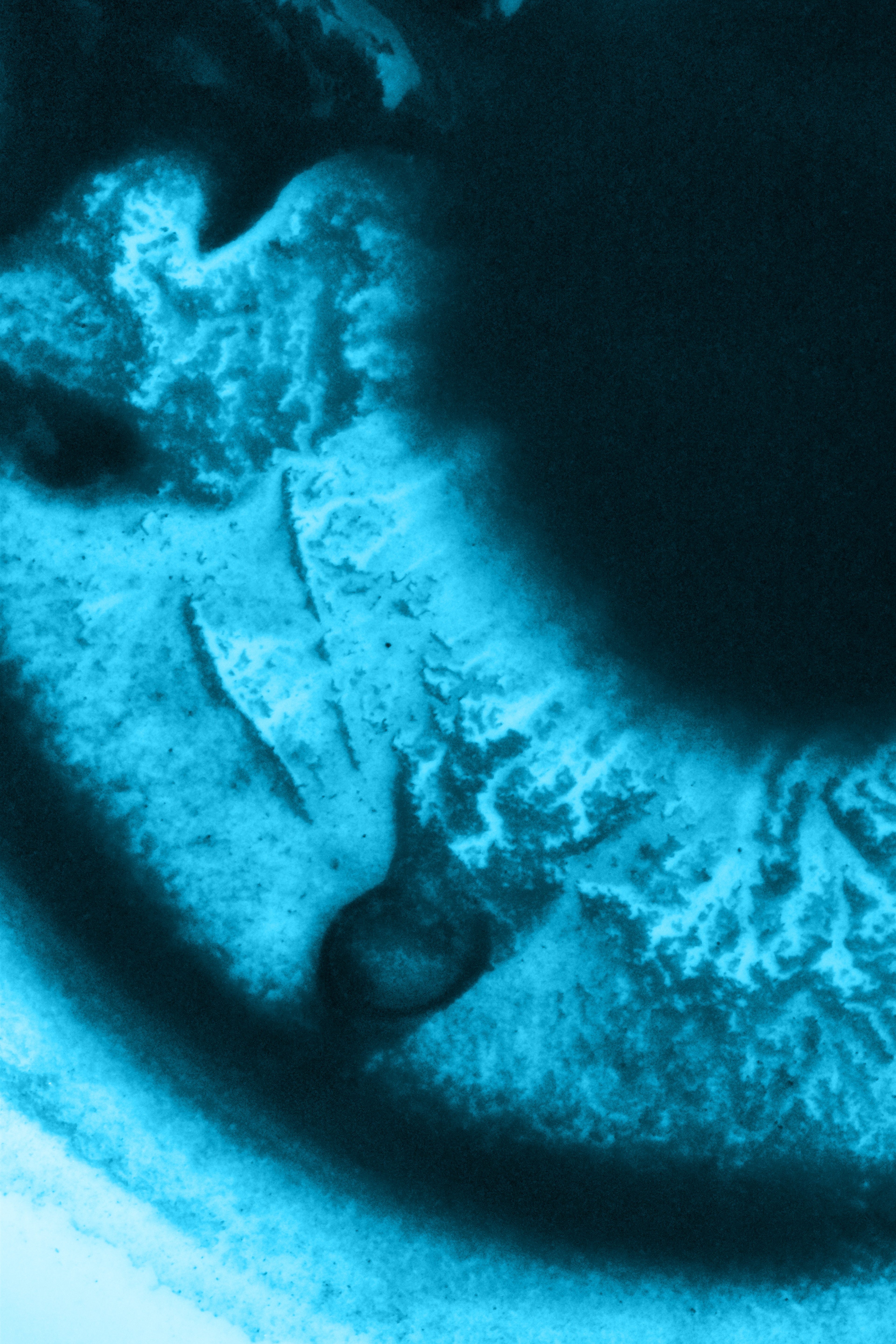

Excerpts from my book:
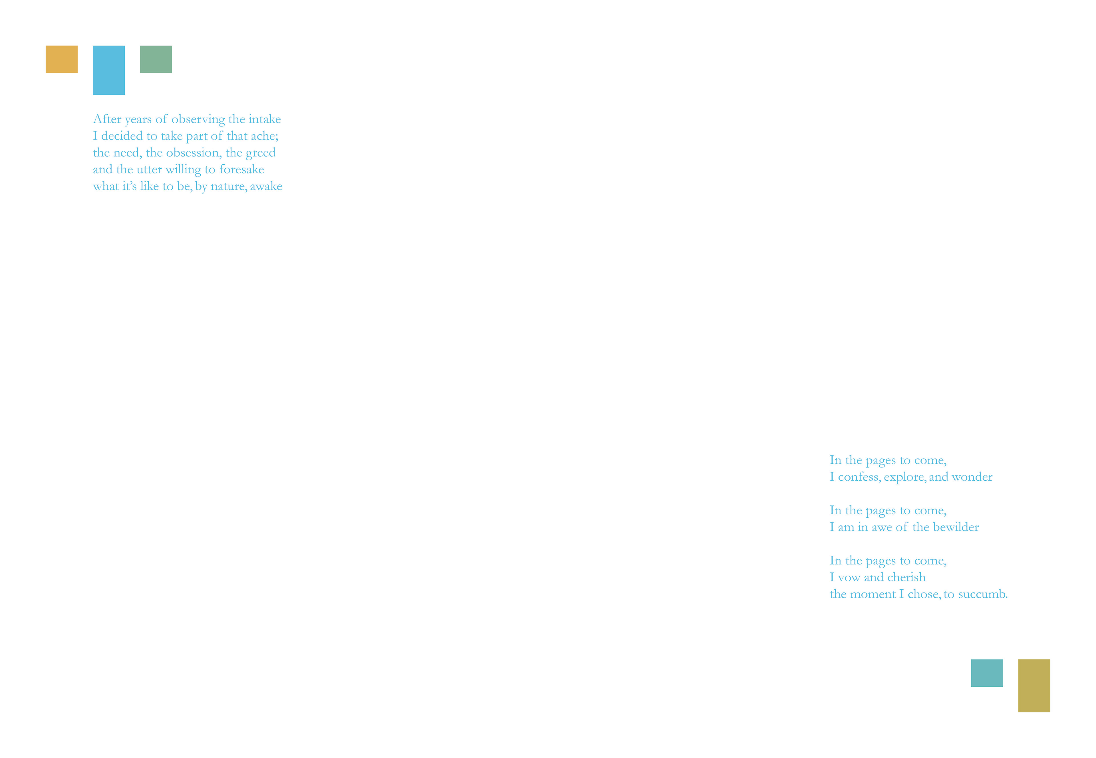
Intro page of the book
