Class: Newly Formed, RISD Spring 2021 | Assignment Name: Zebra
Final Publication Method: Booklet
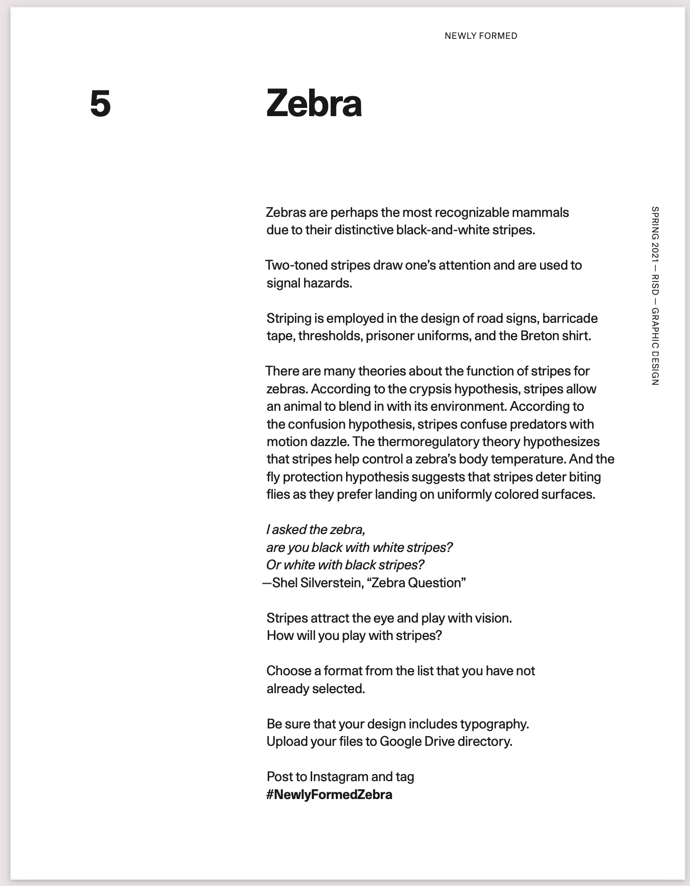
The Prompt For This Assignment

For my Newly Formed class, we were given an assignment (displayed in the top left) that's inspired by Zebras and asks us to play with stripes.
Thought Process:
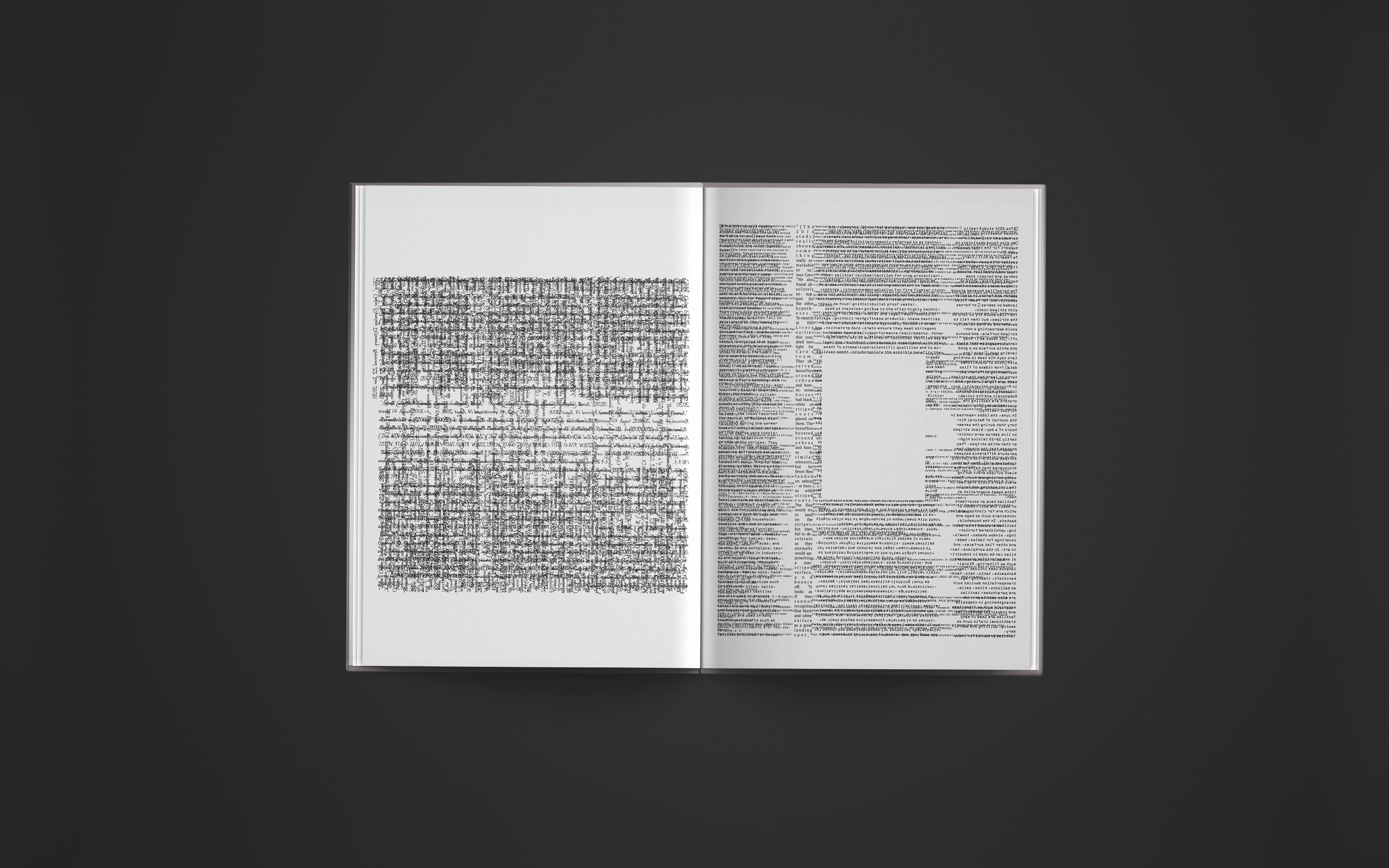
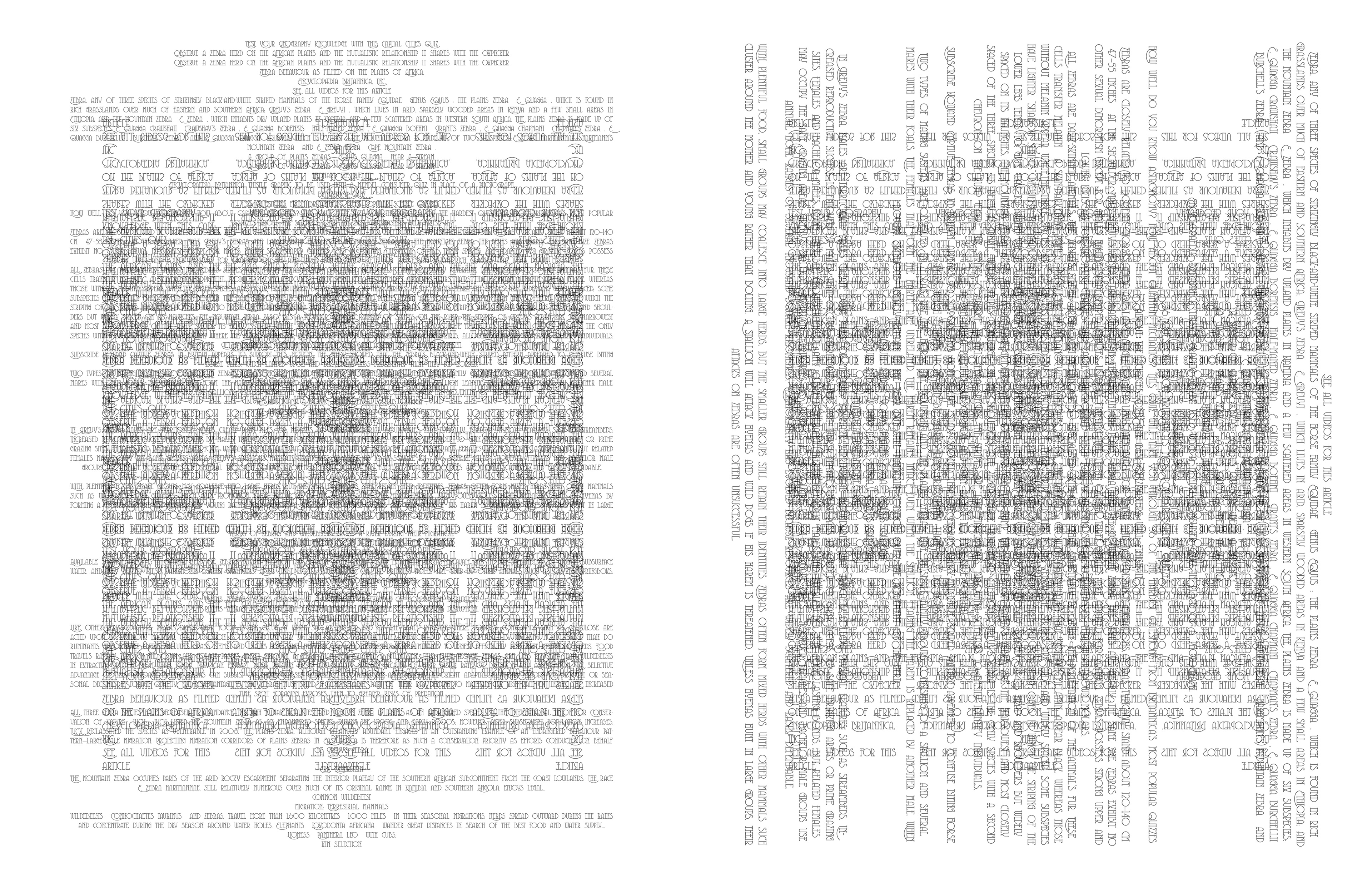
I started deconstructing the meaning of stripes (particularly in the context of a Zebra). Initially, I didn't know why Zebras had stripes; however, after doing some research, it turned out that Zebras have black and white stripes that function as thermo-regulators. The black absorbs the heat in the morning (thus warms the zebra up) and the white reflects light to help cool the zebra. This made me realize that a "stripe" can be defined as something that has a dual function. The black and white are cross-sectional yet have contrasting functions. A stripe responds to the current space/ state.
This realization lead me to think about hot vs cold, day vs night, left vs right, soap vs water, etc. These various elements can all be referred to as "stripes".
Black and white are often shown in conjunction to exhibit positive vs negative space. This notion unfolds itself to the idea of absence vs presence of something. Some examples of forms that hold this feature are windows, shadows, AC ventilators, etc. The absence of heat causes the AC sensors to warm the room, and the absence of the sun leads to the "night", etc.
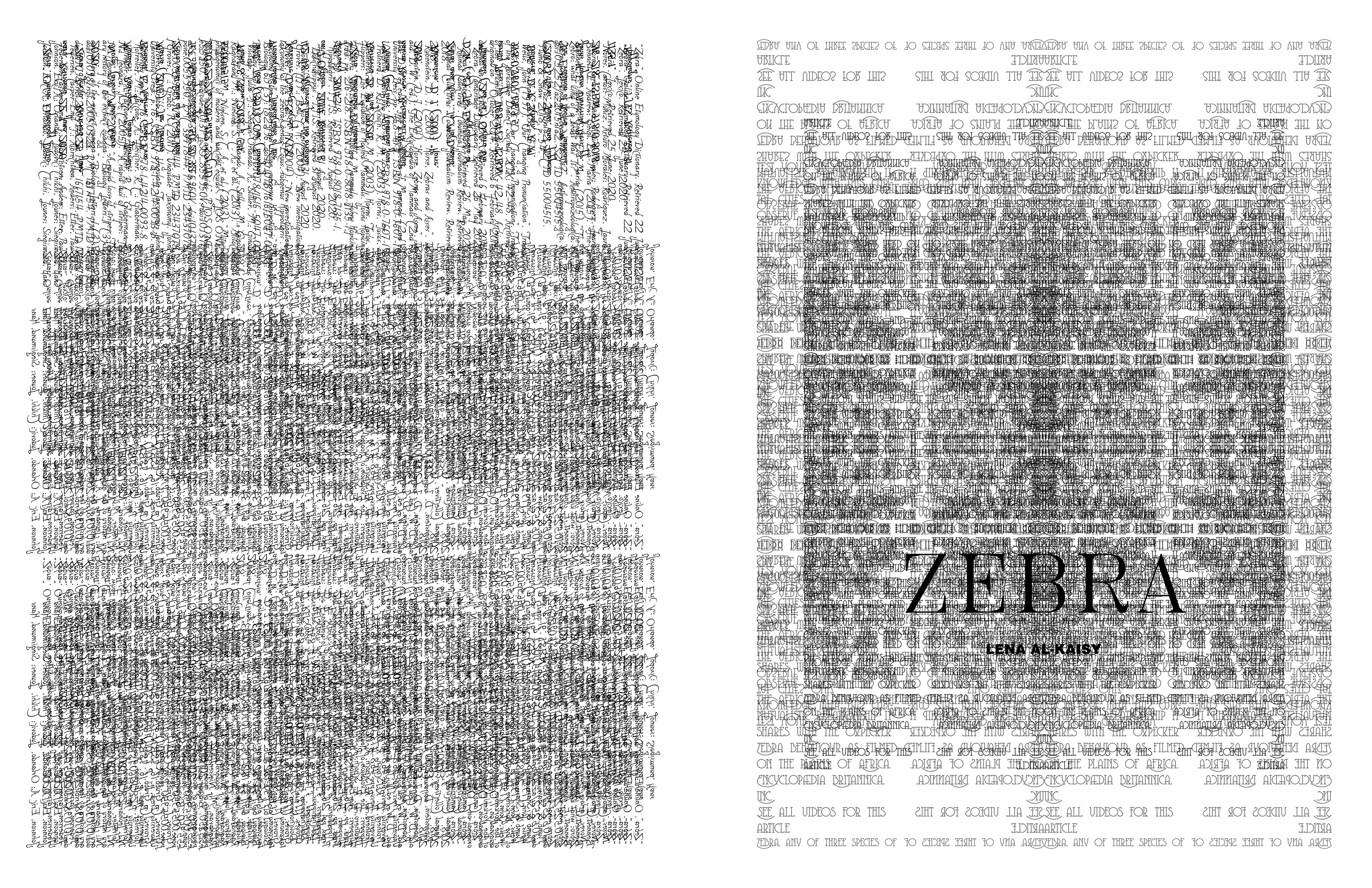
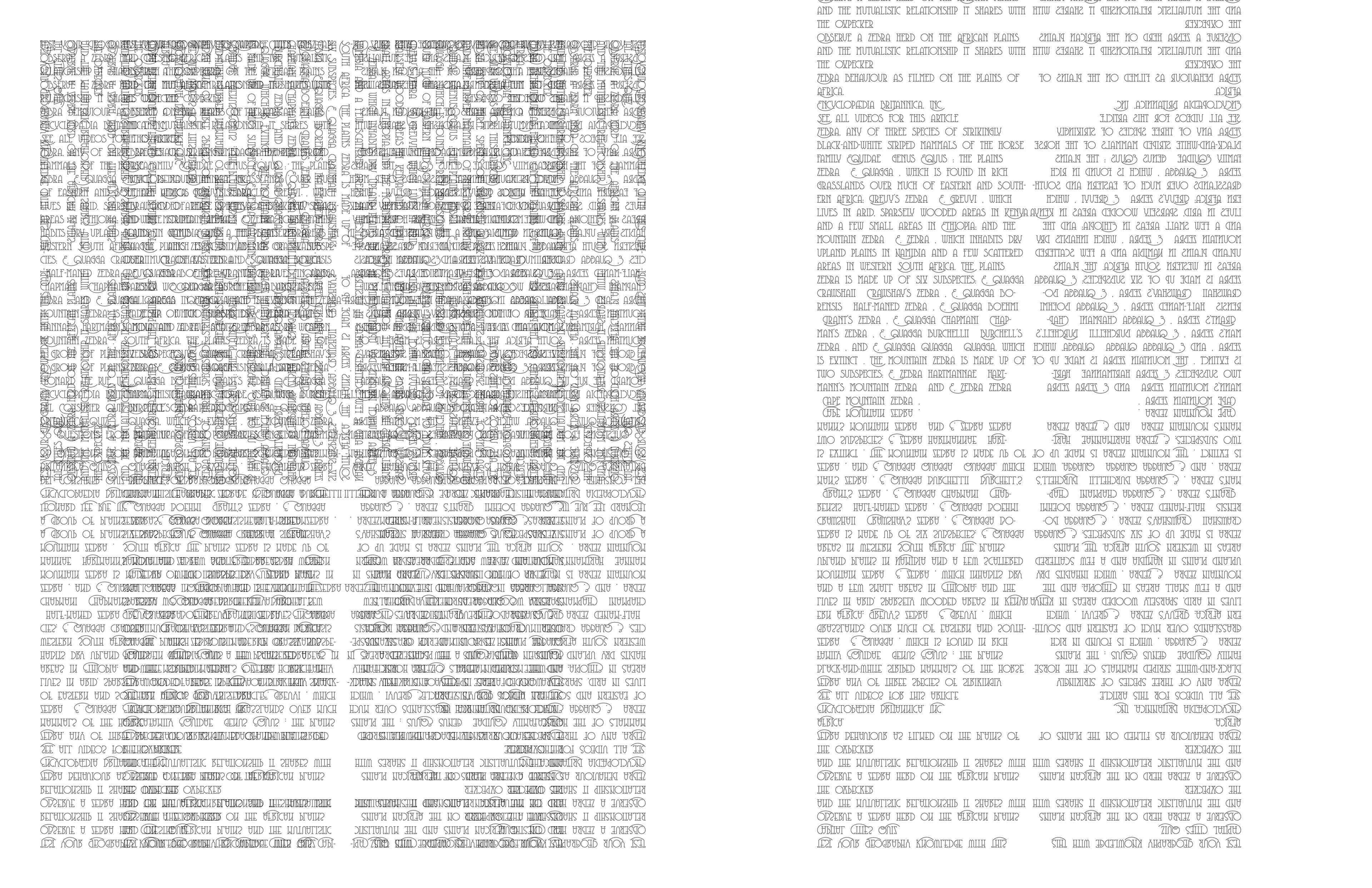
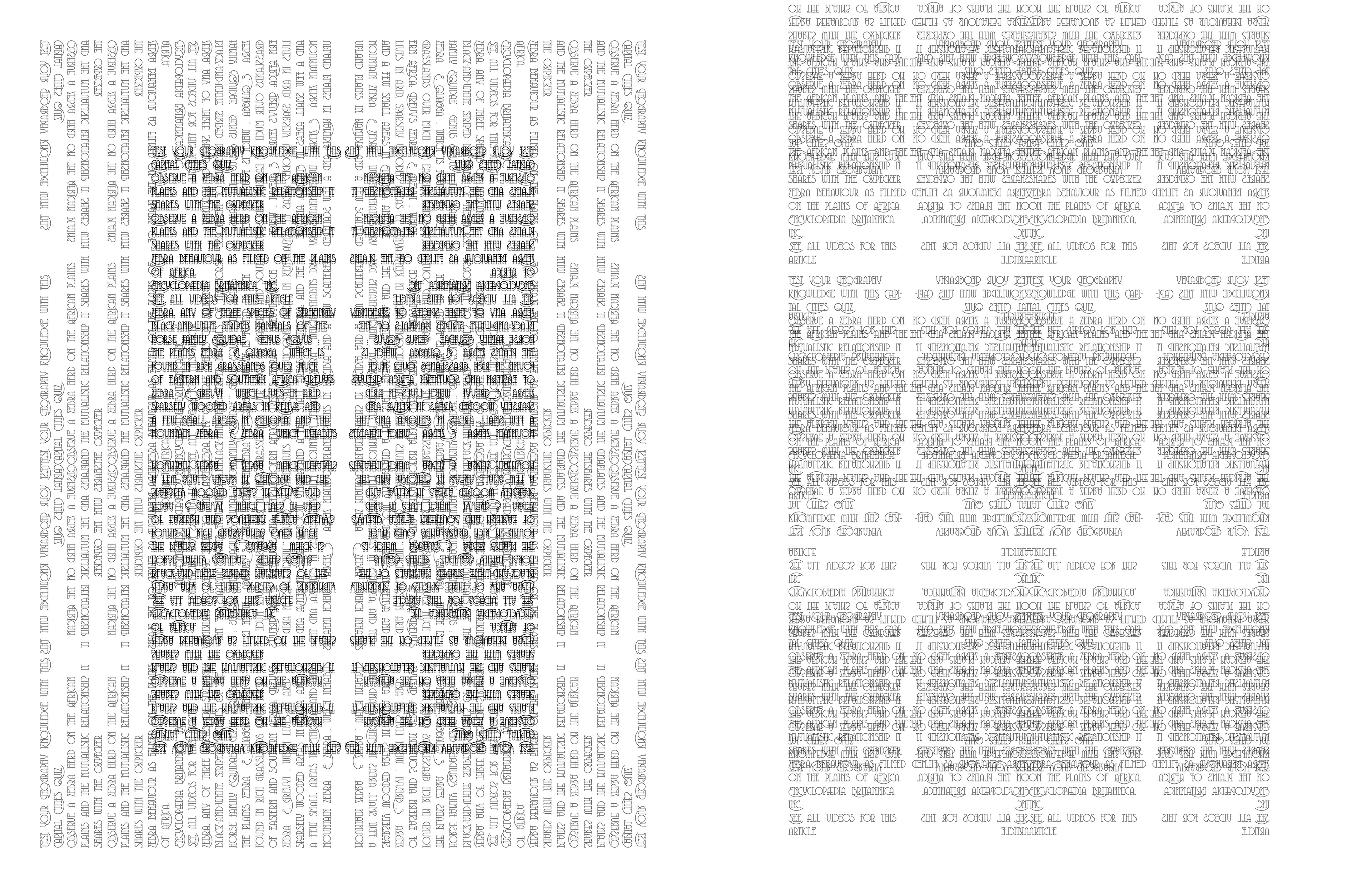
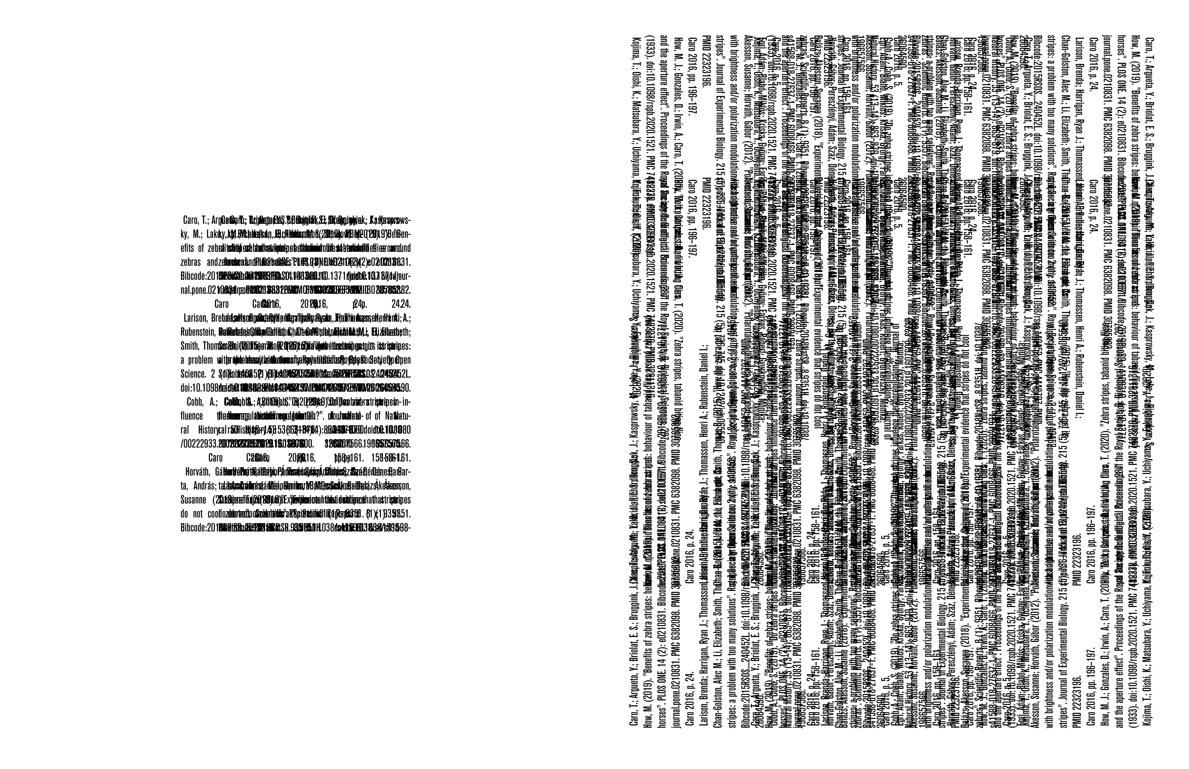
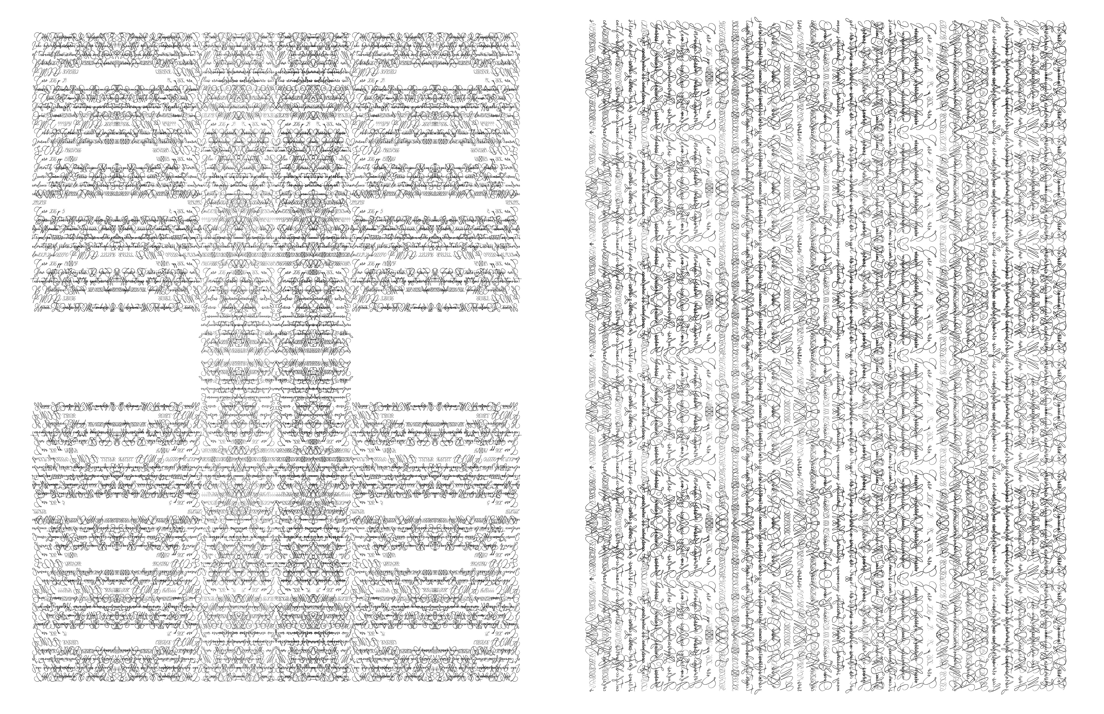
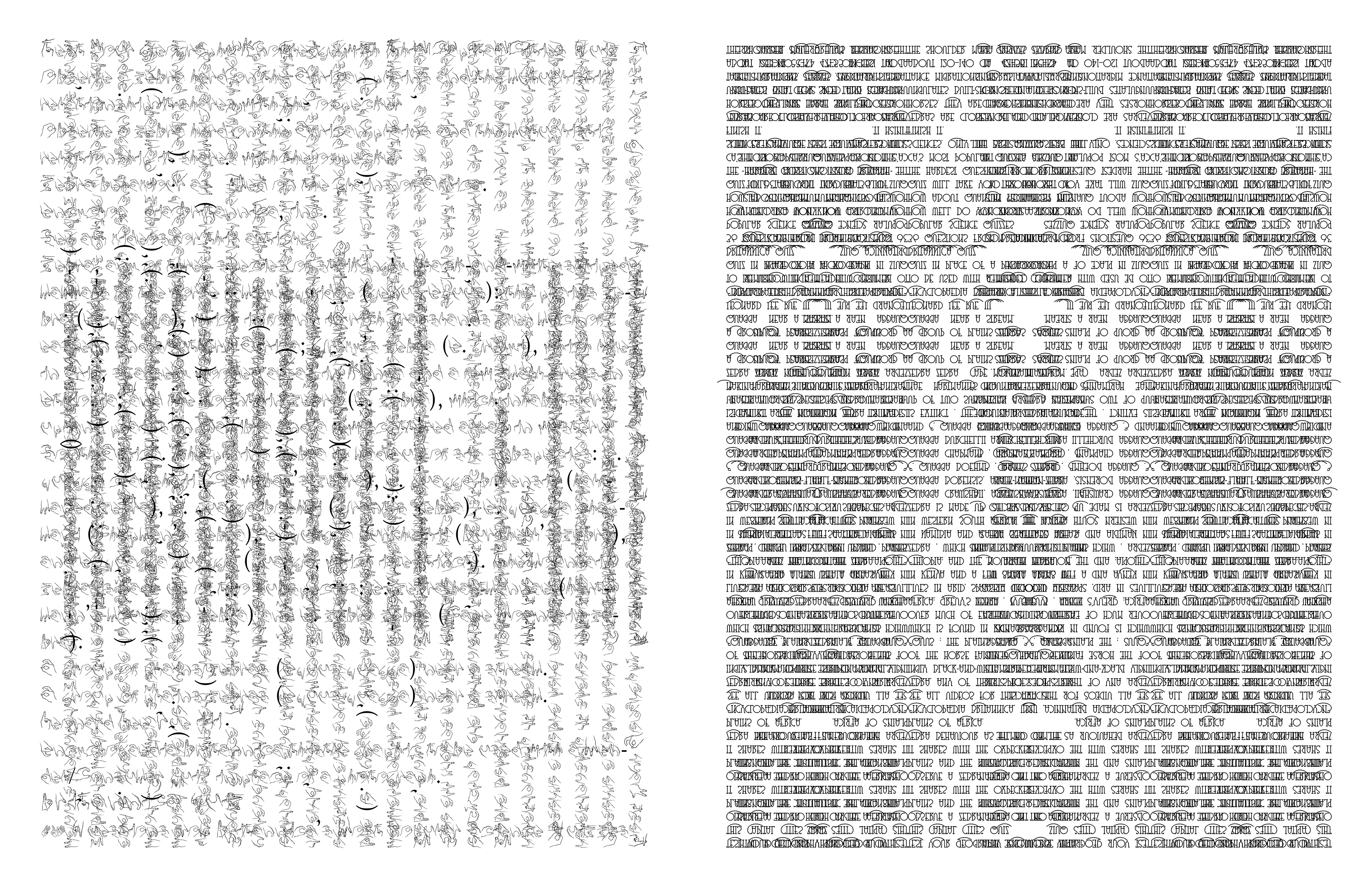
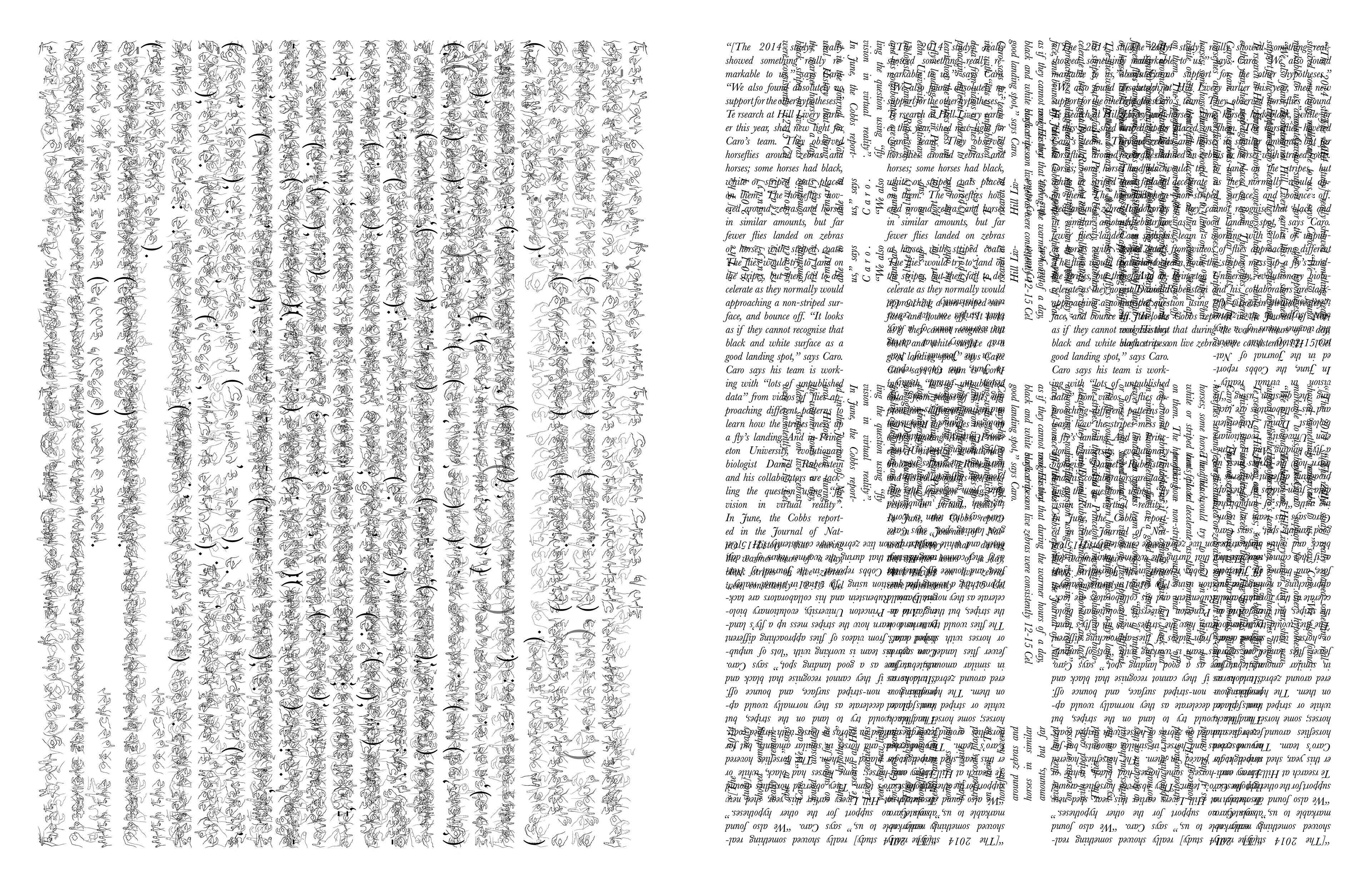
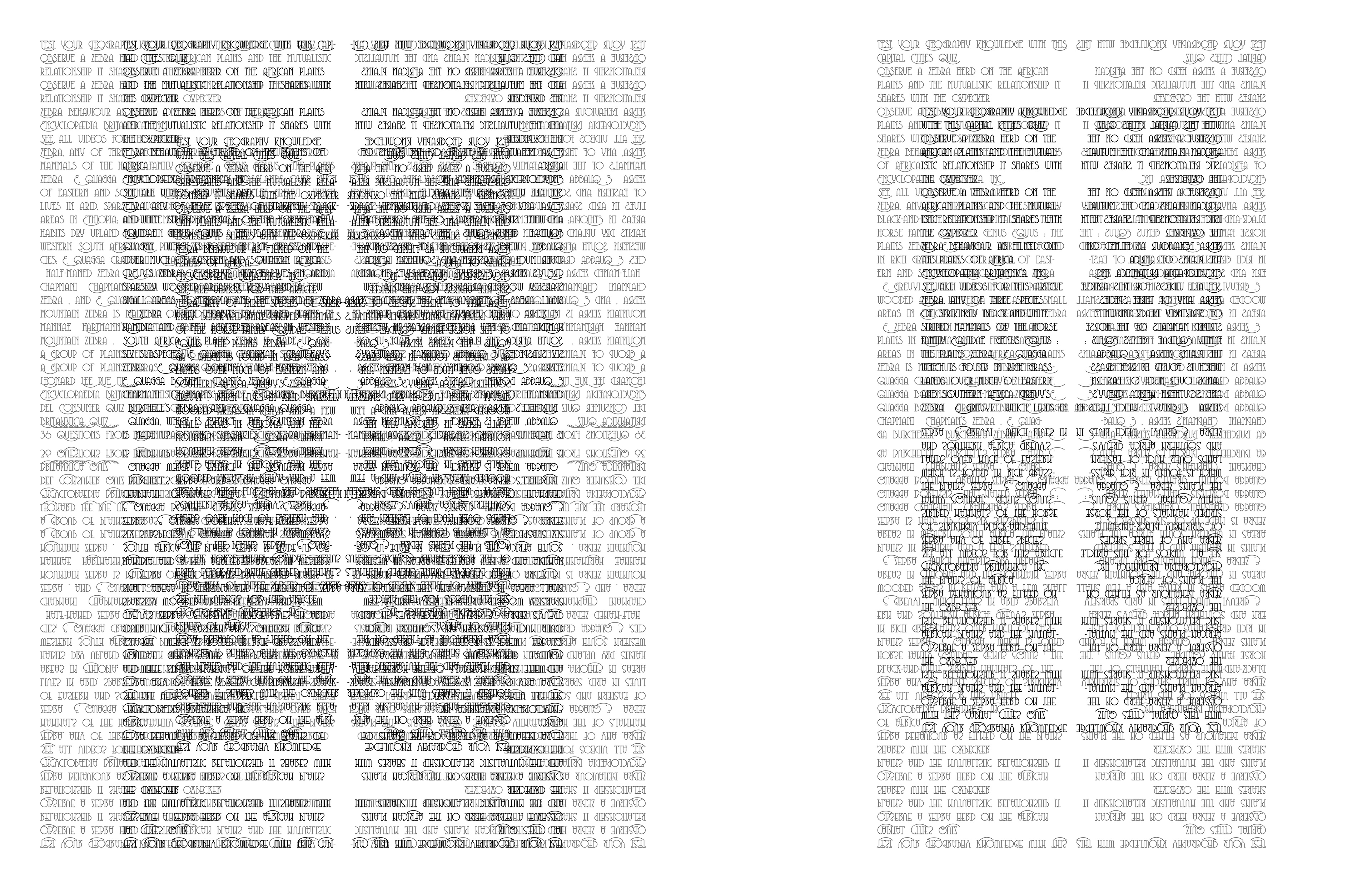
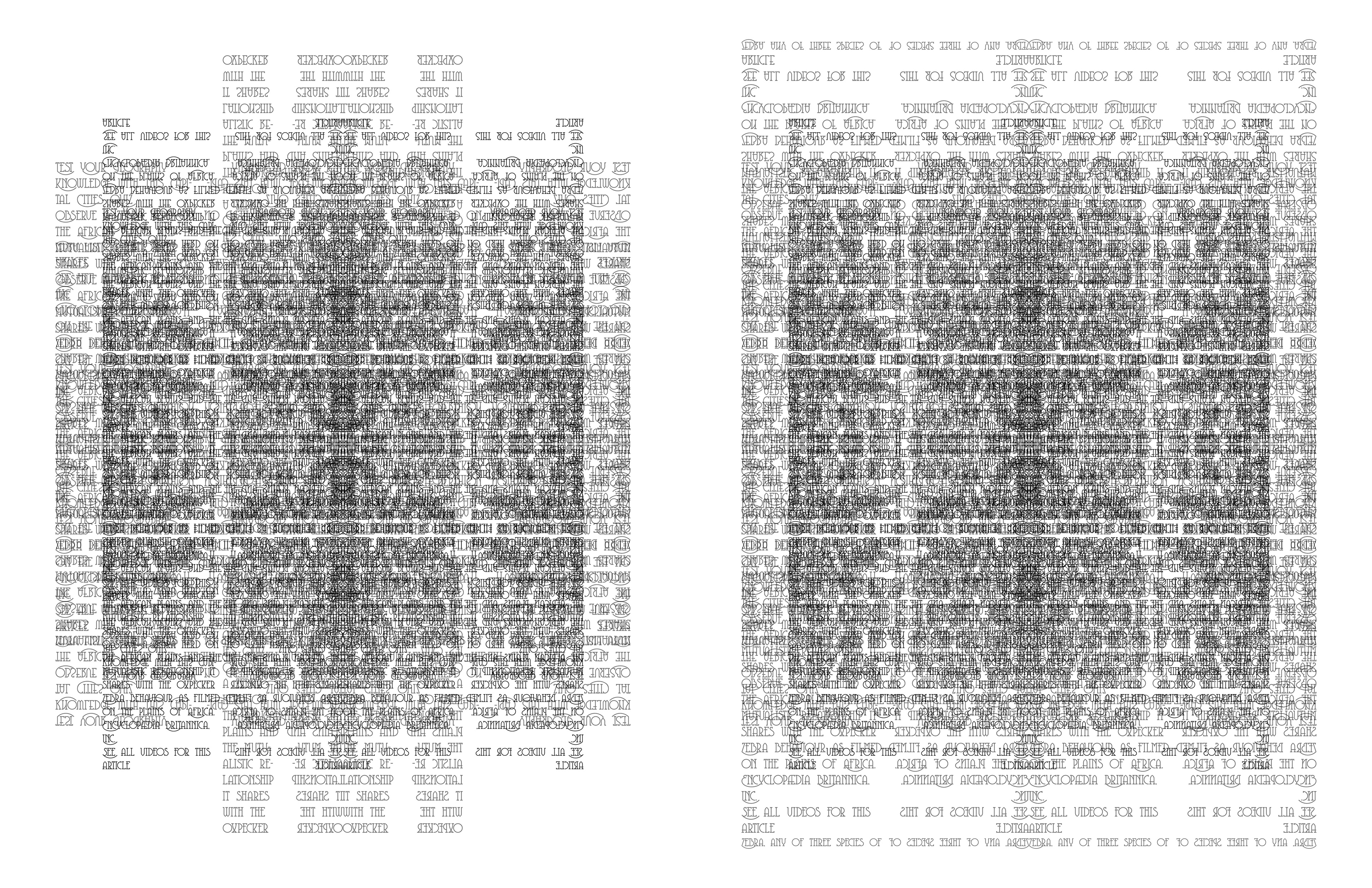
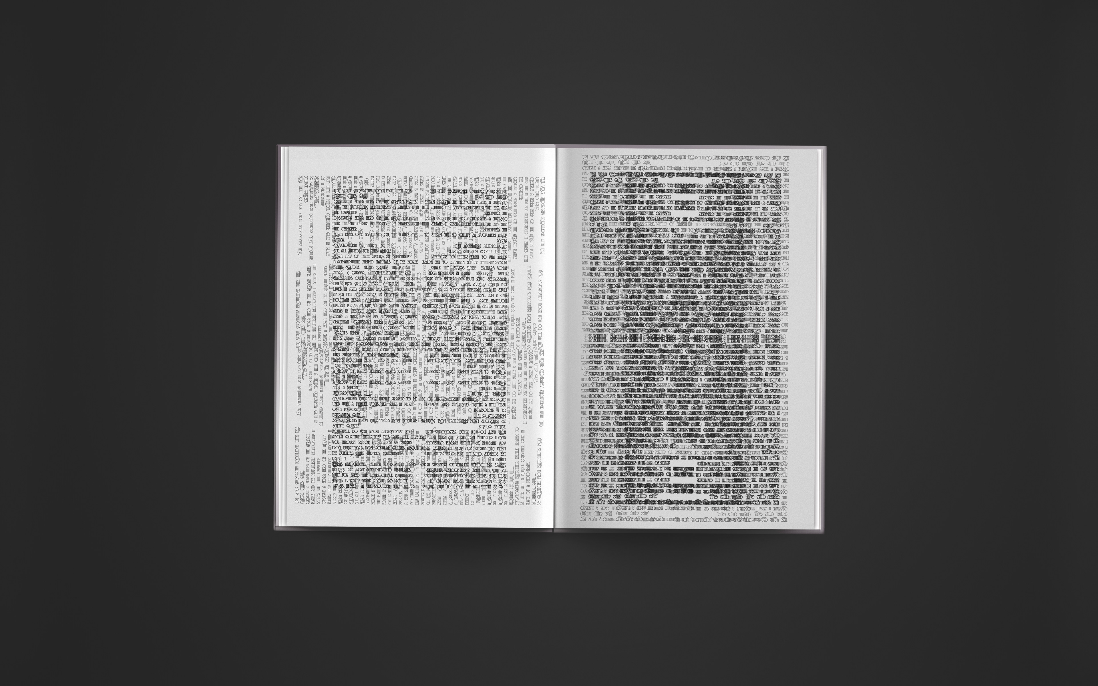
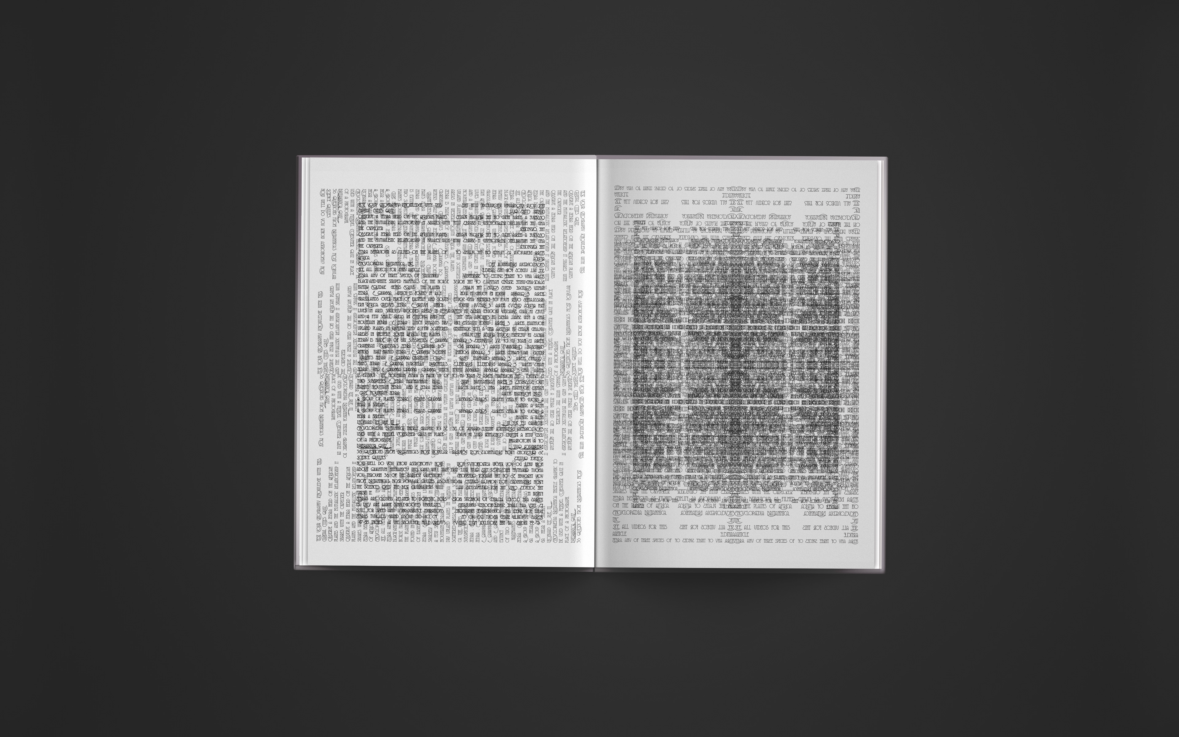
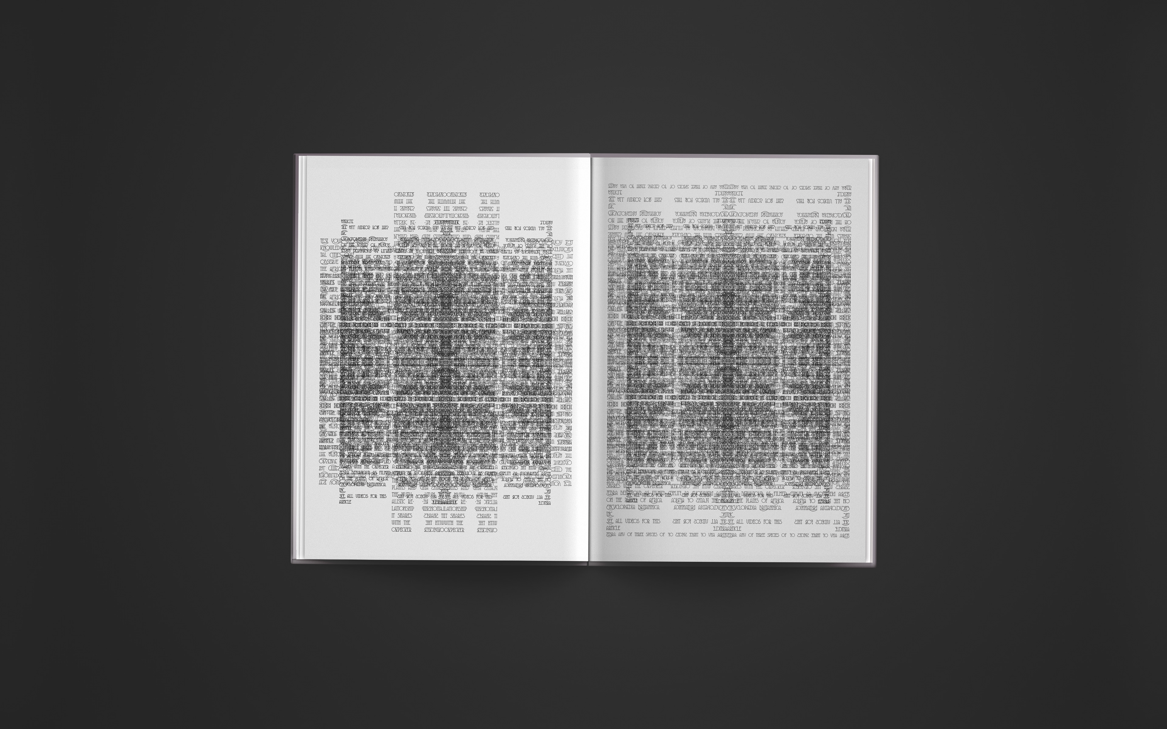
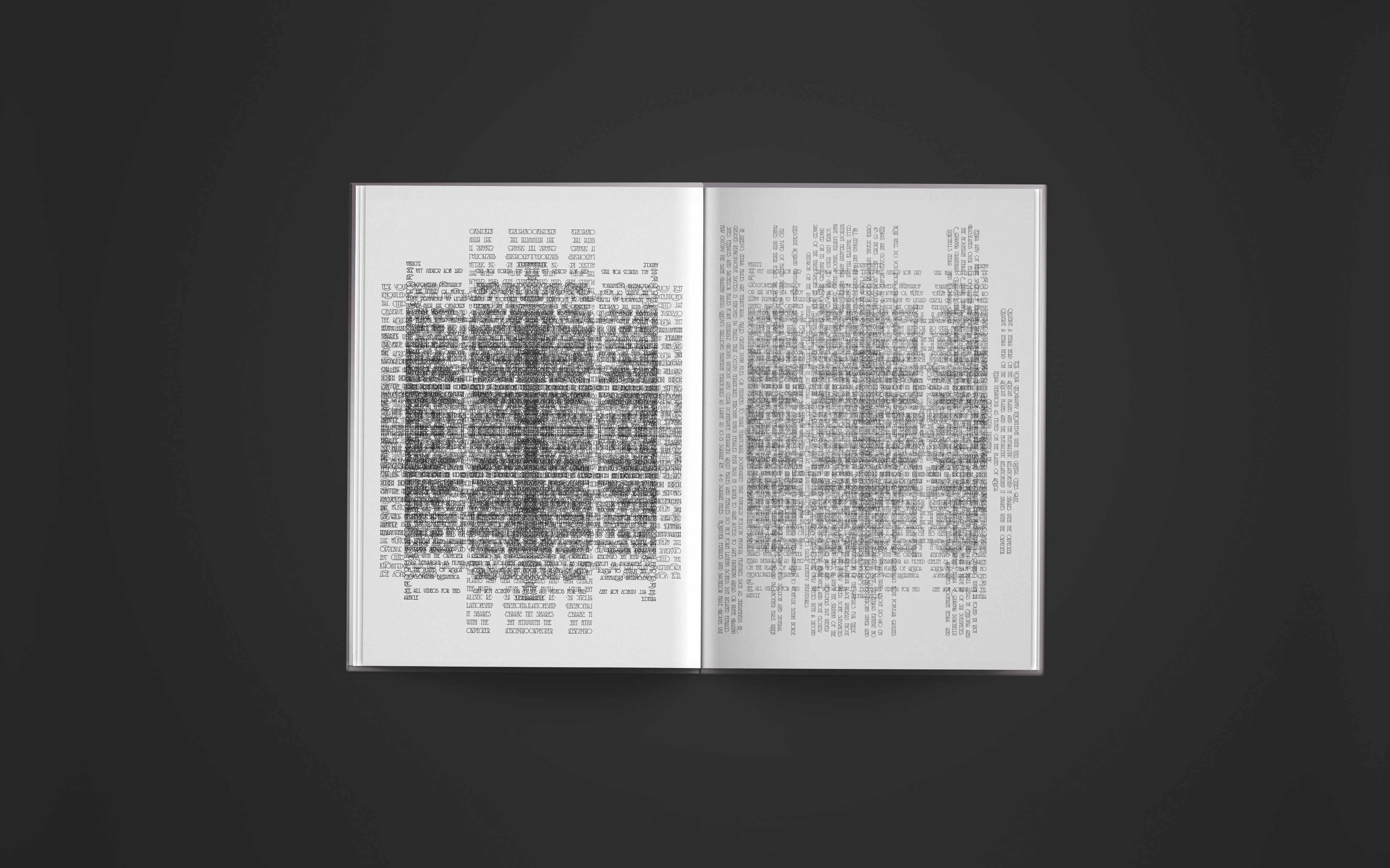
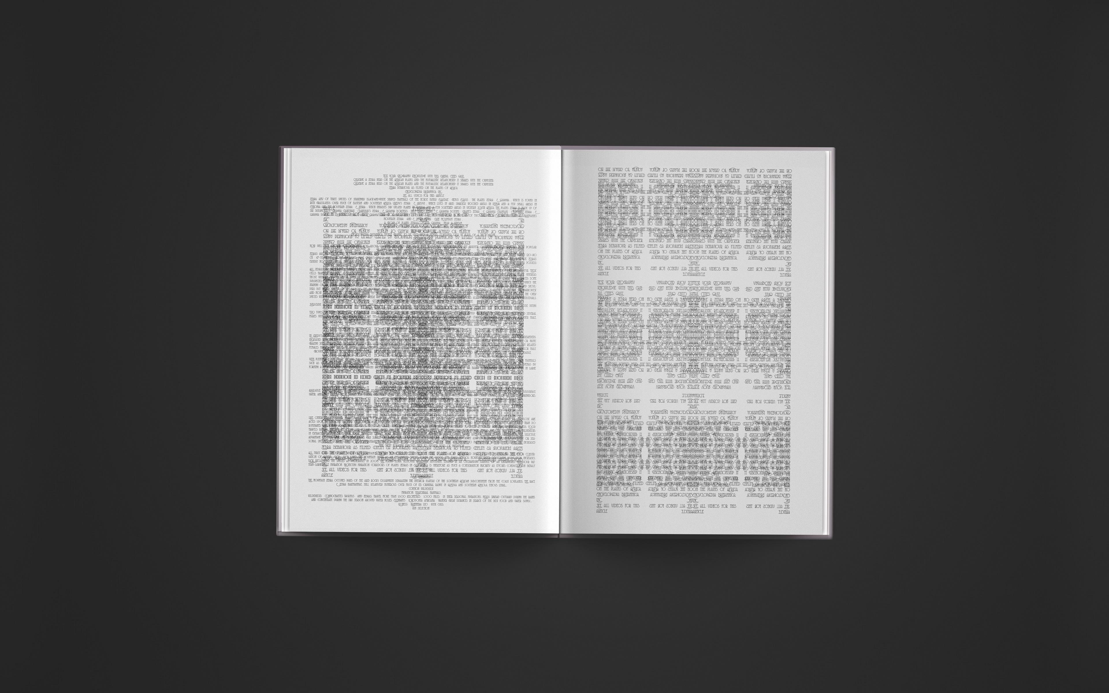
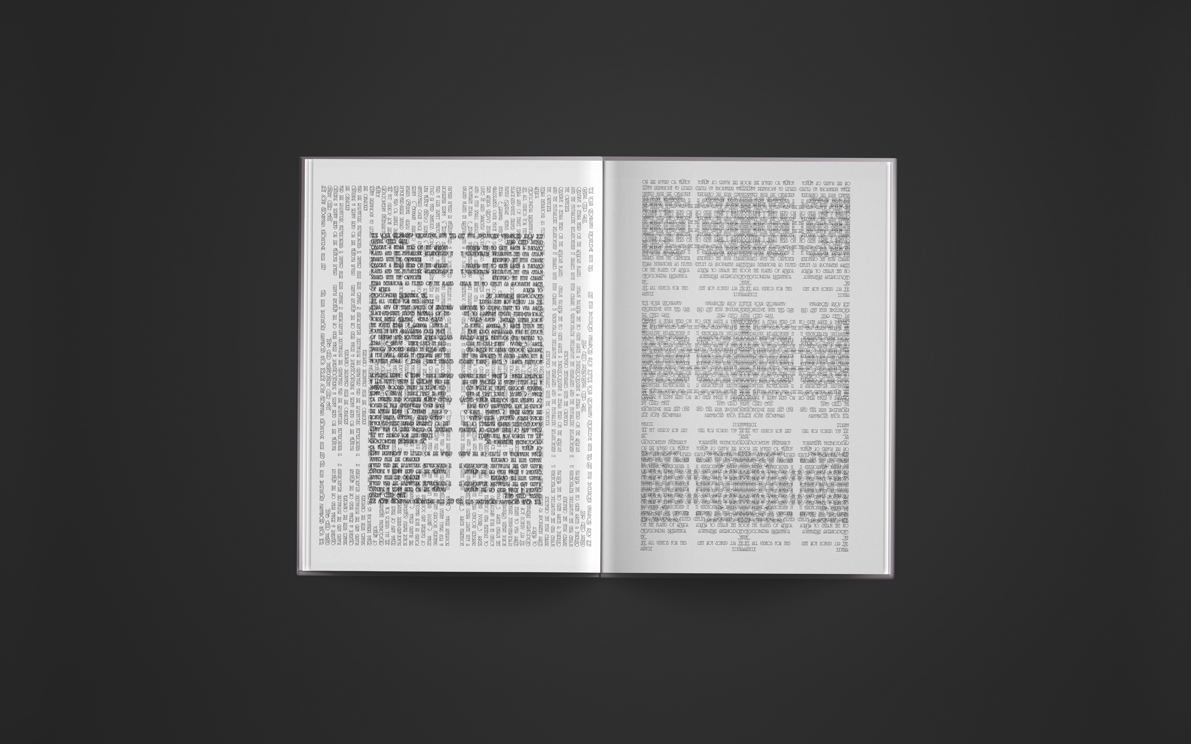
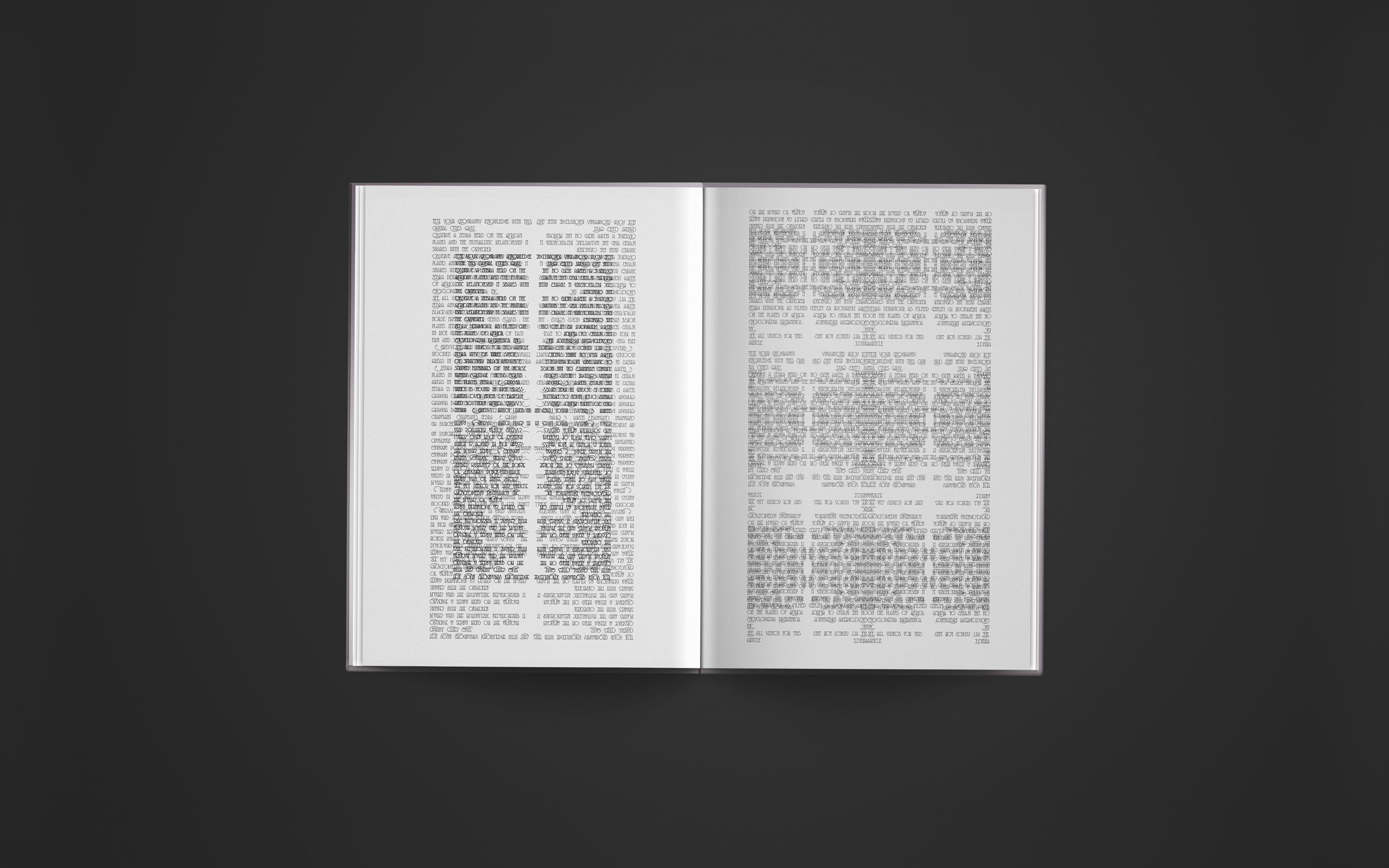
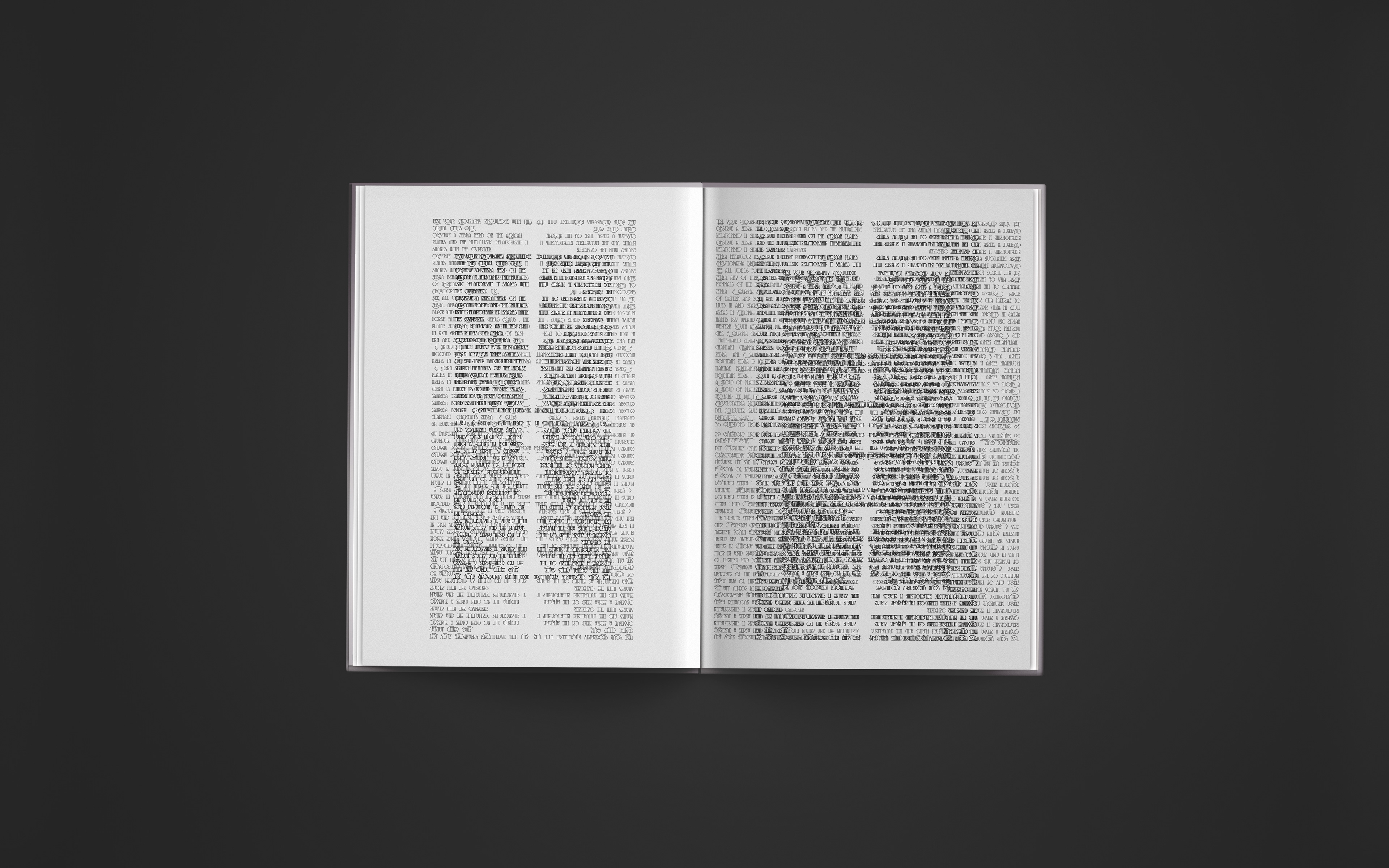
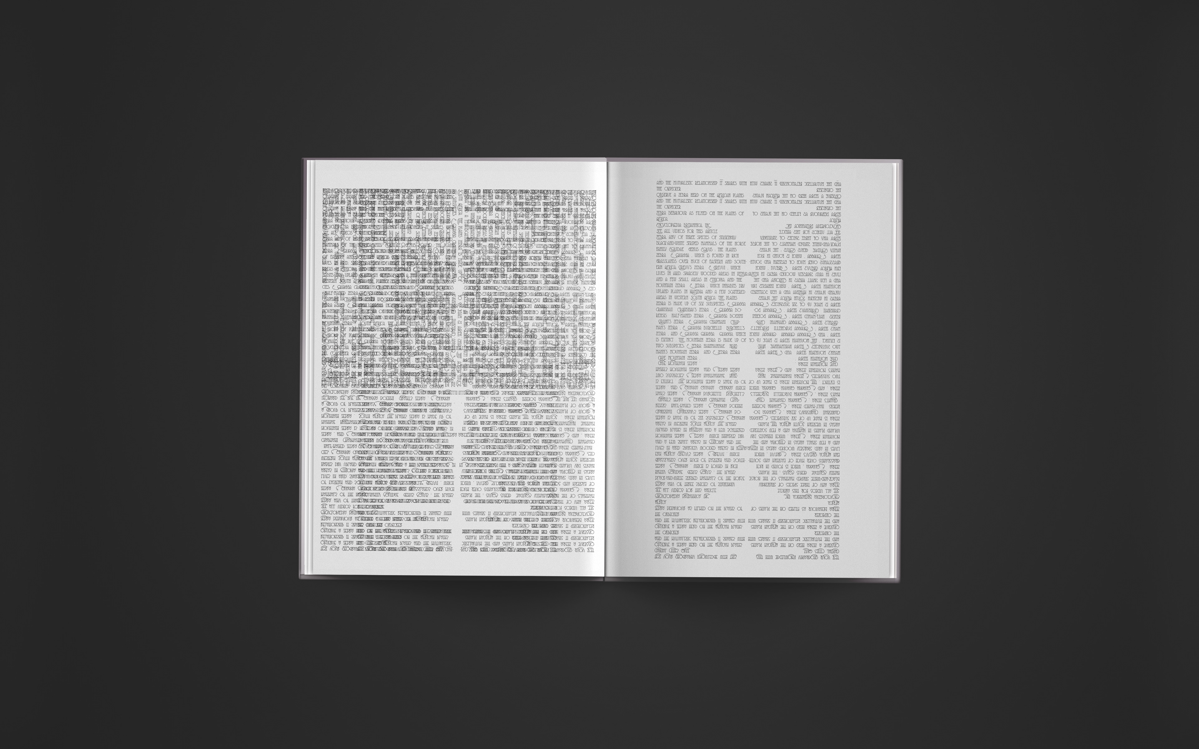
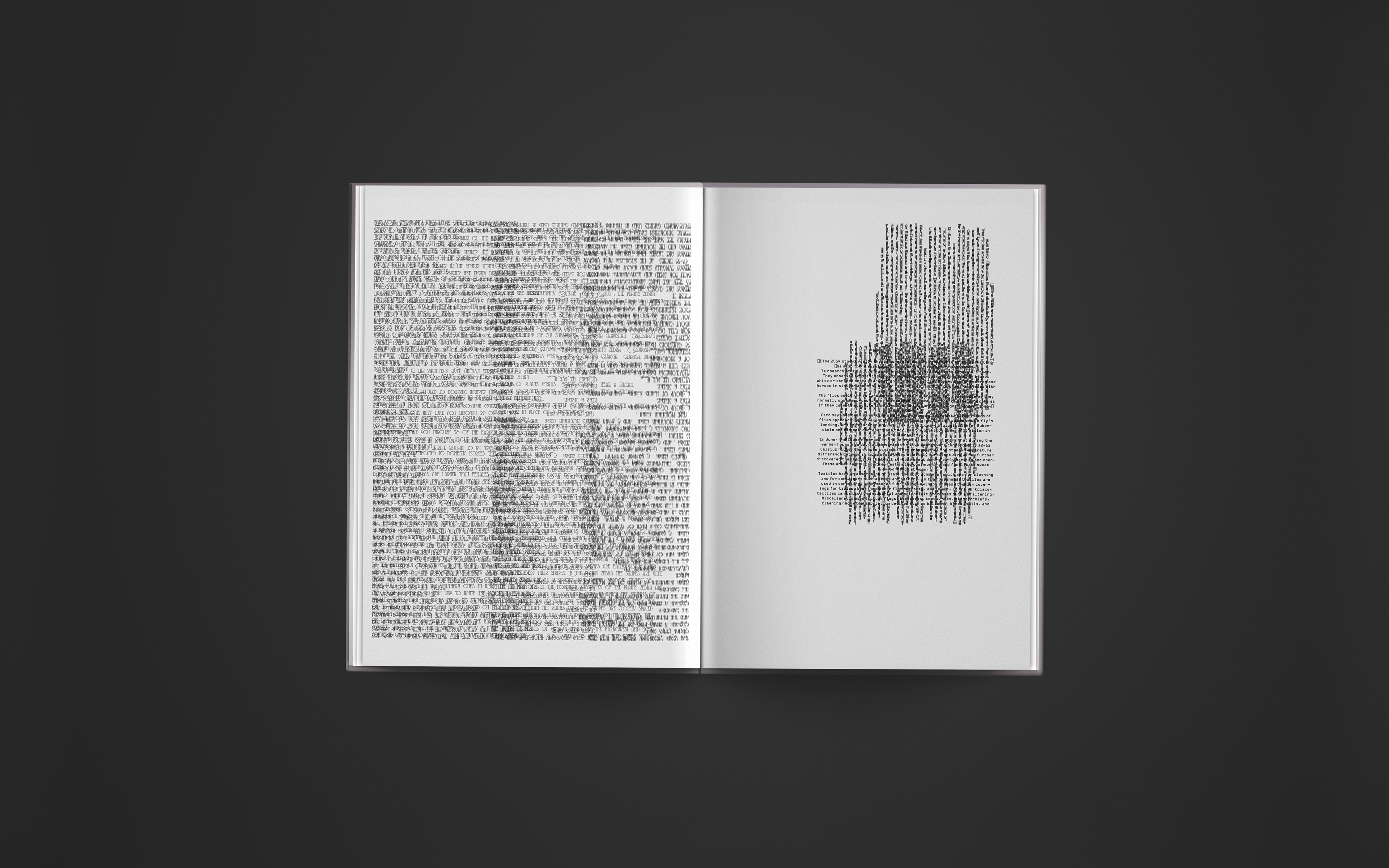
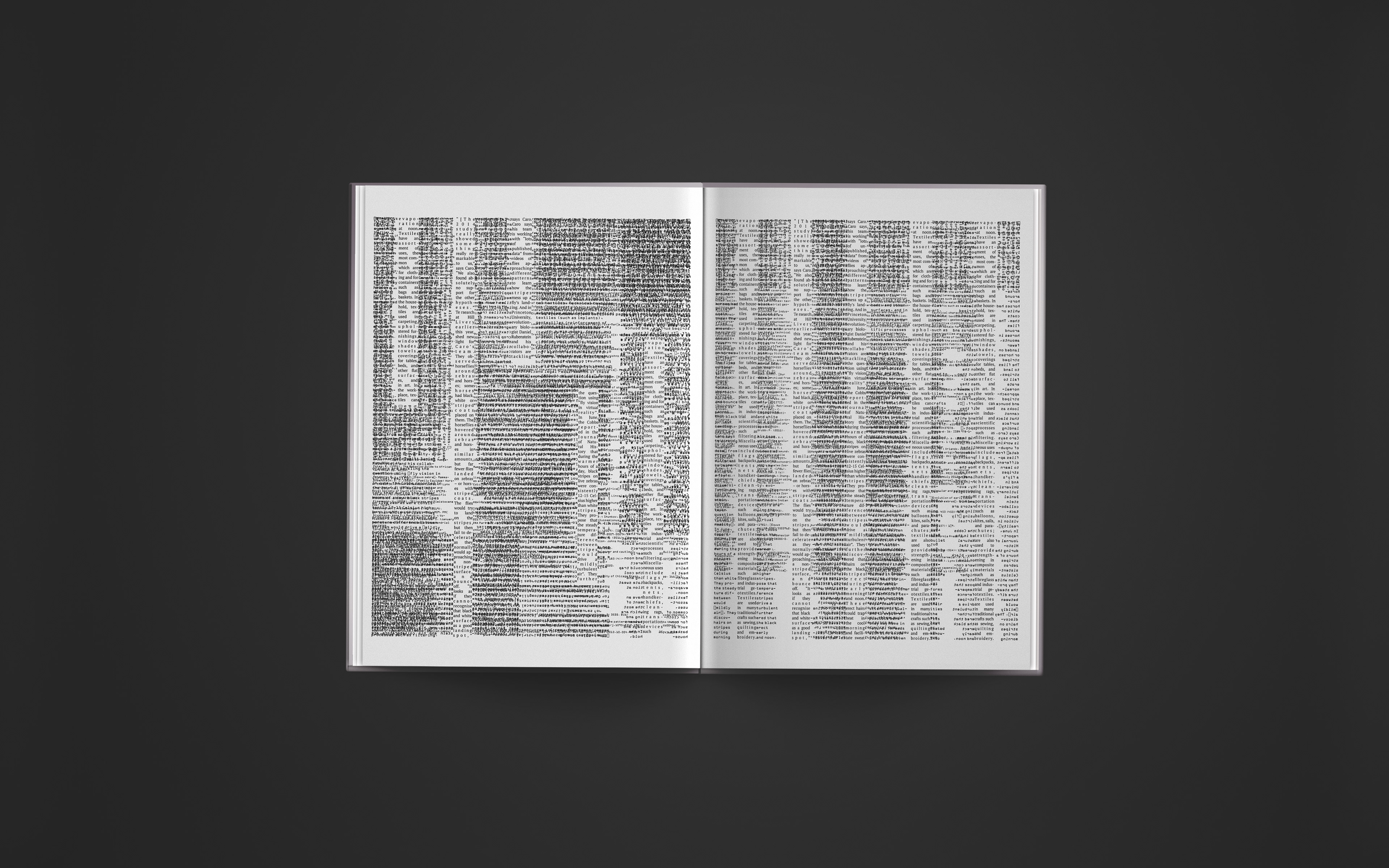
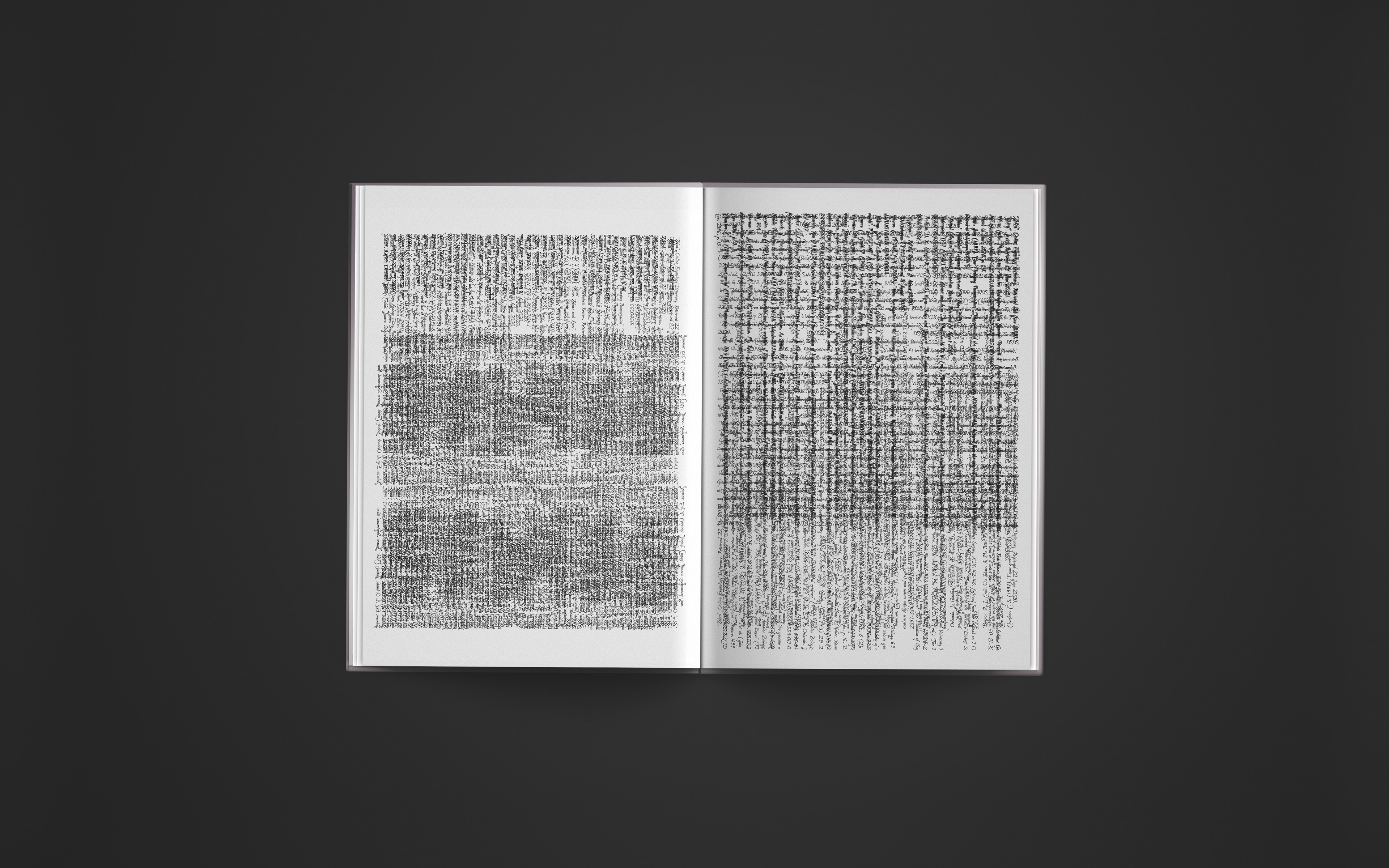
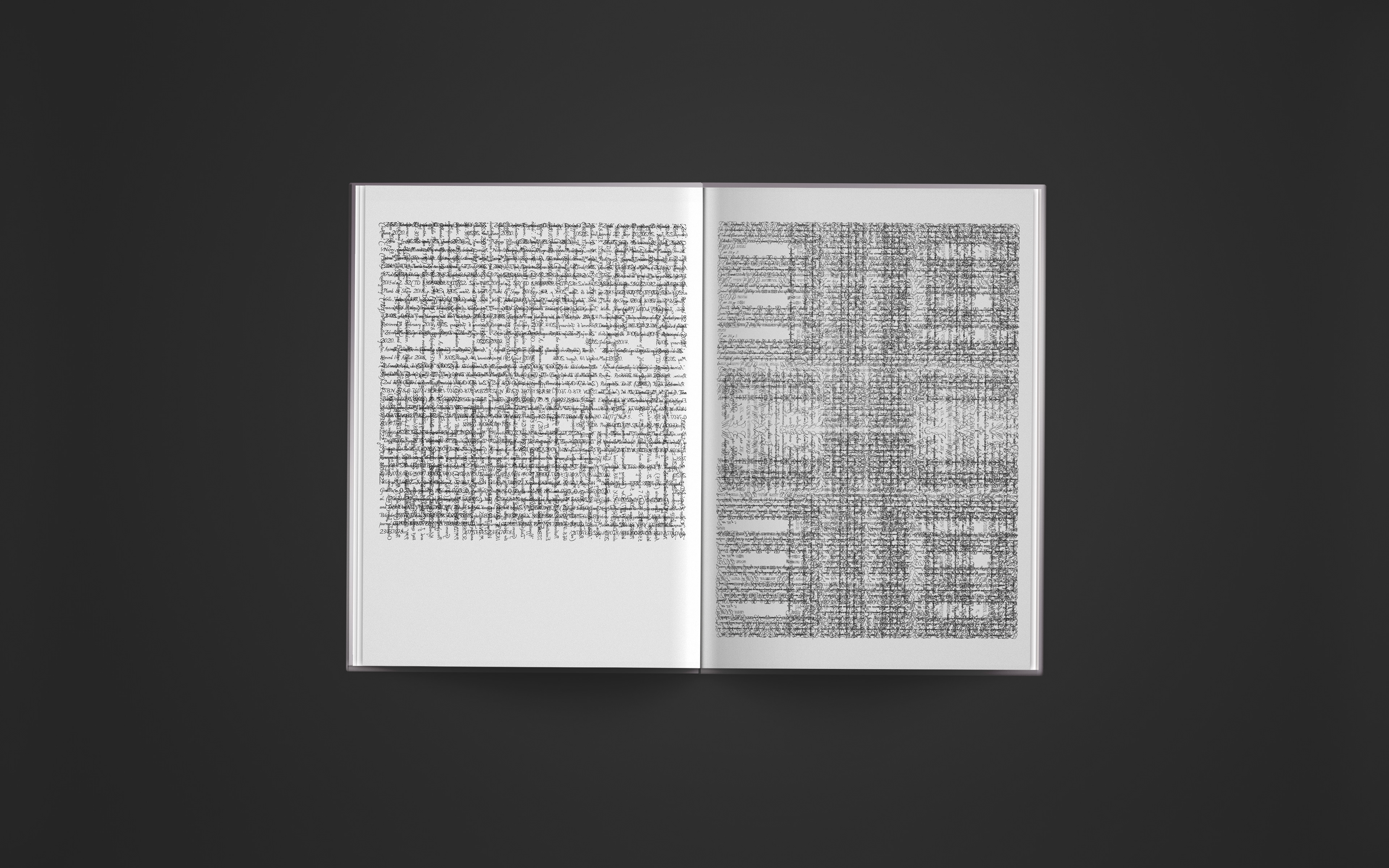
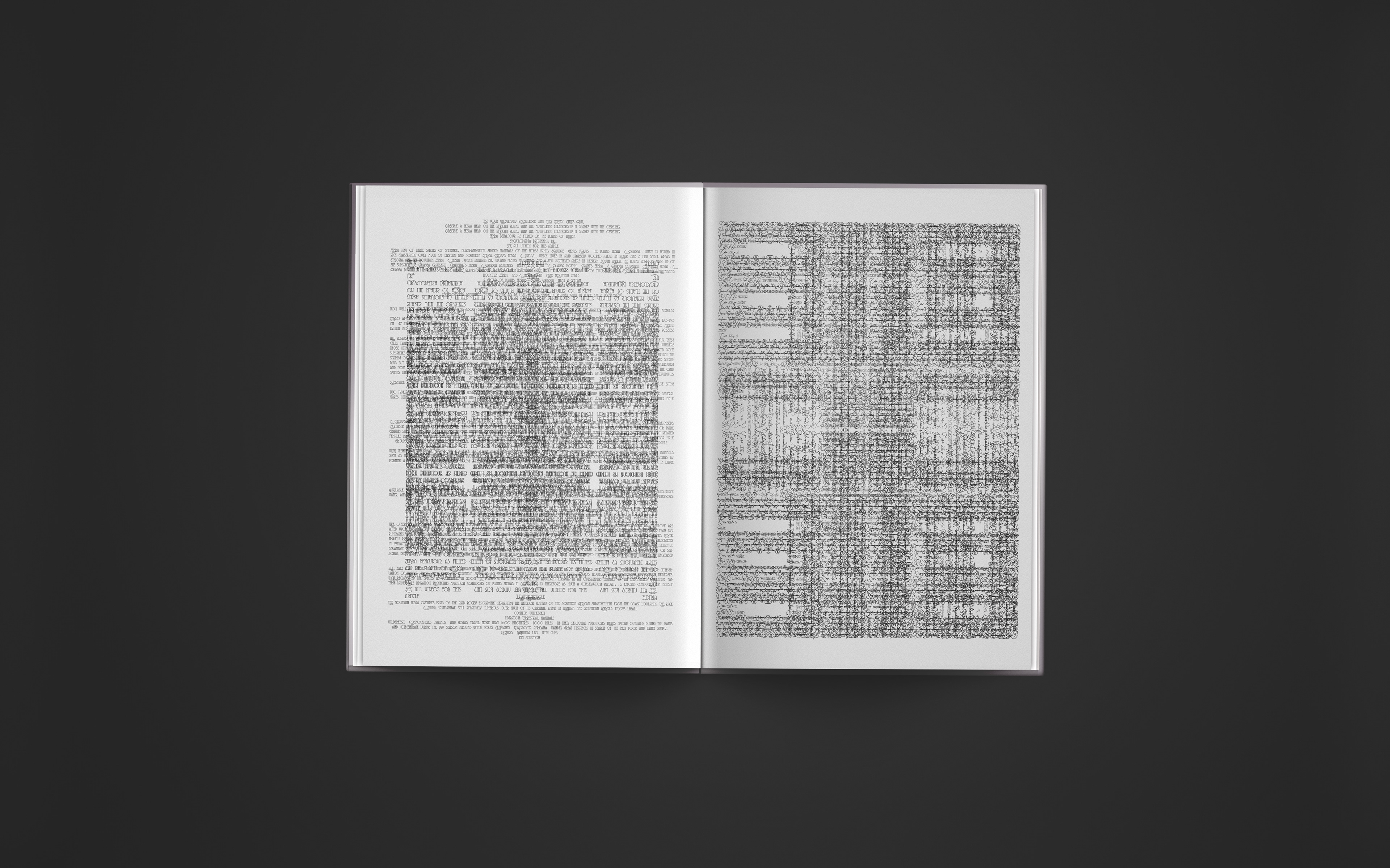
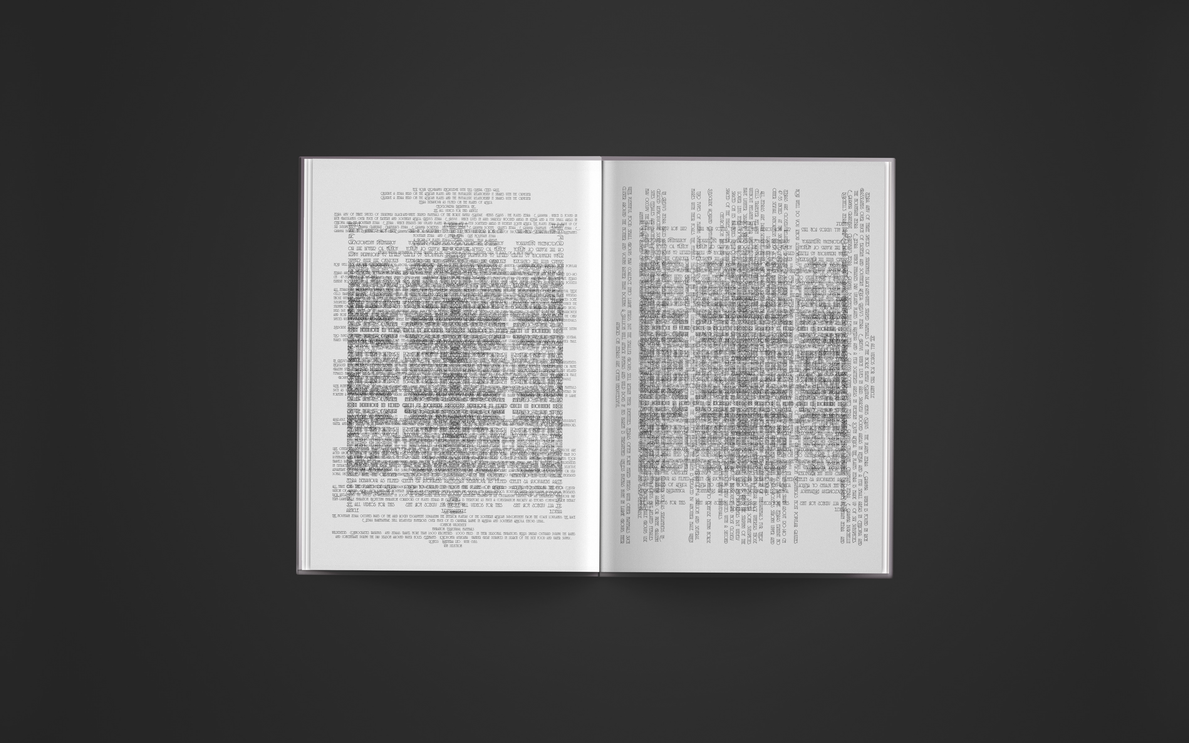
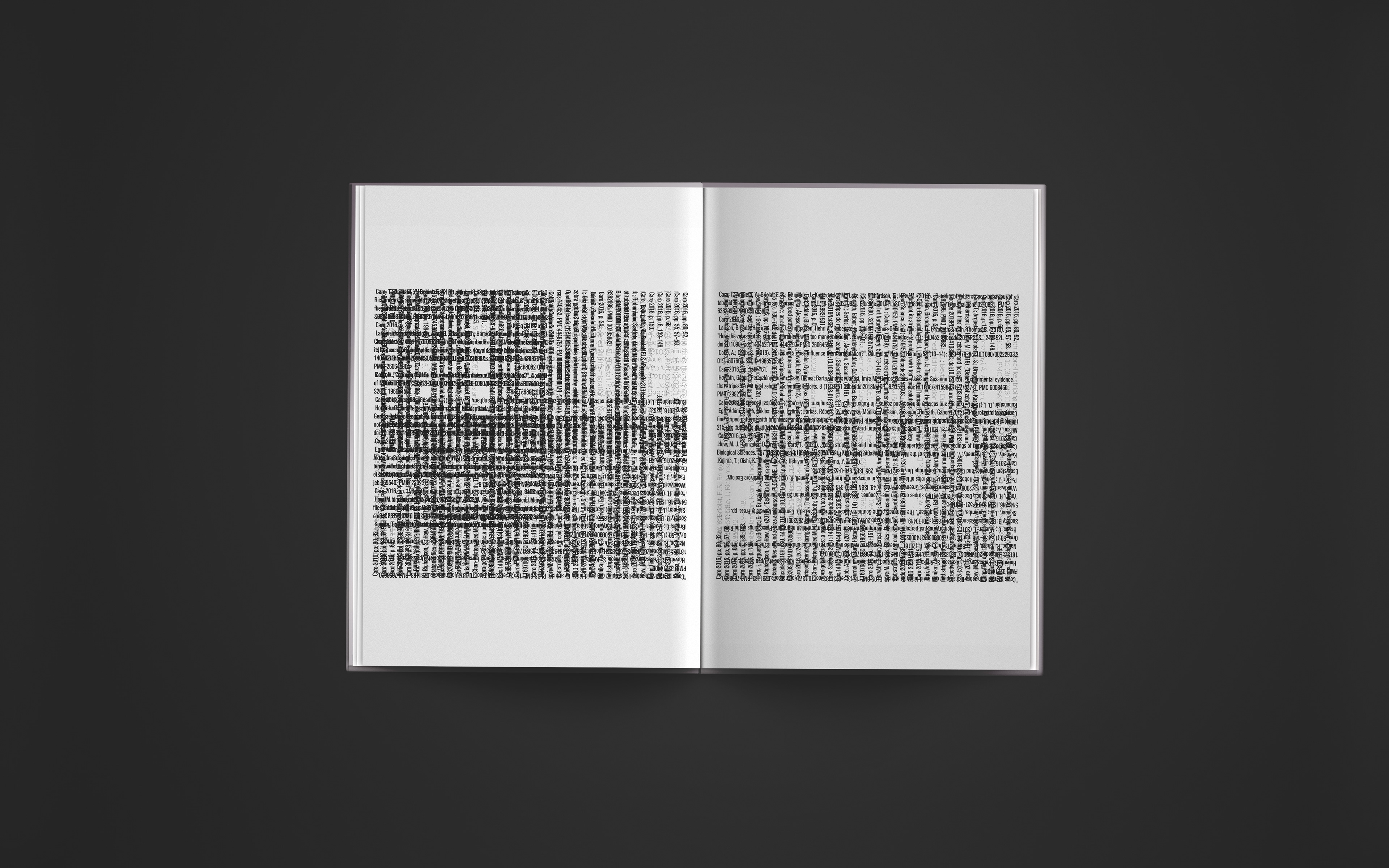
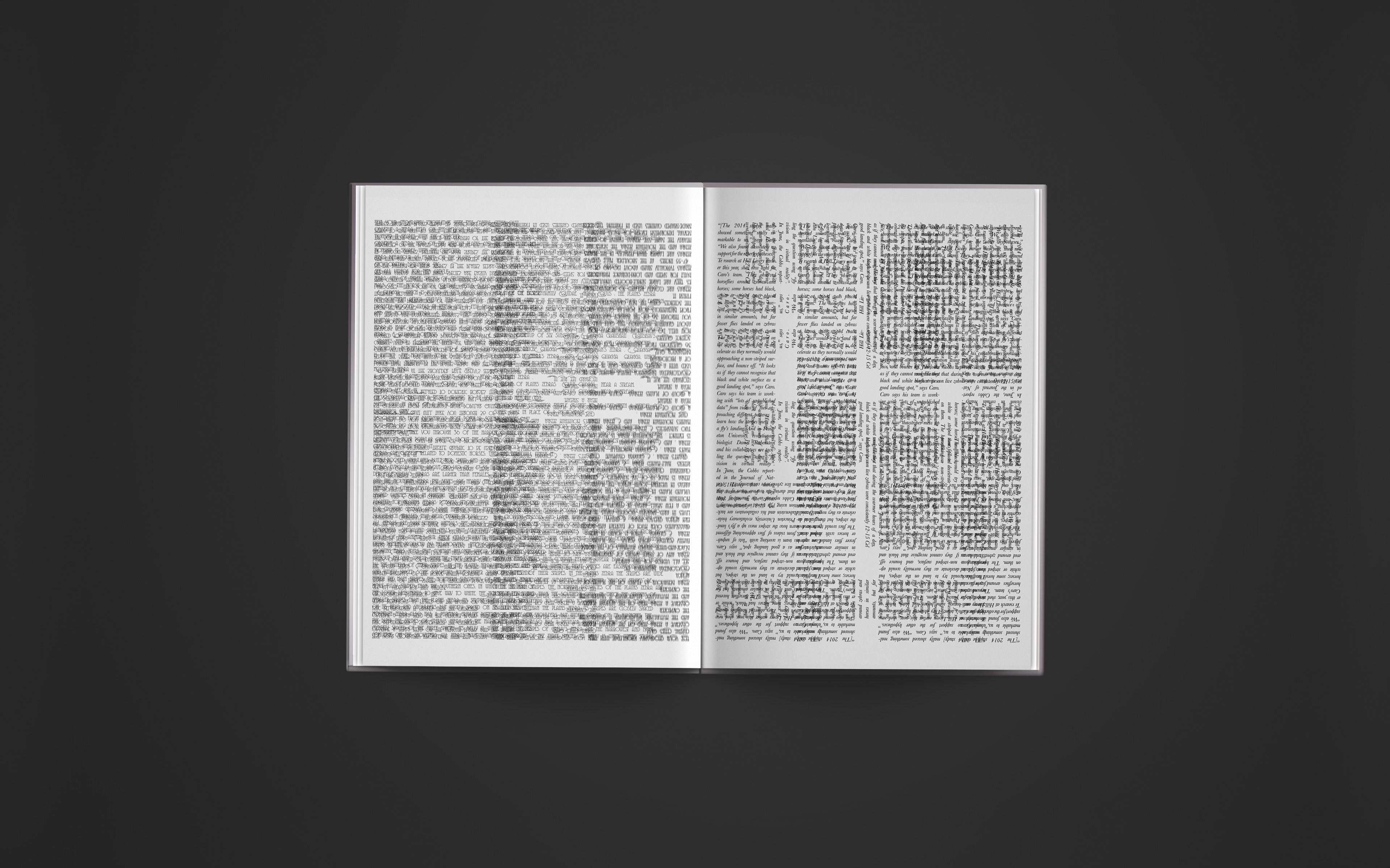
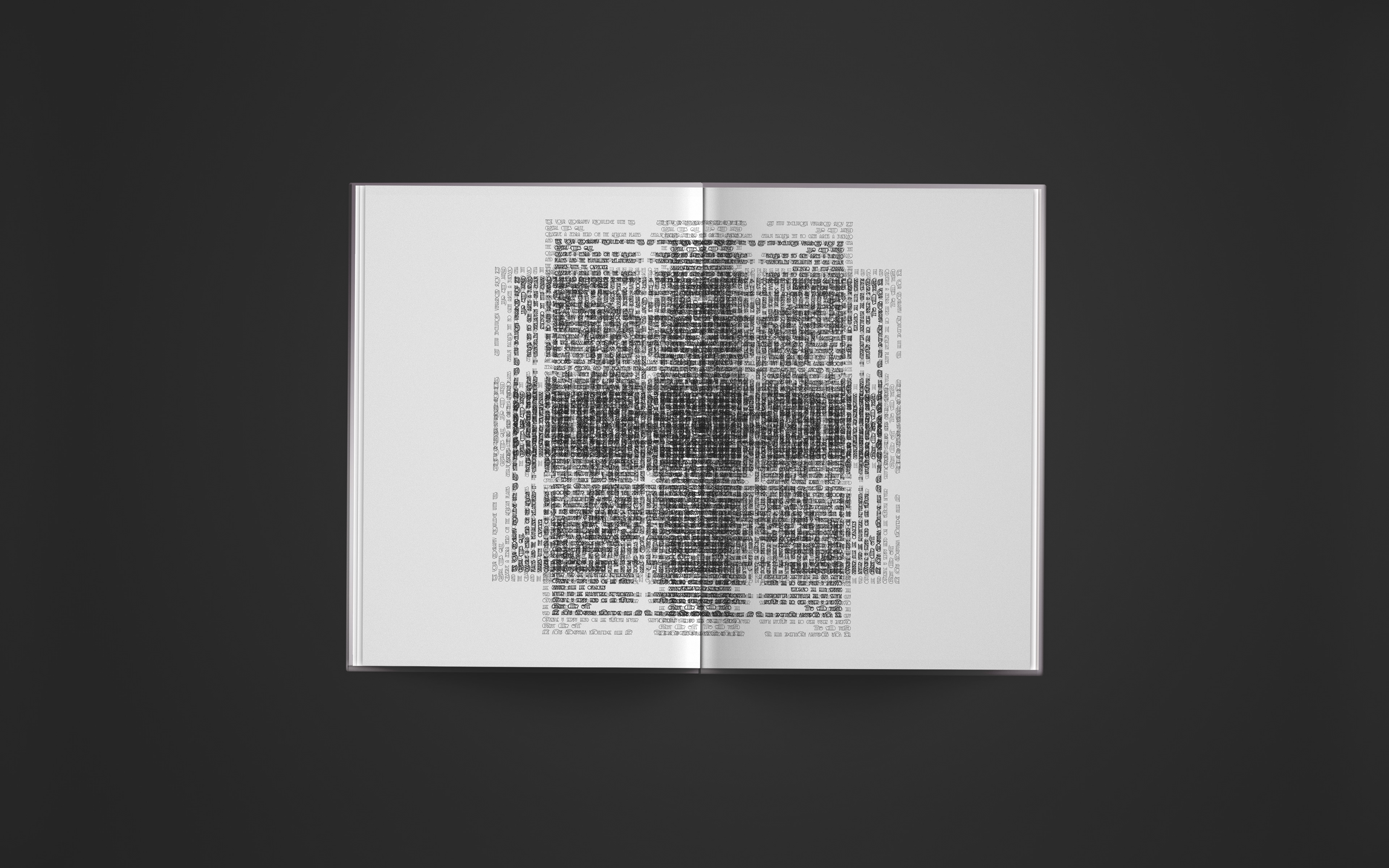
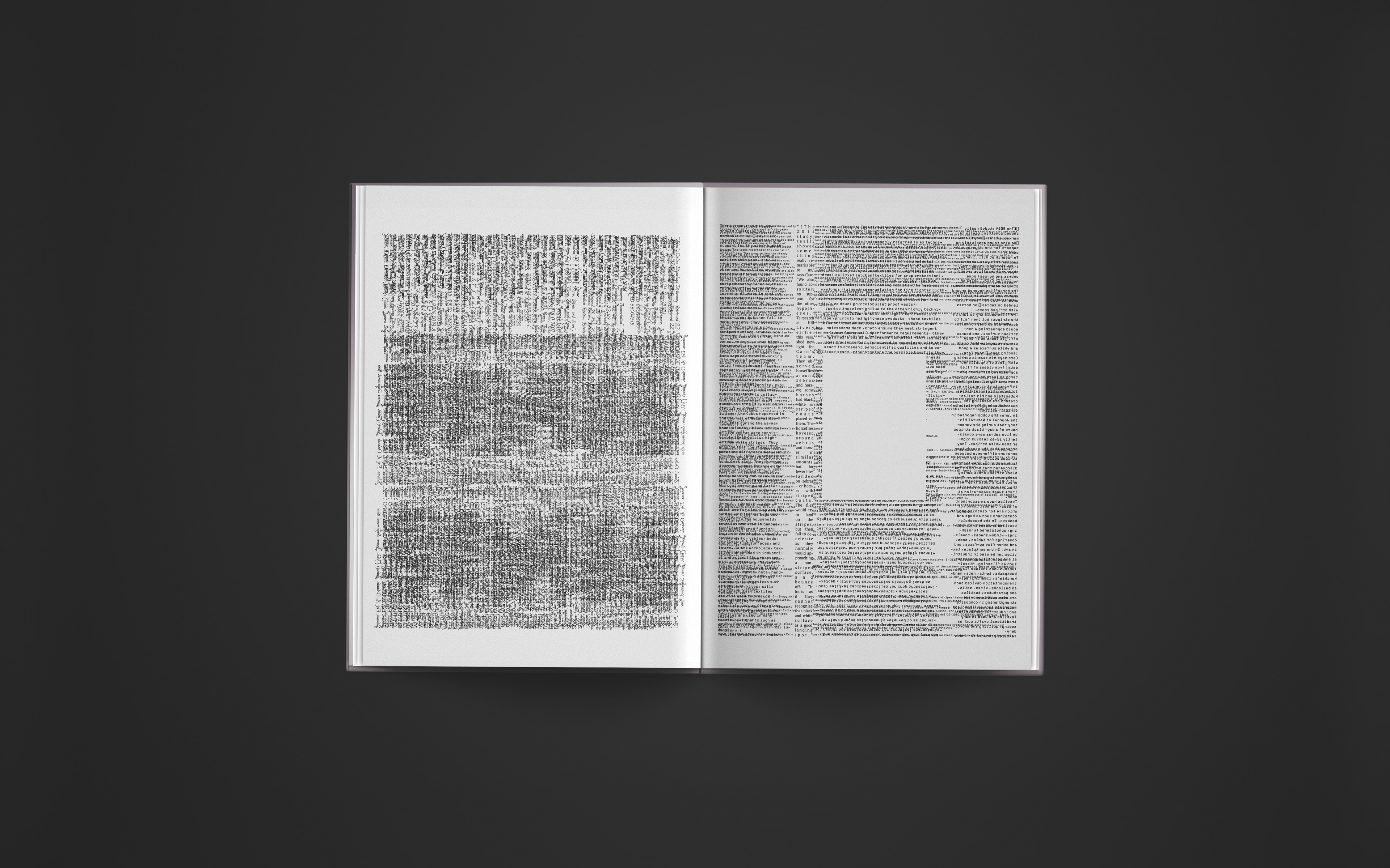
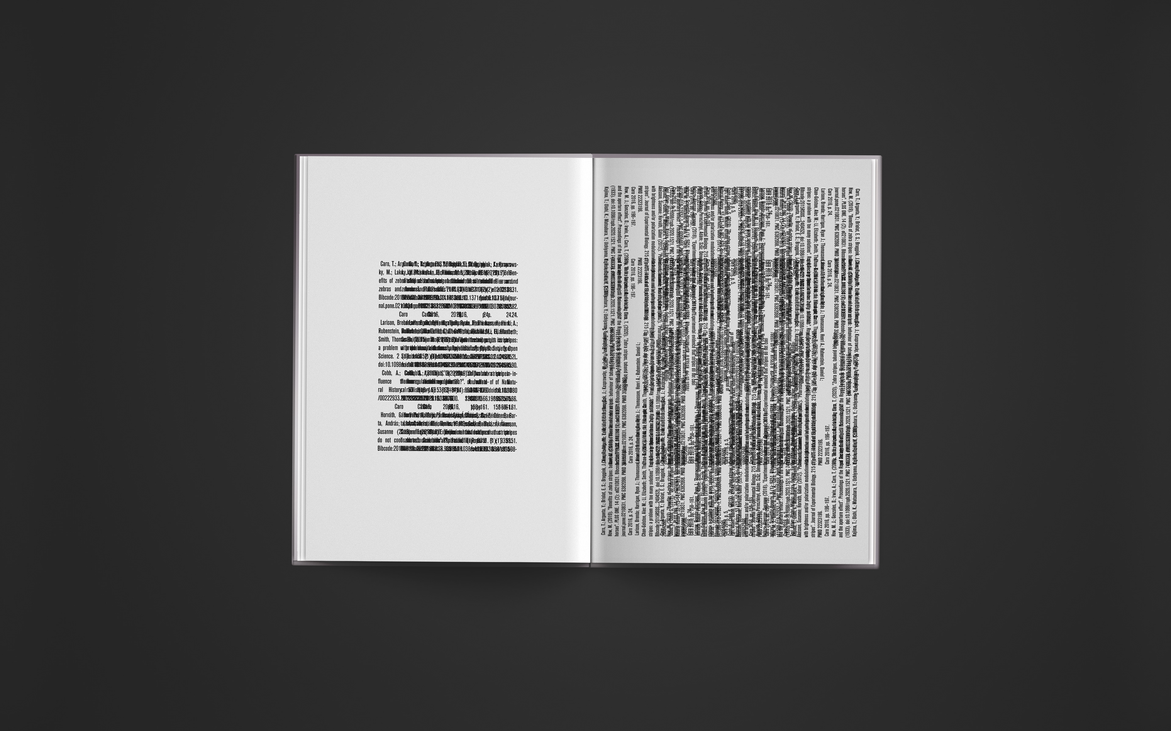
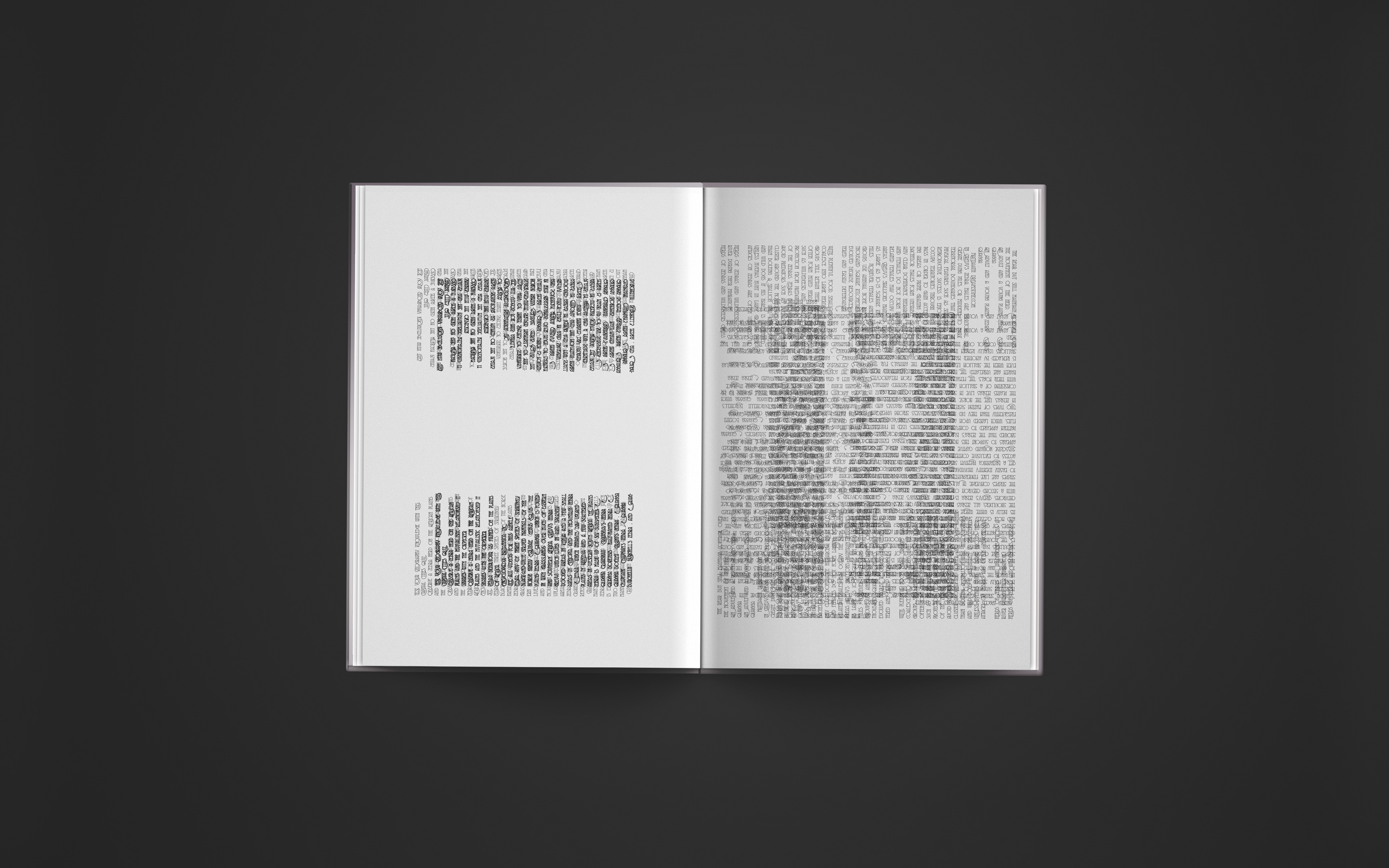
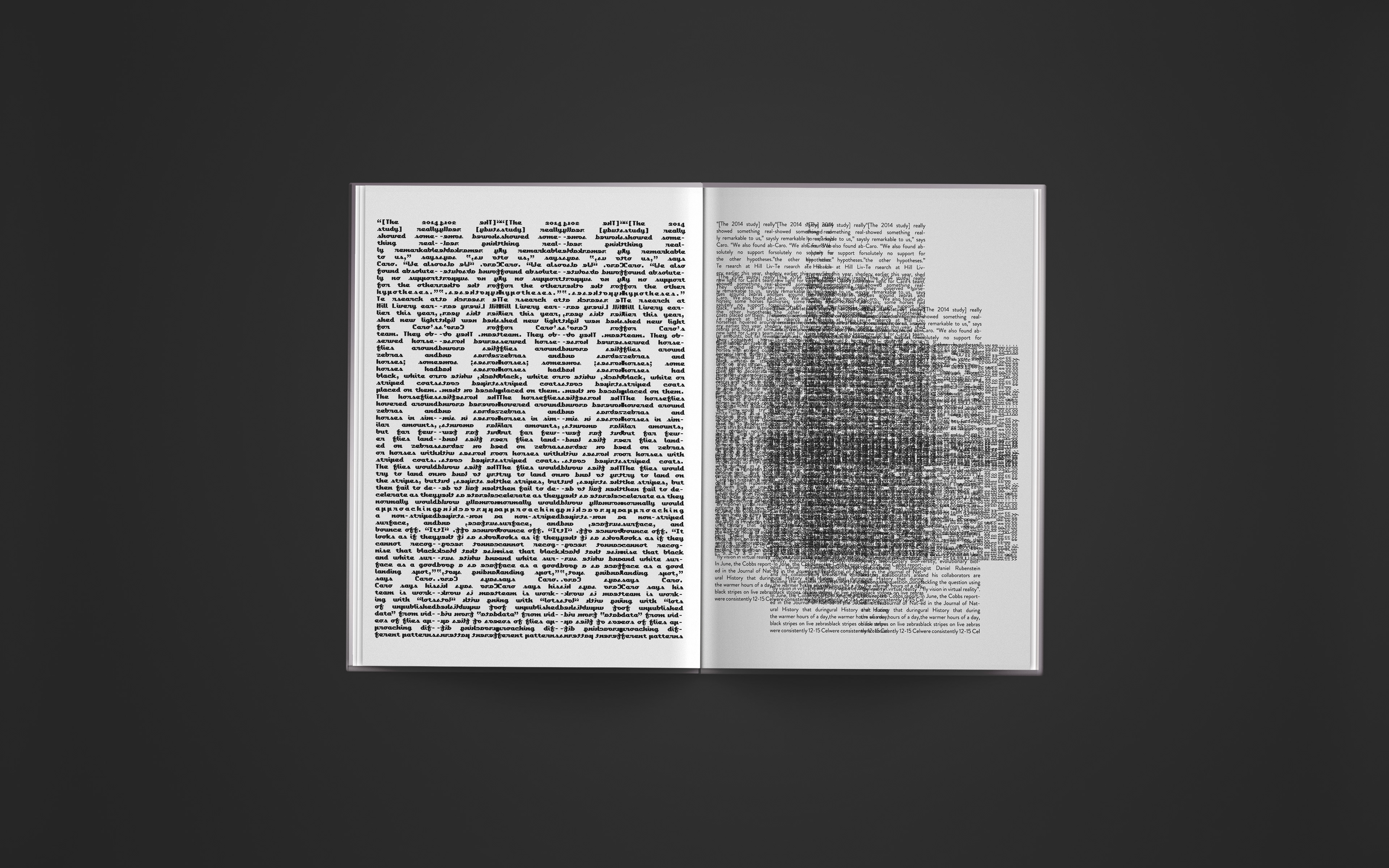
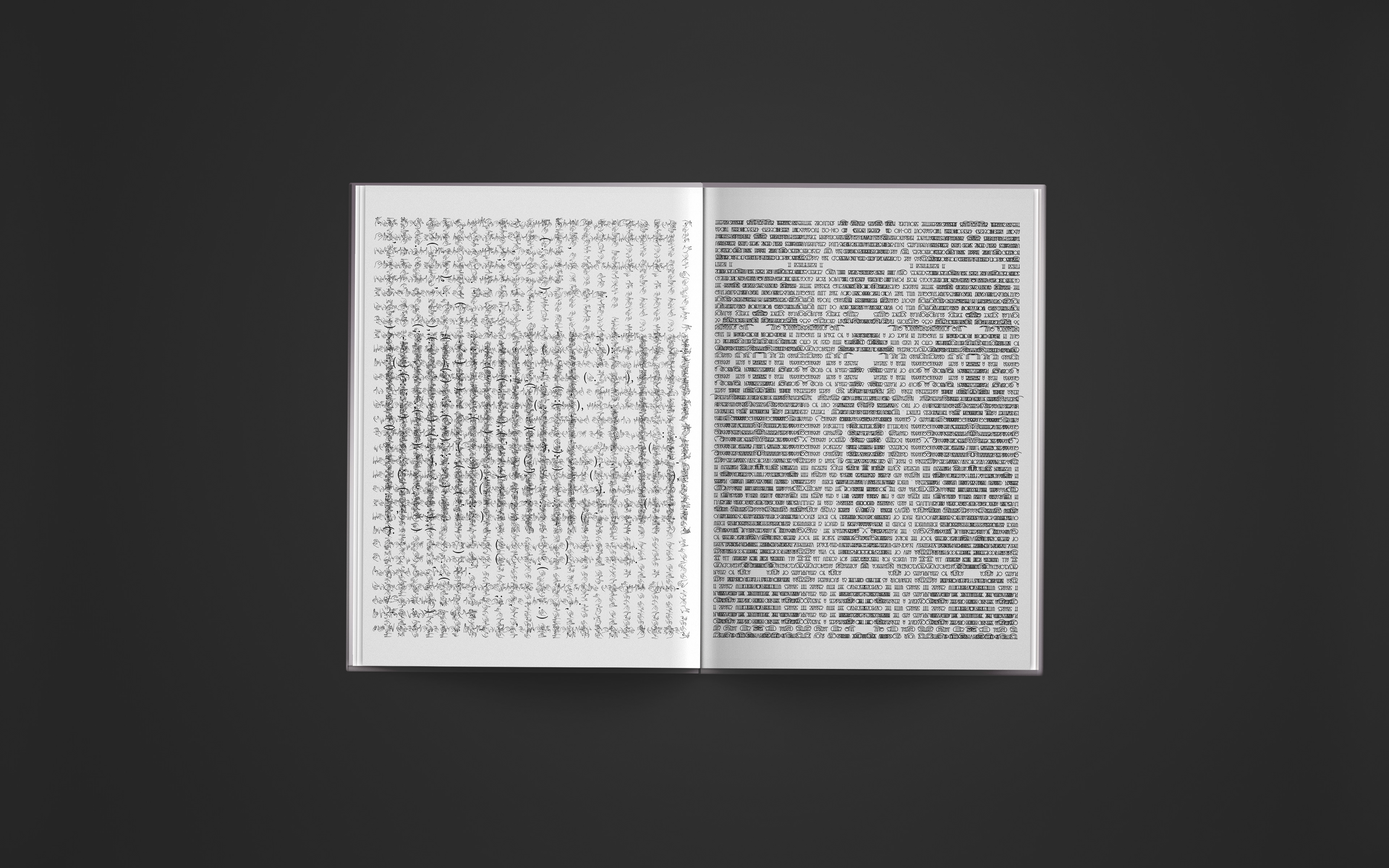
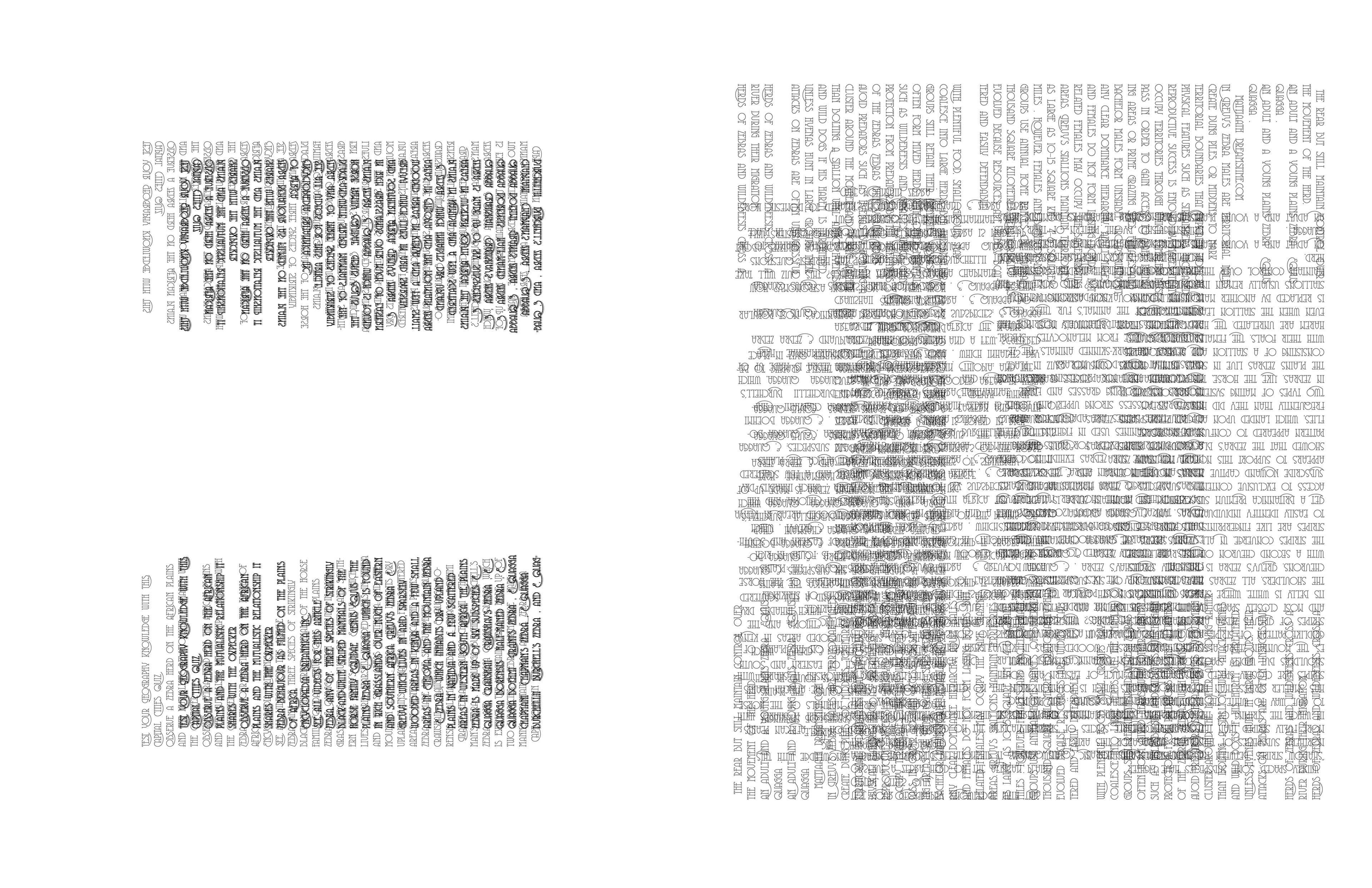
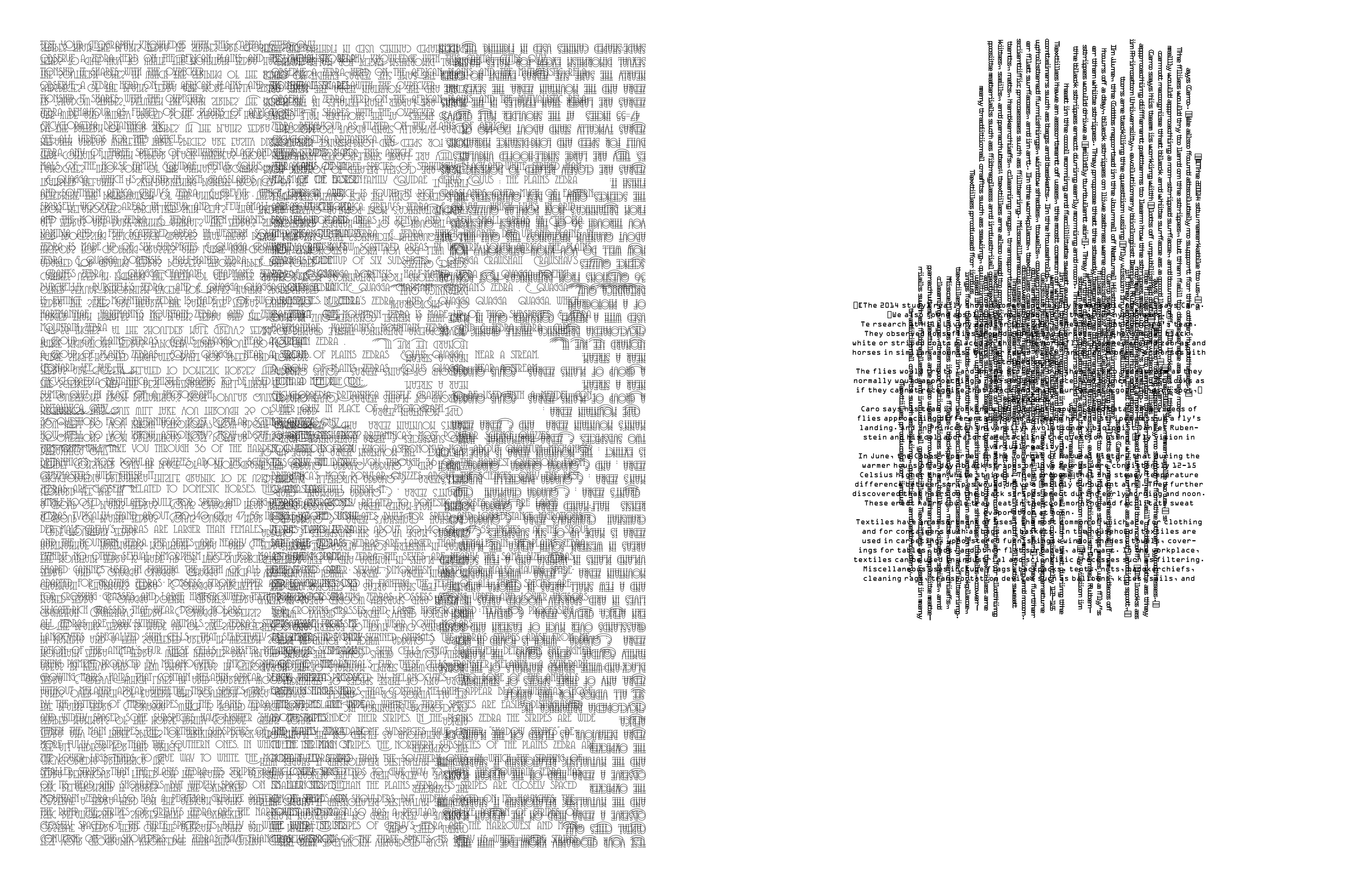
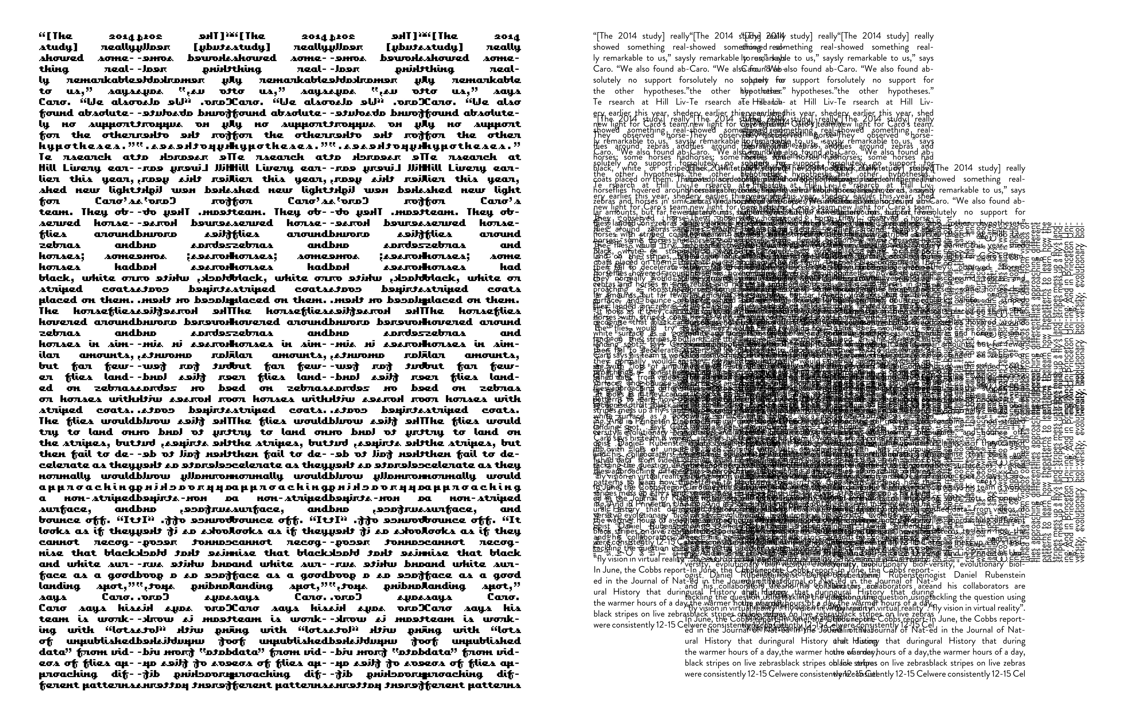
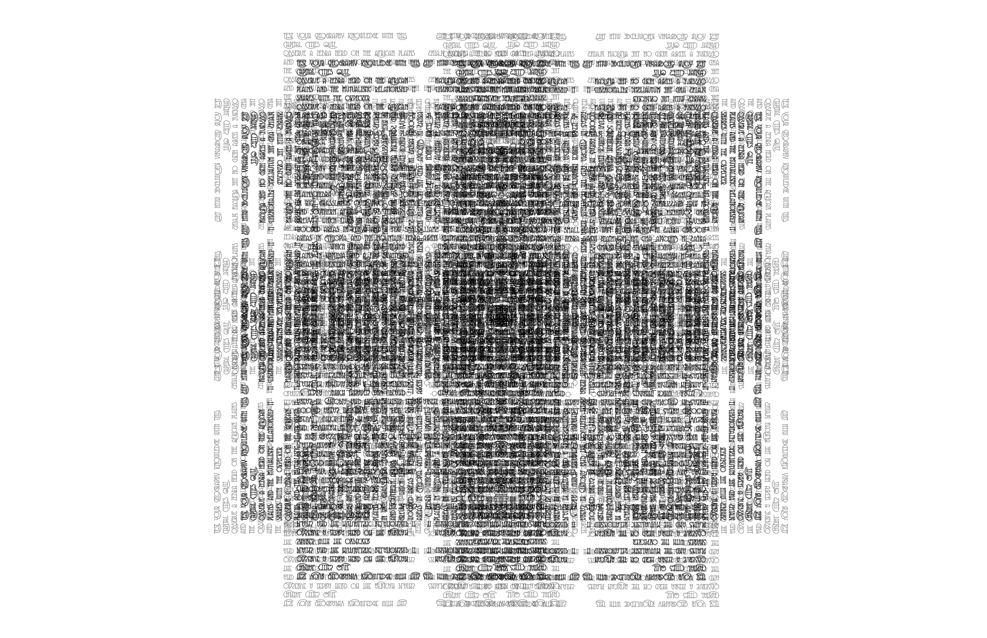
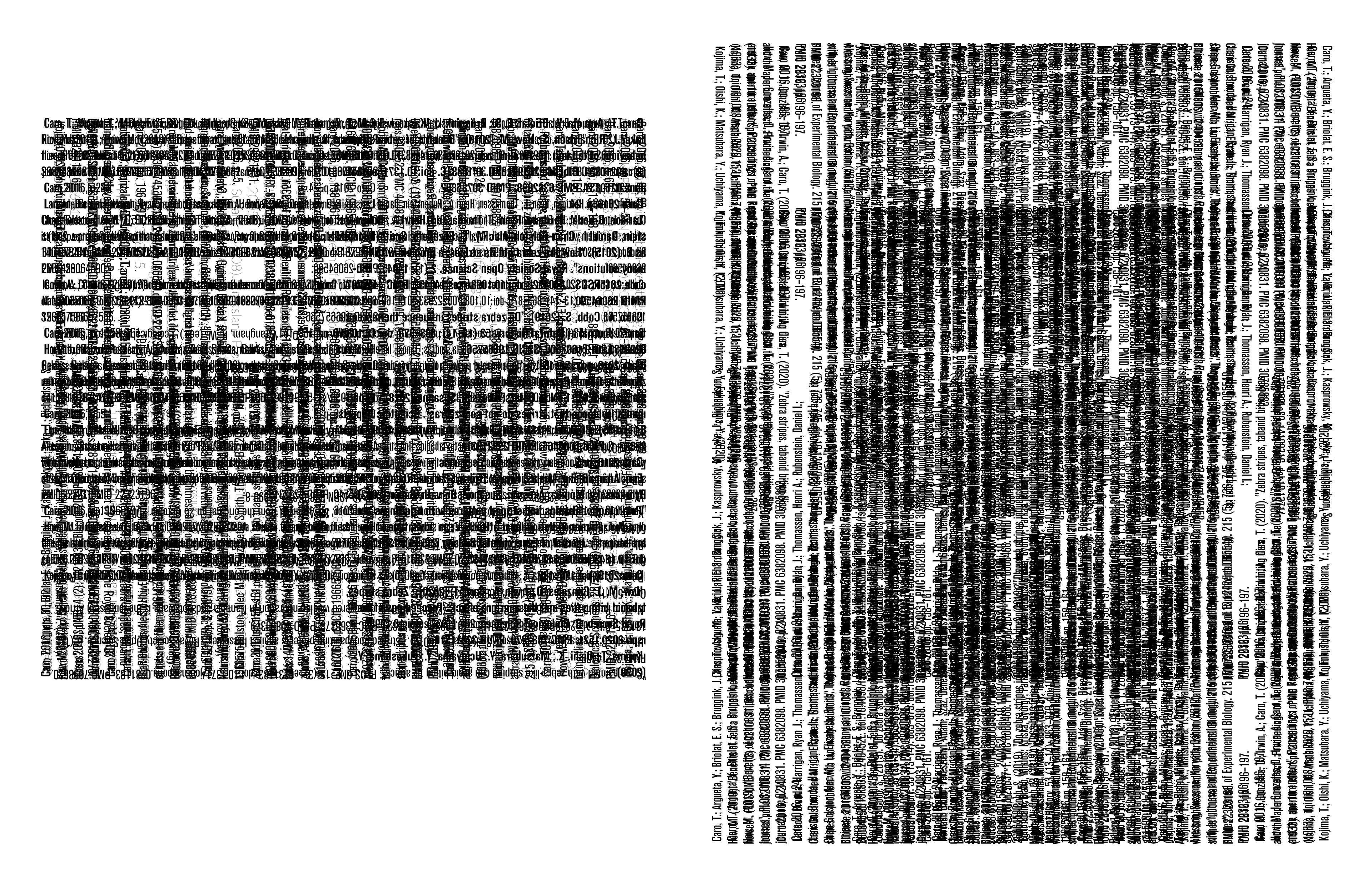
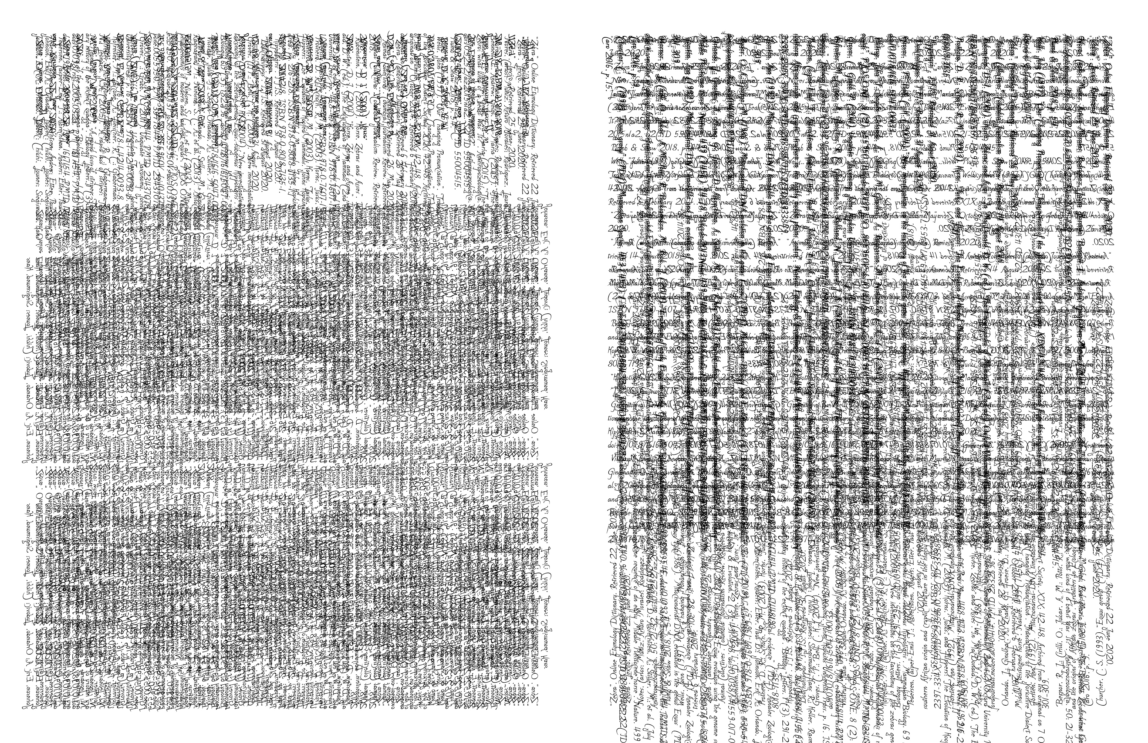
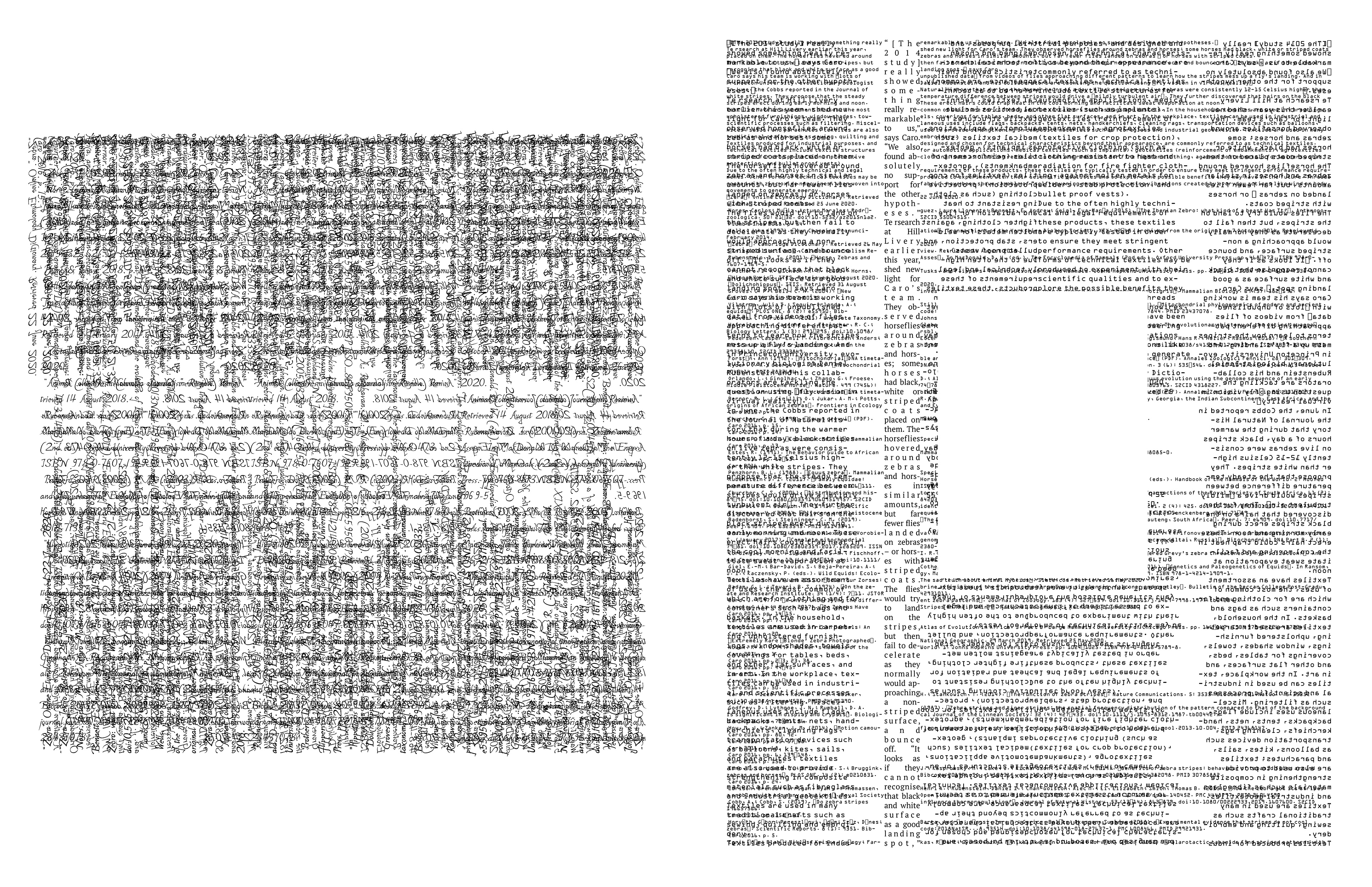
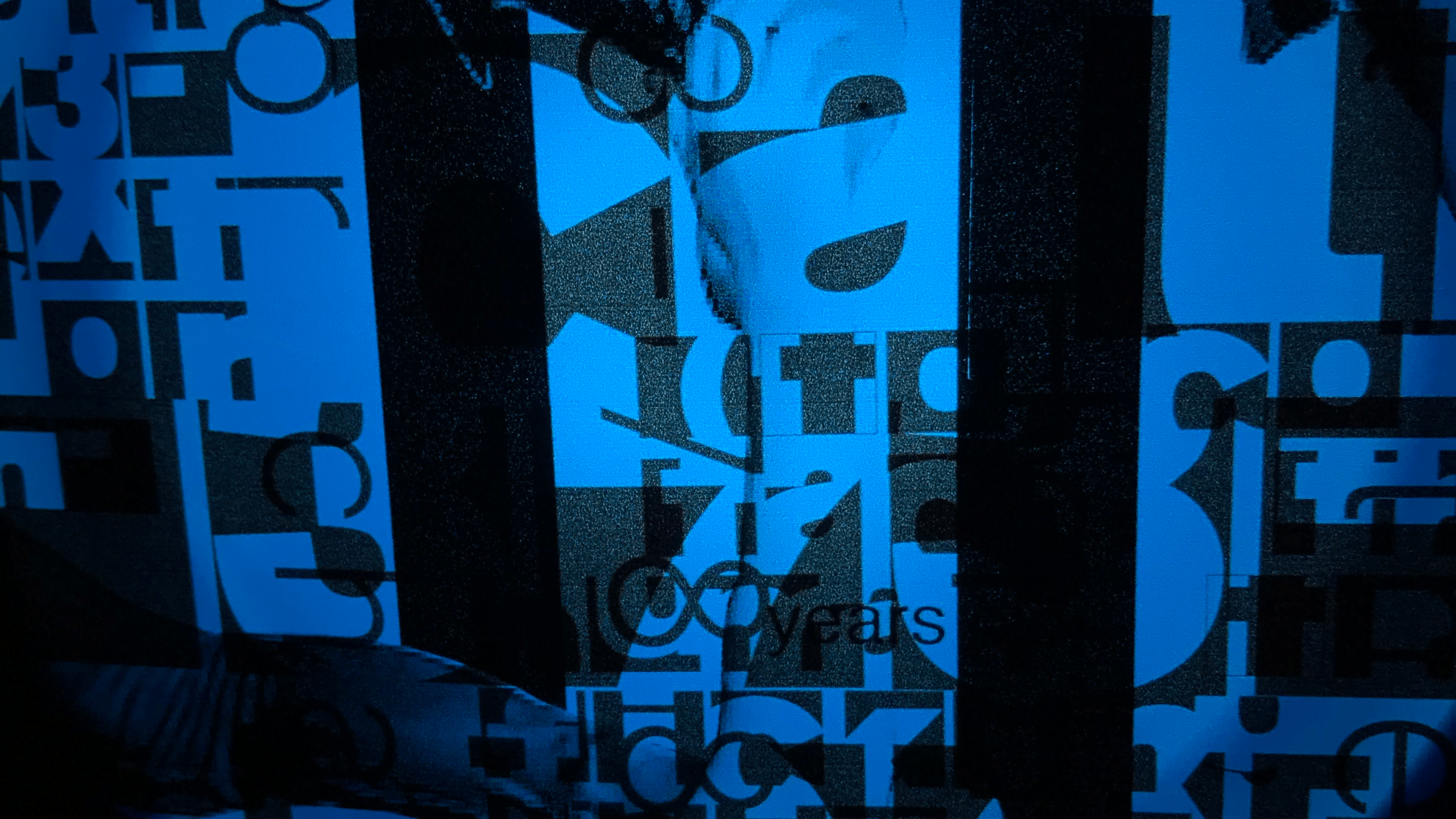
All of these realizations manifested in my final product. The idea of absence vs presence made me think about text and the space in which it exists in. The negative & positive space created in the presence of type became the essence of my project. I integrated the positive and negative space to create patterns and textures out of the text that I use so that it's reminiscent of the zebra's stripes that hold an interesting pattern and texture.
When I was layering the text and placing them on InDesign, I made conscious decisions. I would either vertically or horizontally reflect the body text as a gesture of weaving. Textiles are created through the process of weaving; thus, it felt the most appropriate to mimic that through the way that I'm deploying type. The body text used were all exerted from articles about Zebra or stripes. When the body texts are joined with a reflected a body text, they continue each other in a way and mimic the act of weaving & interlacing in a way.
I used multiple typefaces in this project (decorative, serif, and san-serif) and treated type as a visual form that's waiting to be played with :)