Type 1 - RISD 2019
Assignment for Type Class
step1: take pictures of typefaces around providence
Step2: make a poster/create a collage using the images you’ve taken
Step3: create your poster digitally & give your poster a name that links back to typography
Step4: print it on a scale of 36x48 ‘’
Starting Step 2:
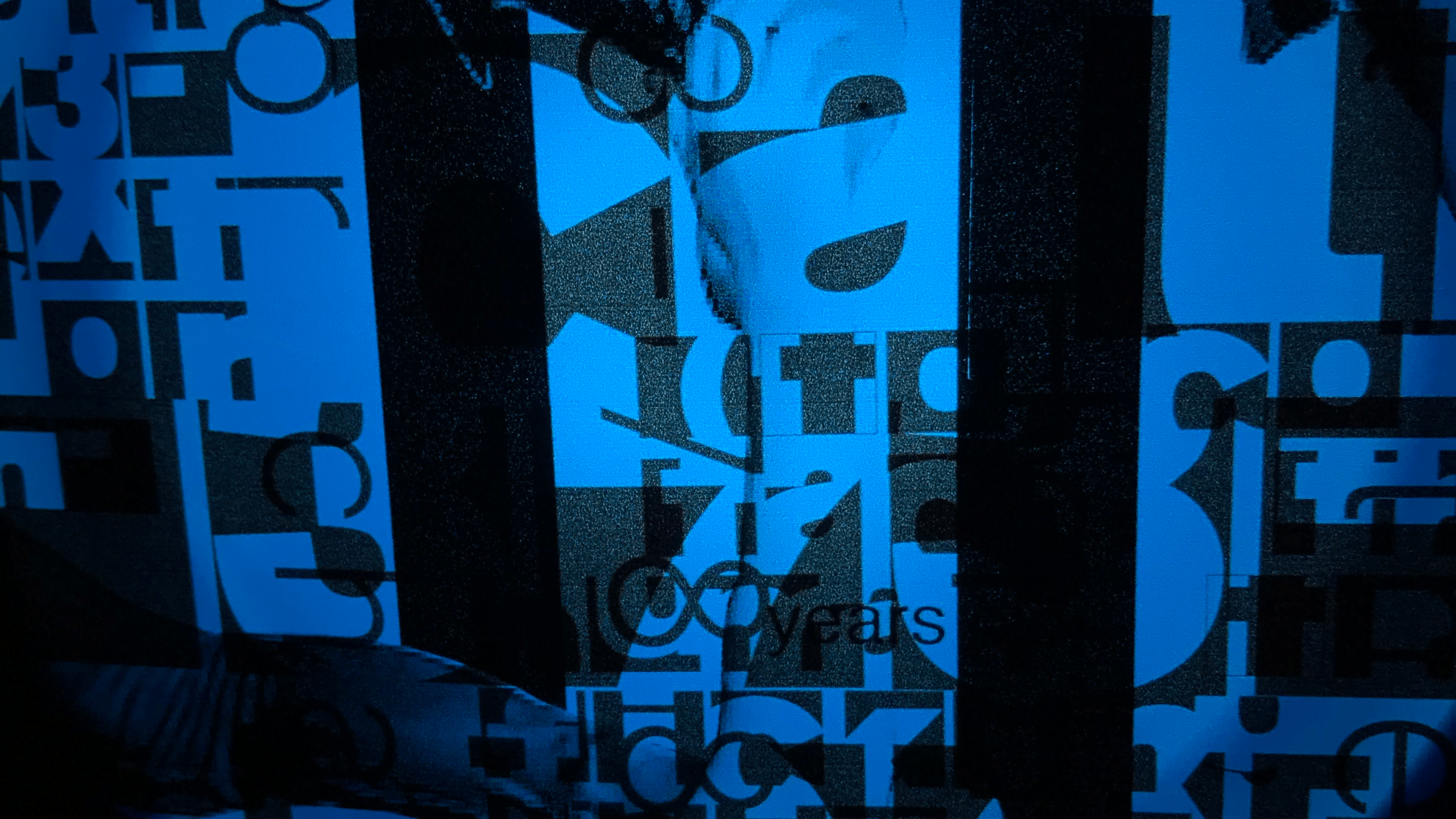
I was intrigued by the colors, composition, typography, and relationship of manholes in regards to their space and place of placement; thus, I chose manholes as an element that I would like to incorporate in my poster. I also used my previous assignment for this class which incorporated the use of different typefaces in a 9x9'' grid (9 boxes x 9 boxes). I used Chivalry and Prisma for one of the compositions, and thus, I decided to use parts of it in this assignment because Chilavry has this "street" feeling to it- which goes along with my theme "manholes".
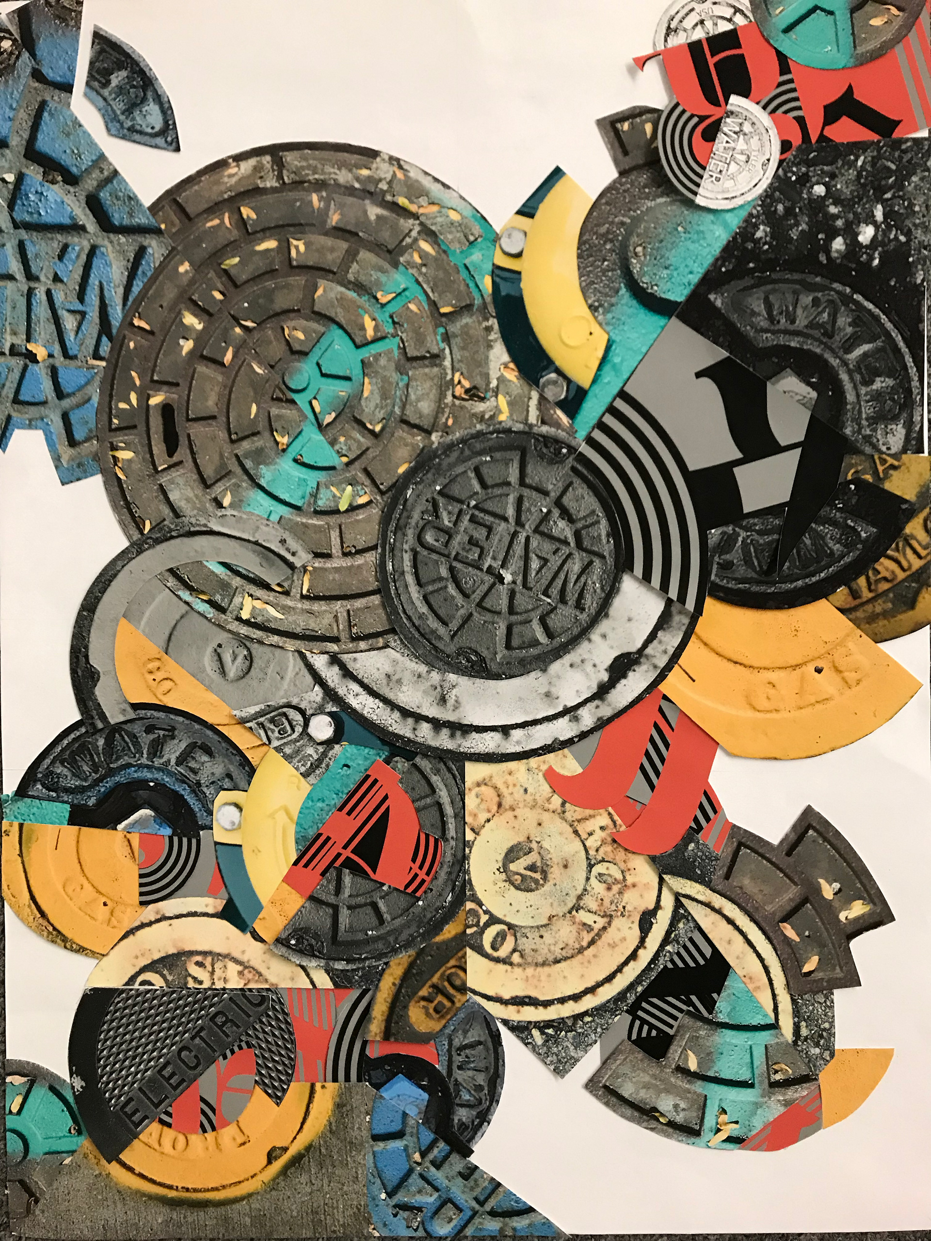
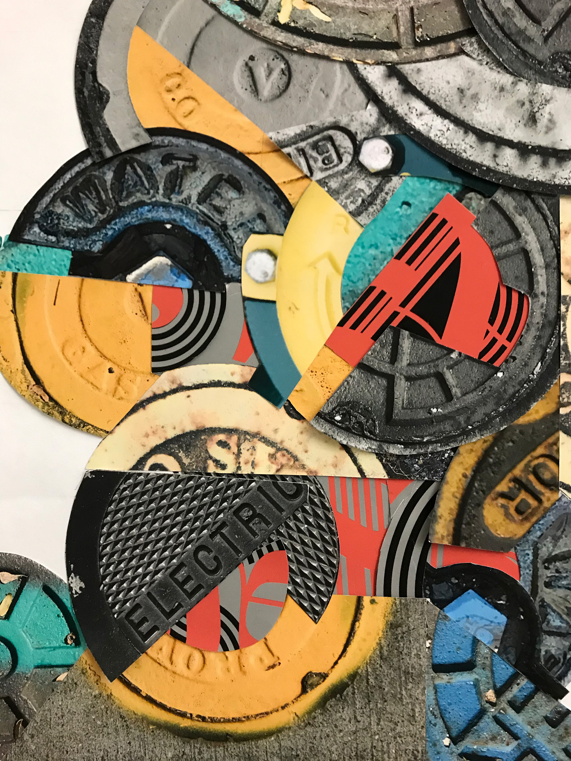
I printed out the images and compositions, collages them physically, then replicated the whole process digitally.
some of the images that I ended up using:
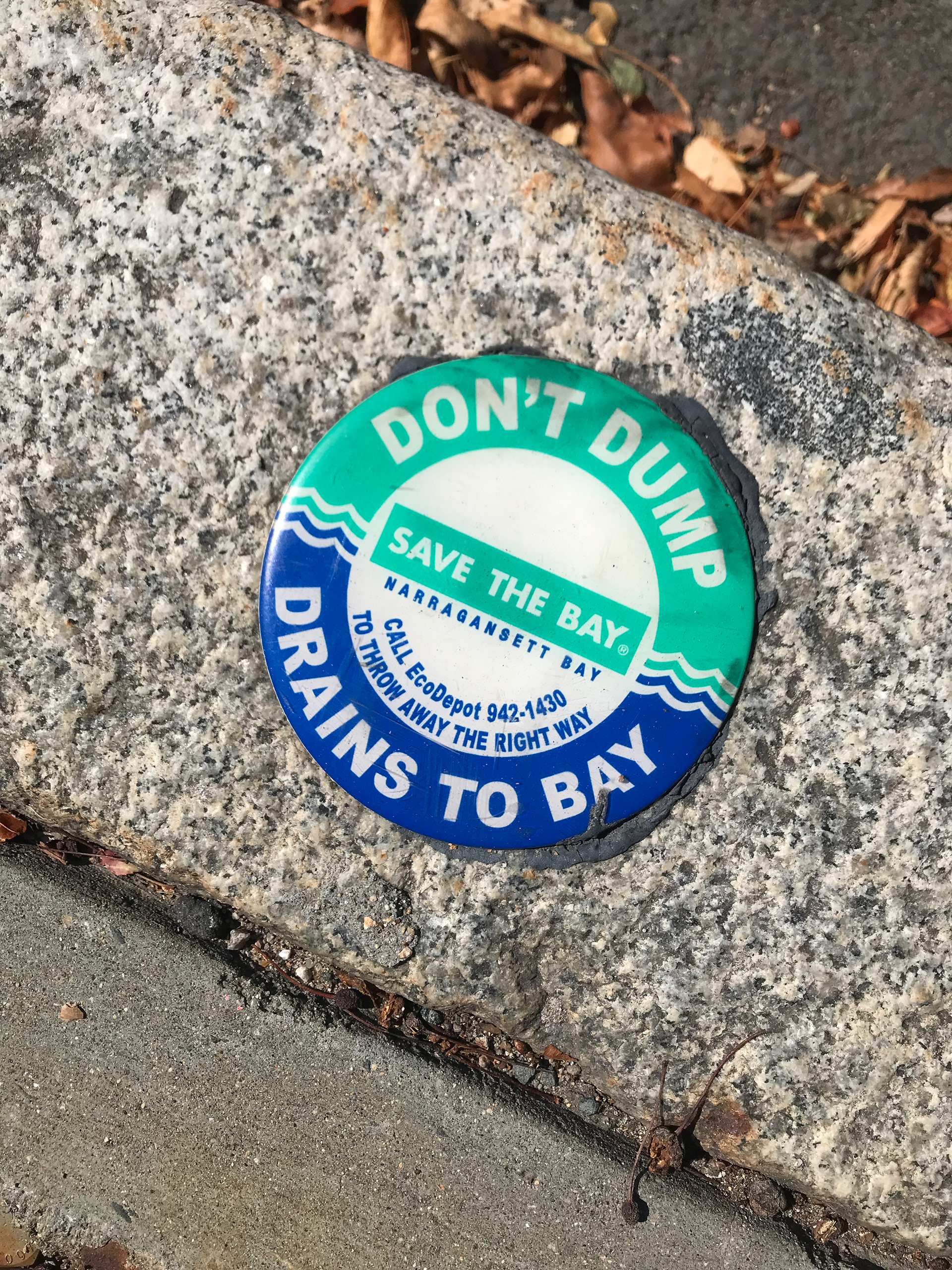
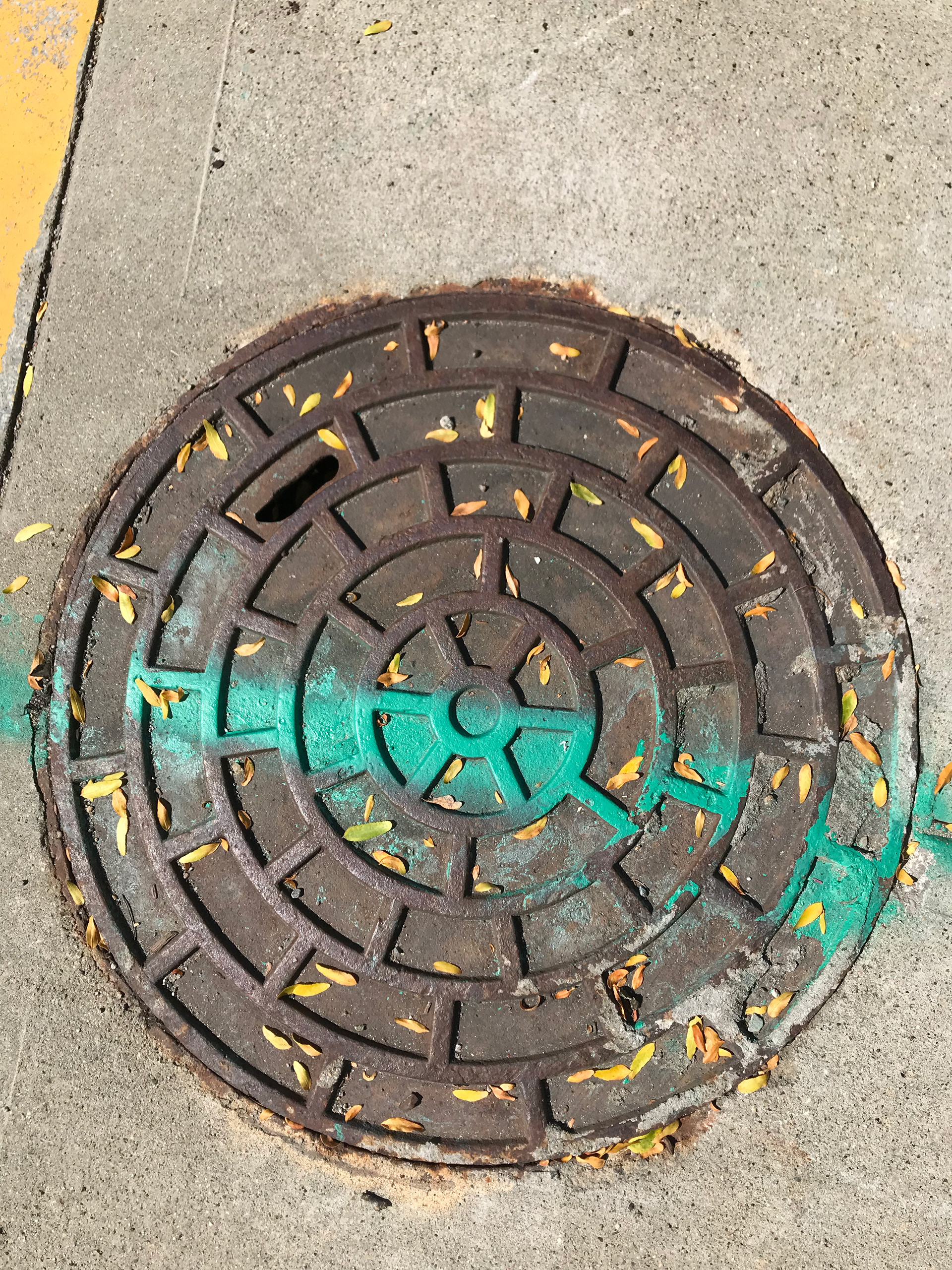
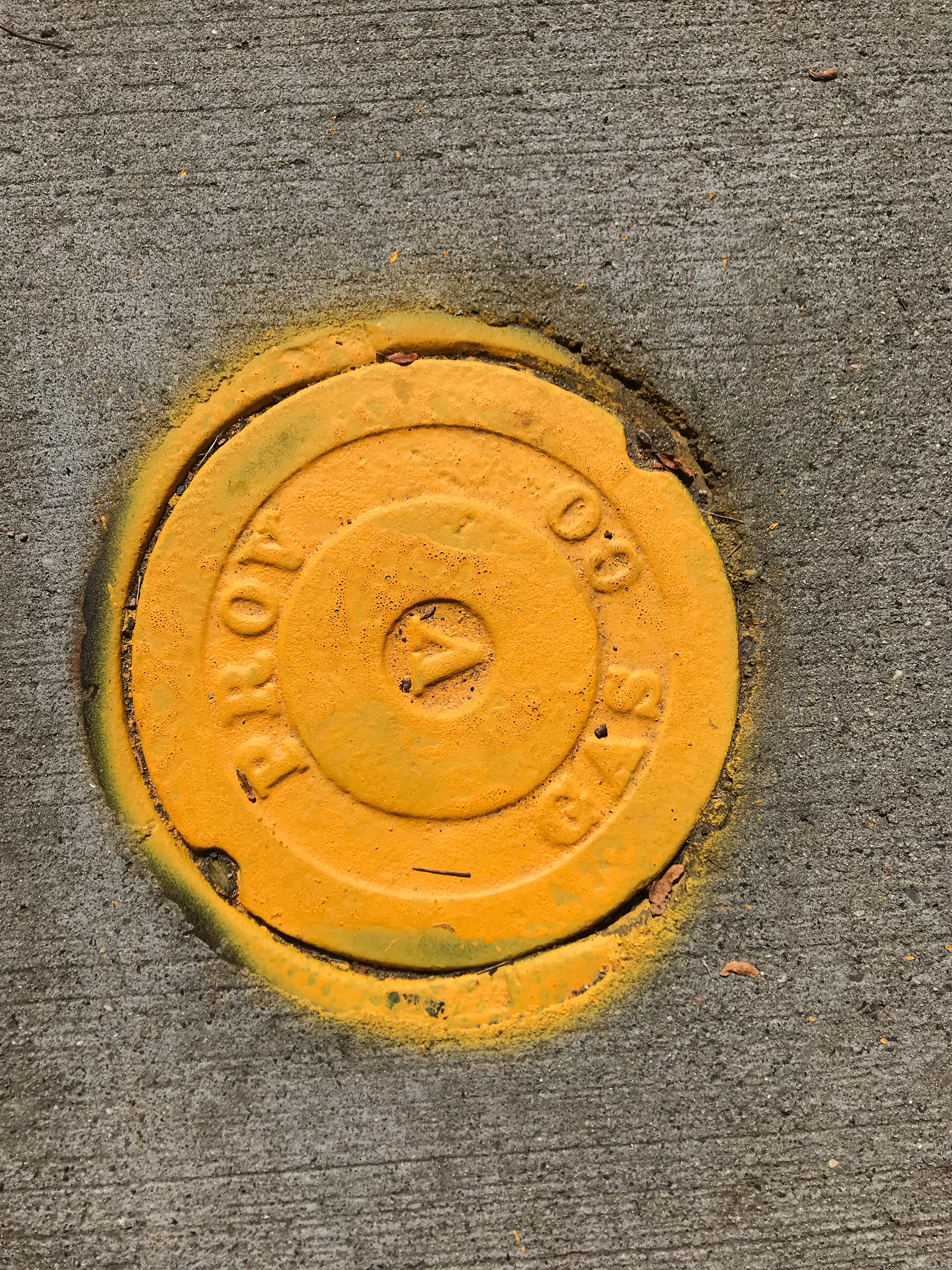
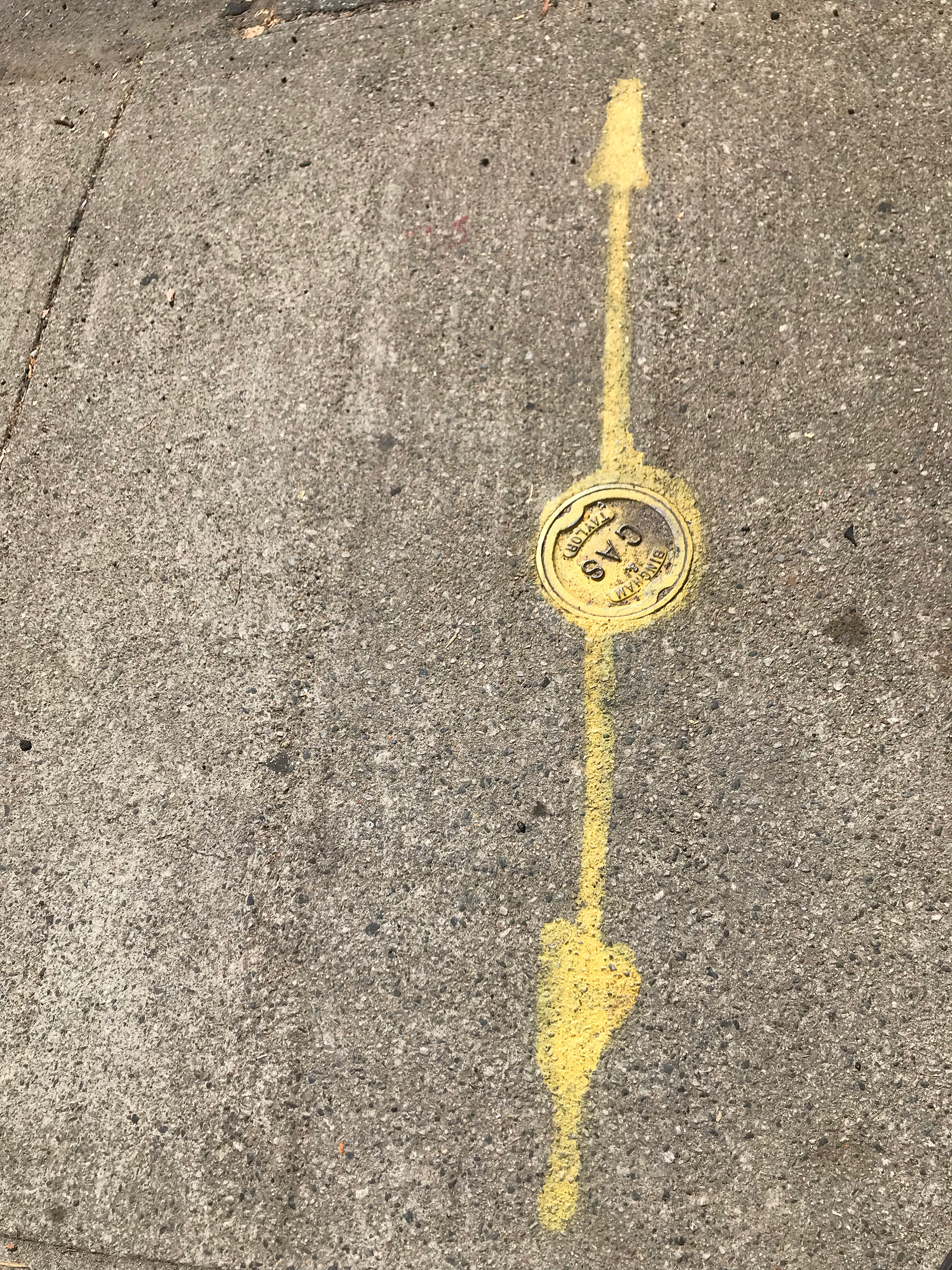
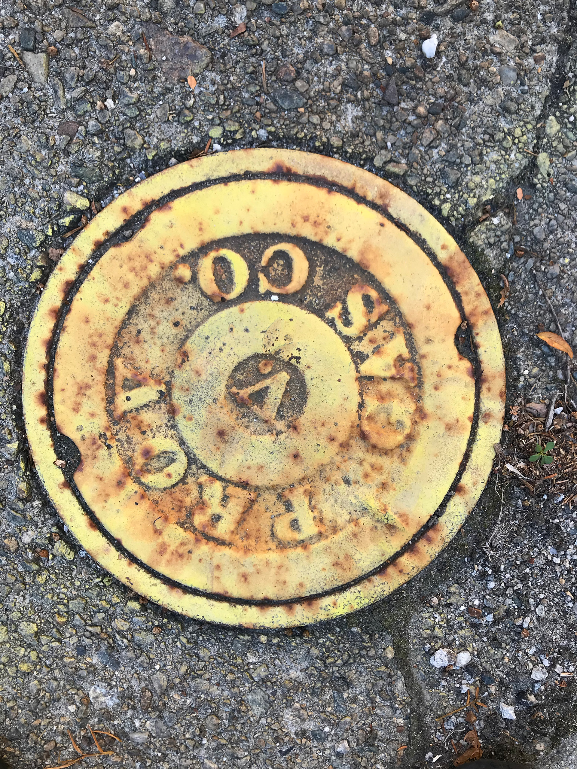
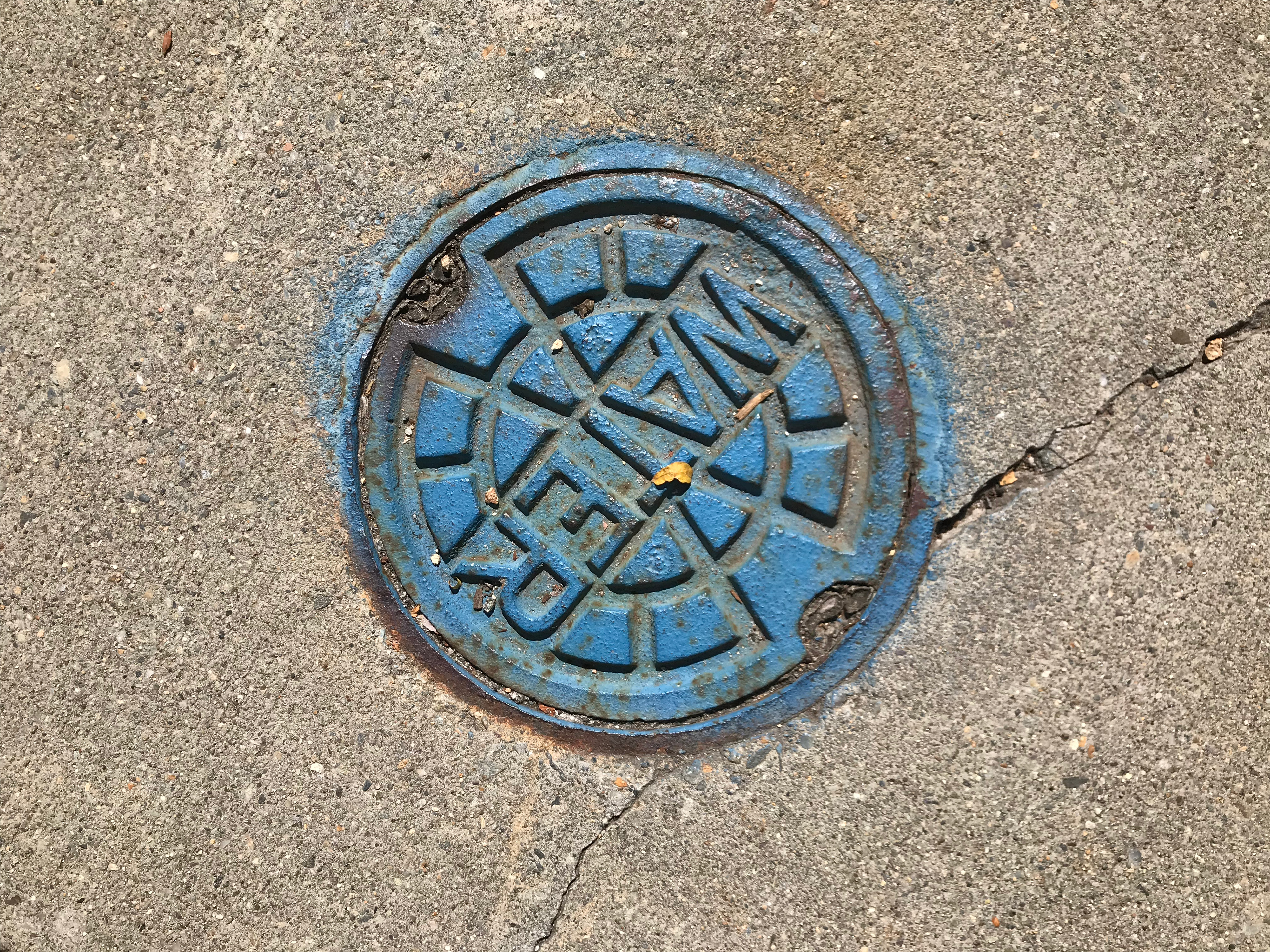


Parts of my type composition that was added into the collage & used later on for inspiration


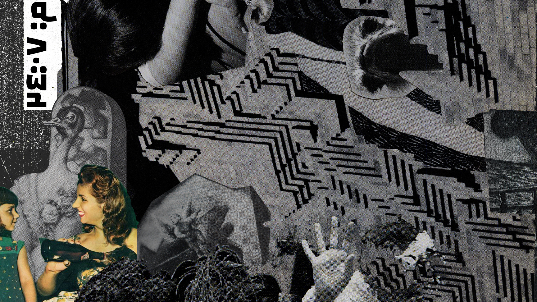
The physical/initial collage that I've made:

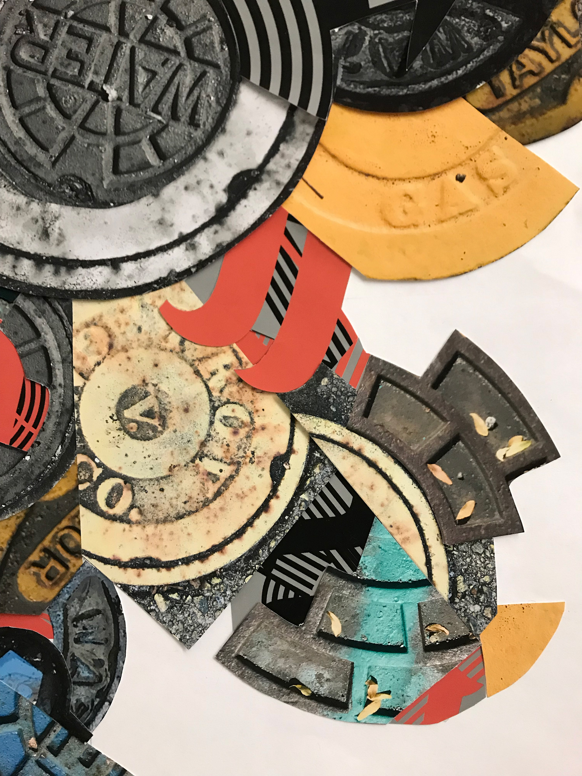
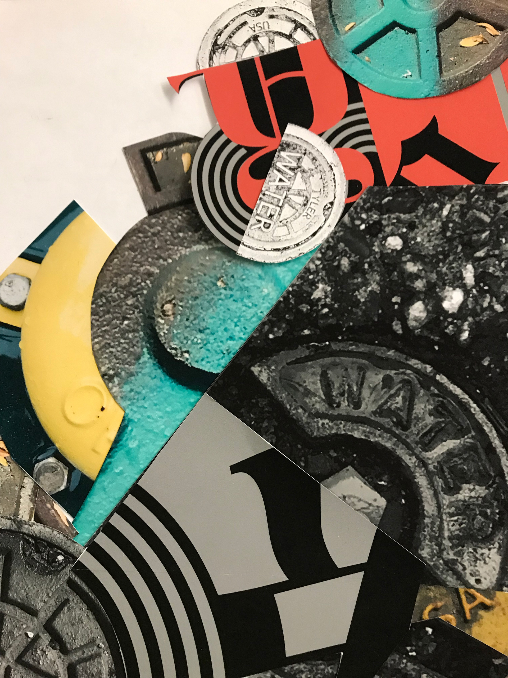

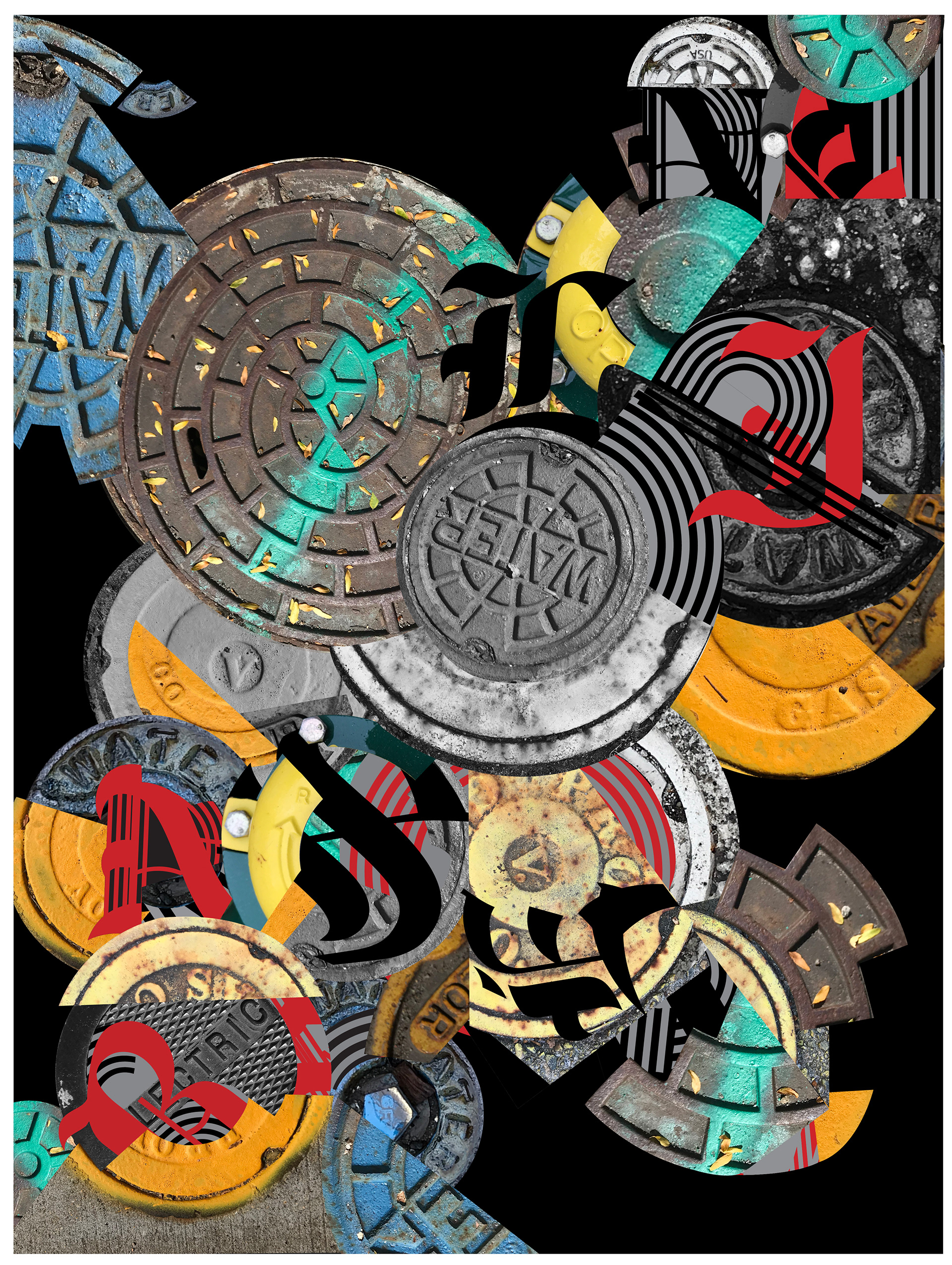
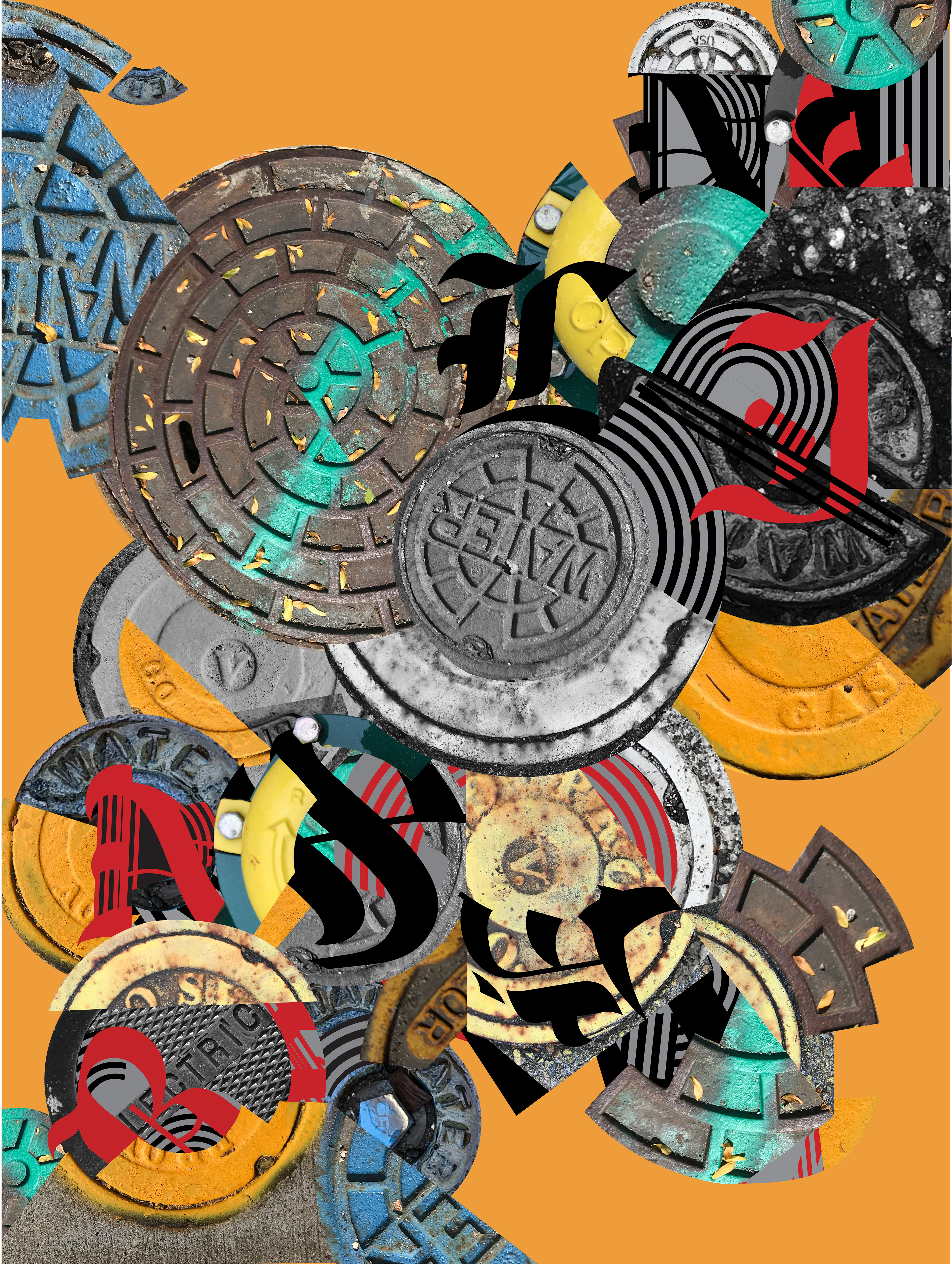
Part 3: I re-created my collage digitally using only illustrator. Also, I decided to give my poster the name "Baseline".
Part 4:
I chose to incorporate to use my type composition as the typeface for this poster; thus, I collaged it so that it is read diagonally starting from bottom left & reaching to the top right. The title "Baseline" could be read across the poster but it requires effort; it coincides with the reality of manholes and our relationship to it as we don't instantly notice them, but rather we need to make an effort to acknowledge it's relationship to it's environment.
I ended up with 3 posters with three different background colors to elicits different emotions and respond to the audience's diverse preference of color.

From physical to digital:
*The before and after image*
