Dubai Design Week – Located in Dubai Design District
Identity System
For my Typography III class we were asked to choose an international event that we’d like to create three different “channels” for. Within these three different branding mediums must be established. I chose to rebrand and market Dubai Design Week which is held at Dubai Design District each year.
I didn’t want to create something that’s completely different from the original. Rather, redesign and expand its identity by borrowing some elements from the event’s original logo. I realized that their original logo and
branding strategy emphasized on the use of simple shapes; thus, I wanted to expand their strategy and make
it more playful.
As I went through Dubai Design District’s events catalogue, I noted how the site locations – in which exhibitions are conducted at – are displayed in aerial view illustrations. Thus, I decided to borrow these shapes and translate them into prominent elements in my identity system & overall design.
The original branding design of the Dubai Design Week only makes use of the circle and rectangular shape; however, in my re-design, it incorporates 6 different shapes (stemmed from the exhibition locations) along with the use of the rectangle and circle. Adding a variety of shapes and colors enhances the value of the event.
In my app design, I wanted to re-conceptualize our understanding of toggles and address it in an unconventional way. Instead of using the typical “back” “forward” signs to surf through the pages, I created a new toggle language that’s solely based on shapes. For instance, instead of writing “Locations” the user is presented with multiple shapes on a yellow circle. The shape the user presses on takes them to the designated exhibition location along with the events or exhibits that will take place in it.
These location symbols are a huge part of my system, which is why I ended up incorporating it in my logo and poster designs.
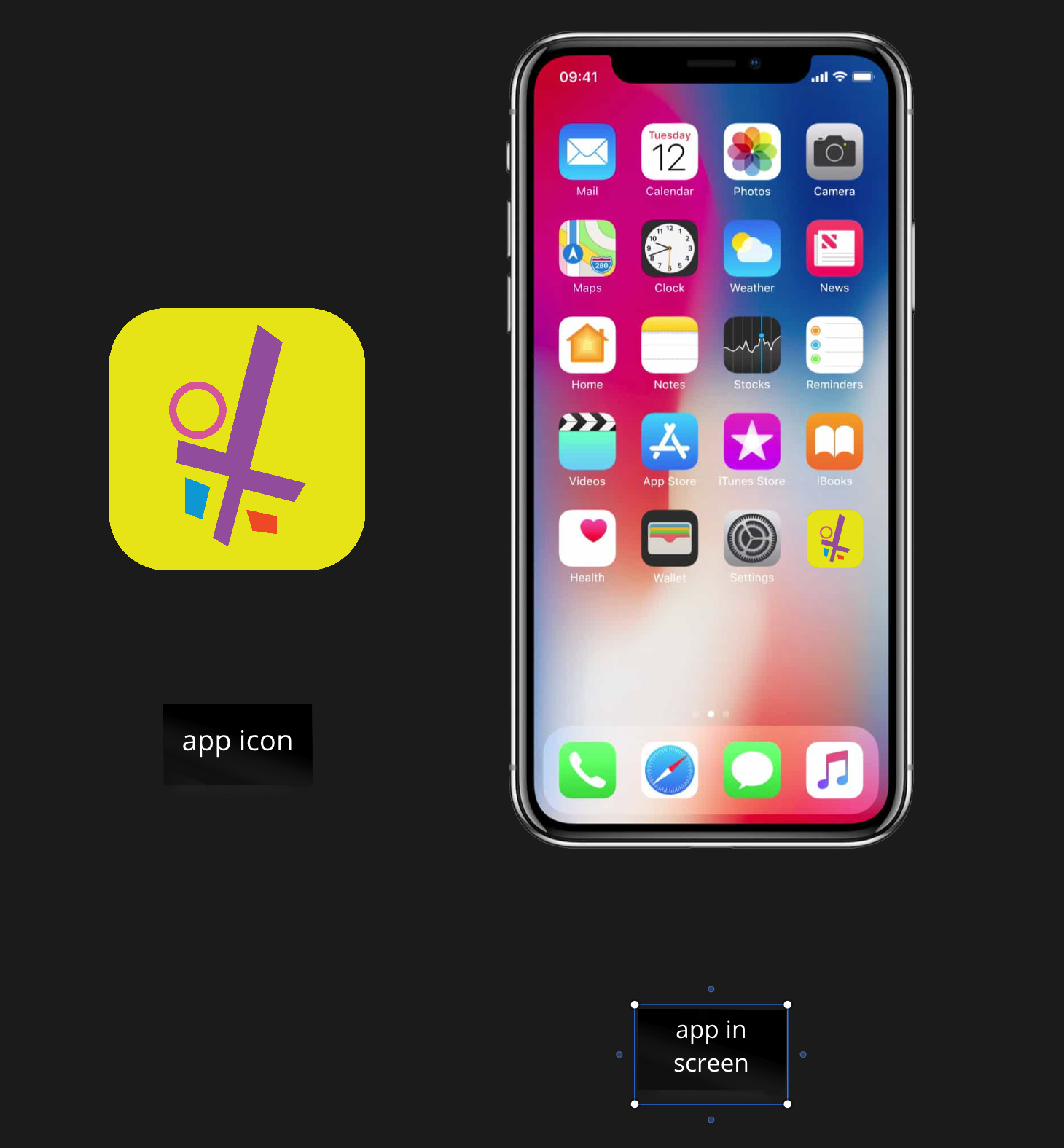
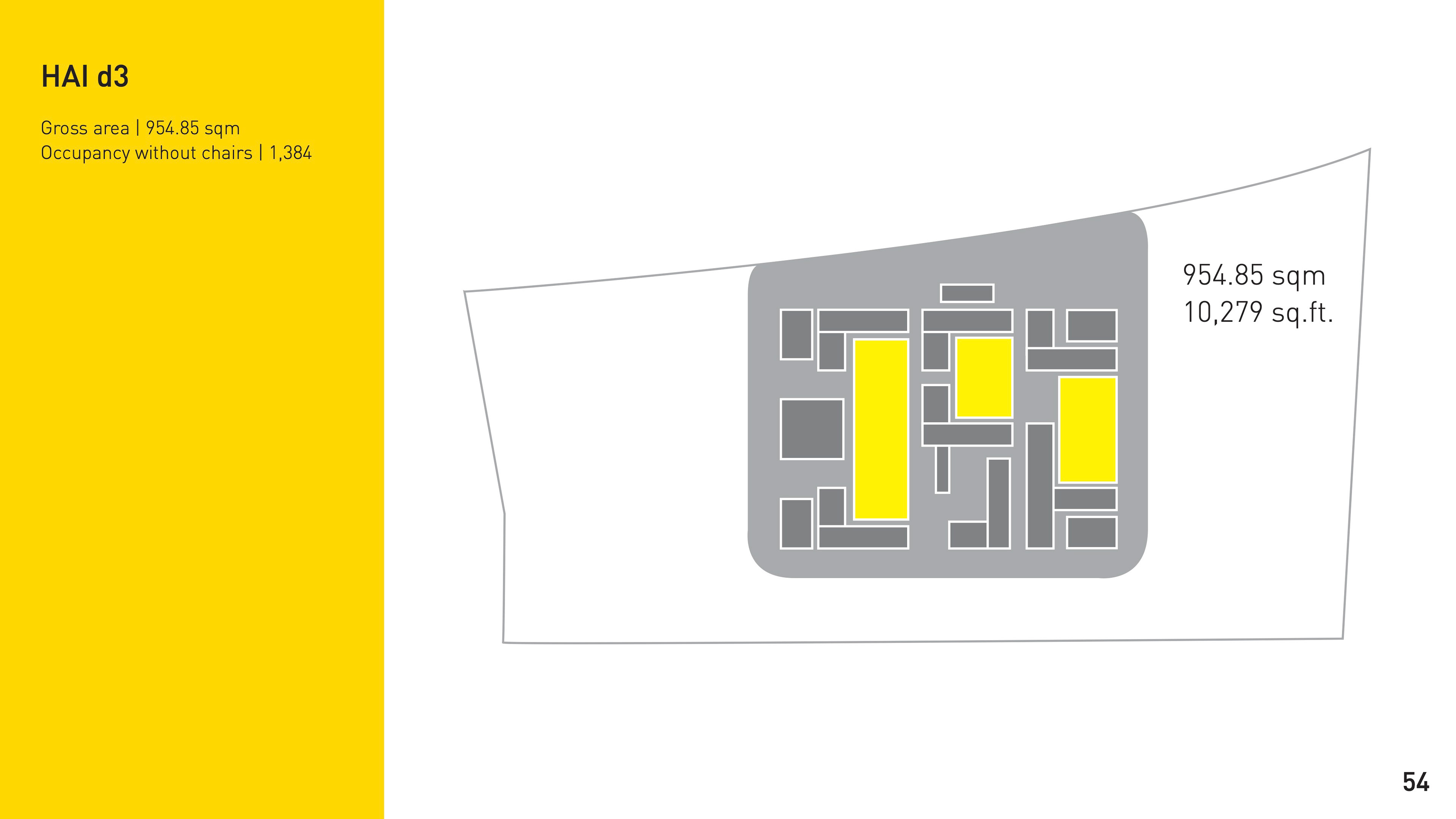
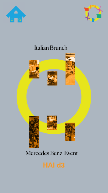
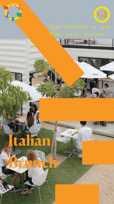
Far left image: how the app icon would ideally look like // right images: example of how the site's landscape shape is incorporated within the event page in my app
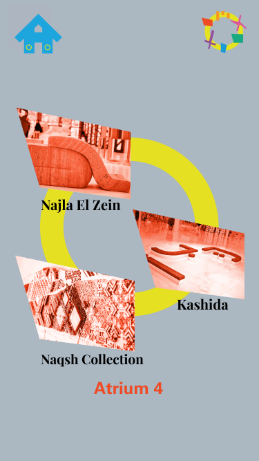
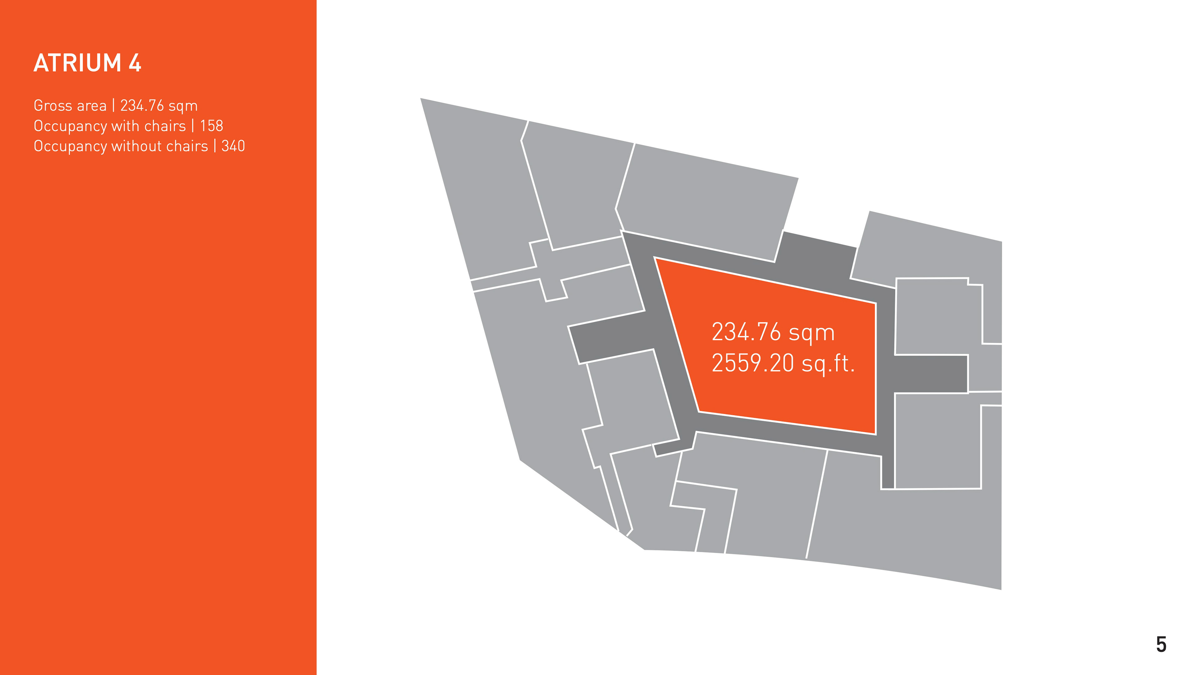
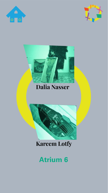
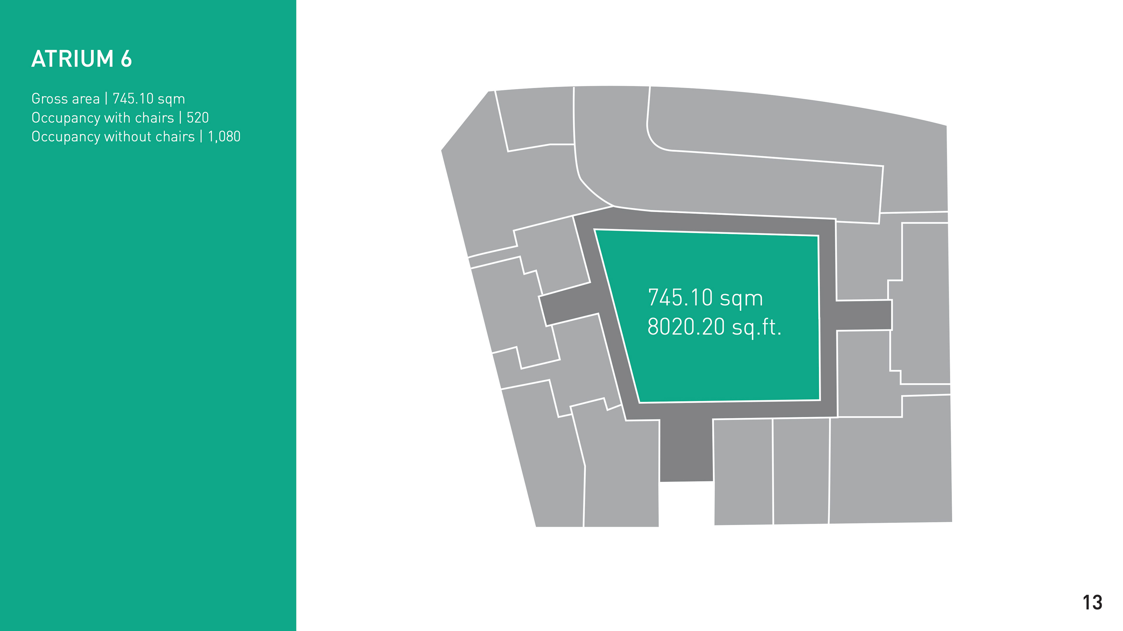
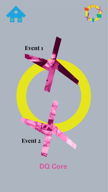
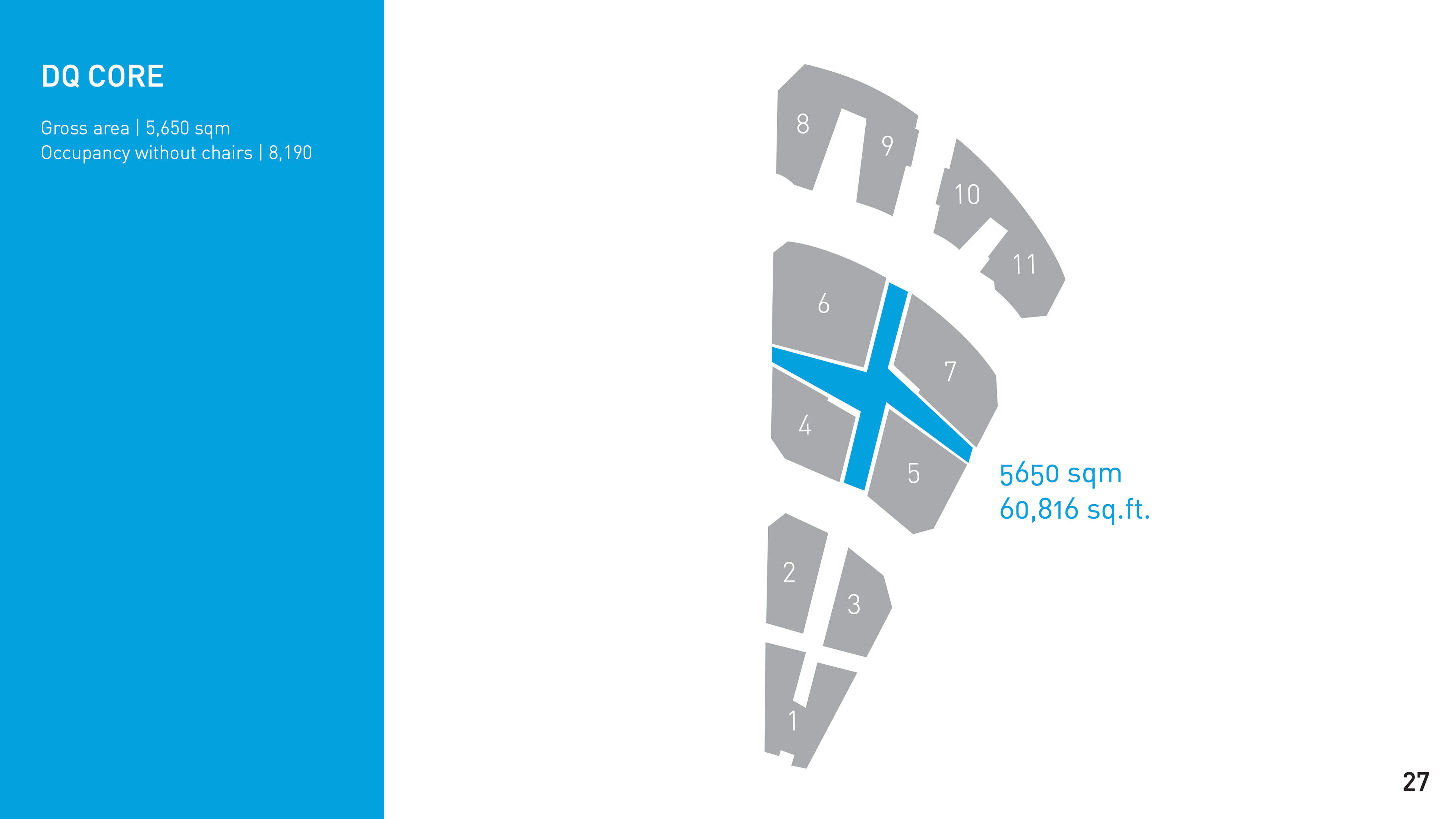
Translating aerial views into a visual language. Some screenshots from the events catalogue along side the location pages that I designed for them on the app.

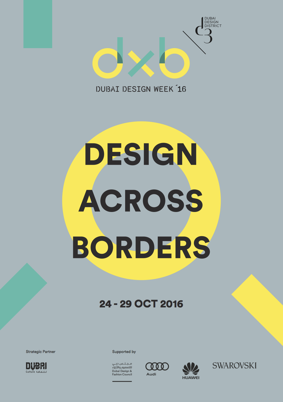
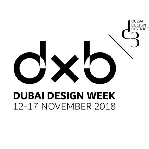
Above: Dubai Design Week's original branding identity


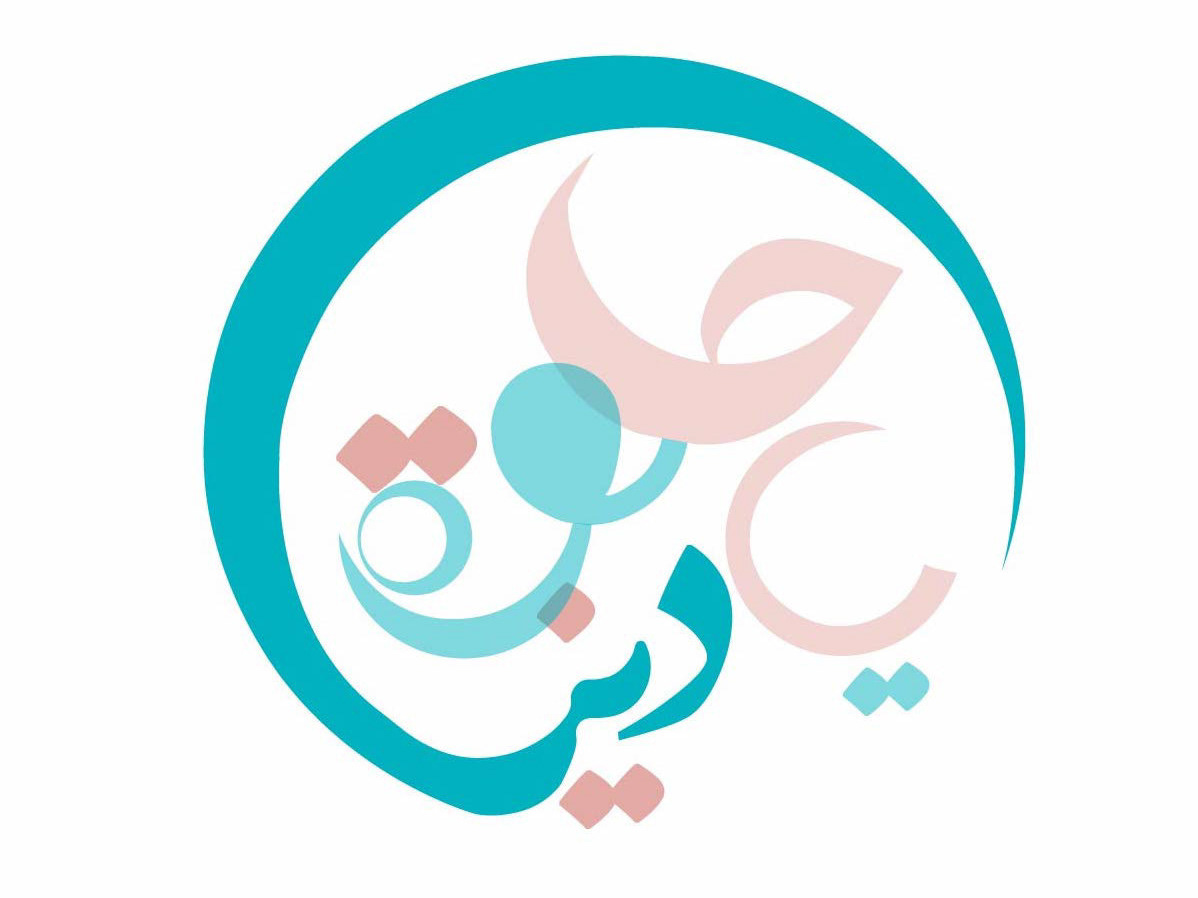
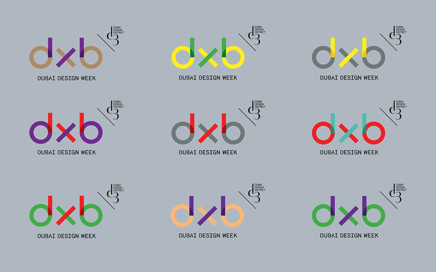
Above: the different logo design iterations that I developed

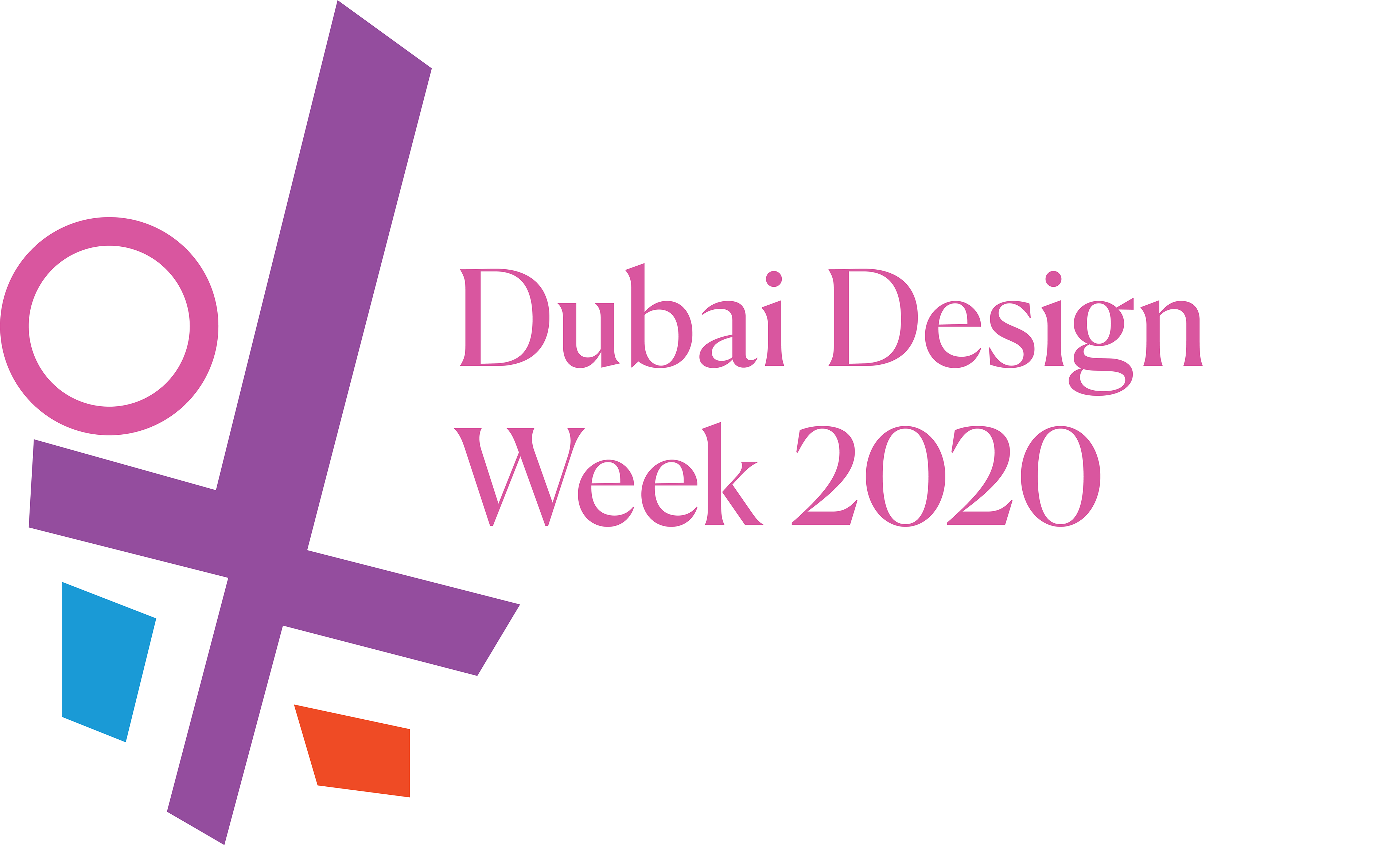
Left image: original Dubai Design Week Logo // Right image: final logo design that I landed on
Created an animation for the logo that I designed. This animation is also featured in the app as the "Welcome Page"


Left image: original poster Dubai Design Week designed in 2016 (I did not design)
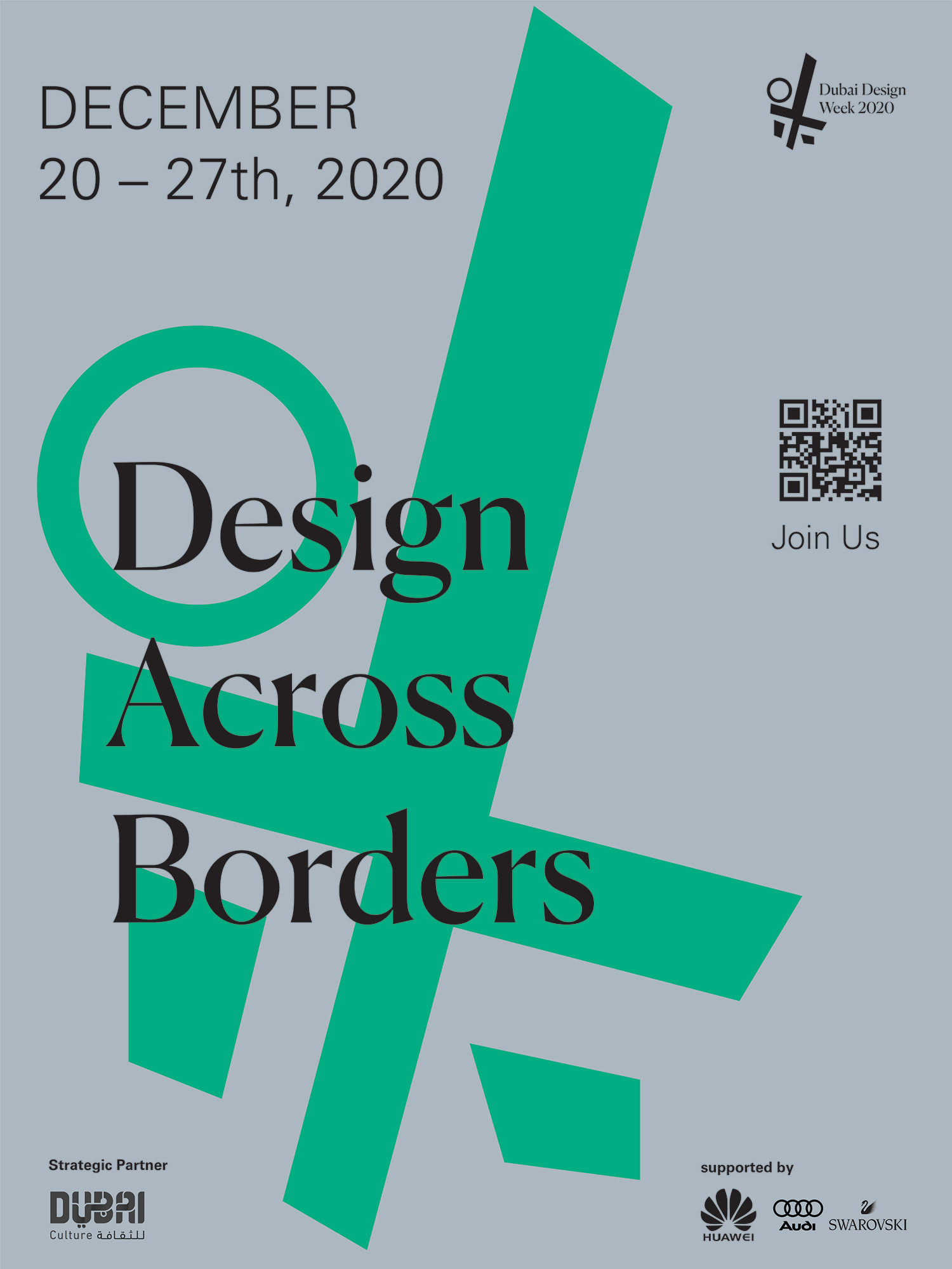
Right image: my poster designs for the event (I designed)
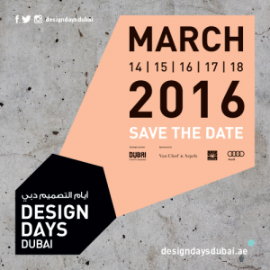

Left image: original poster Dubai Design Week designed in 2016 (I did not design)
Right image: my poster designs for the event (I designed)
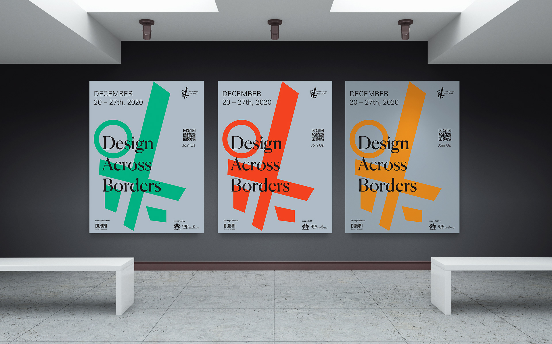
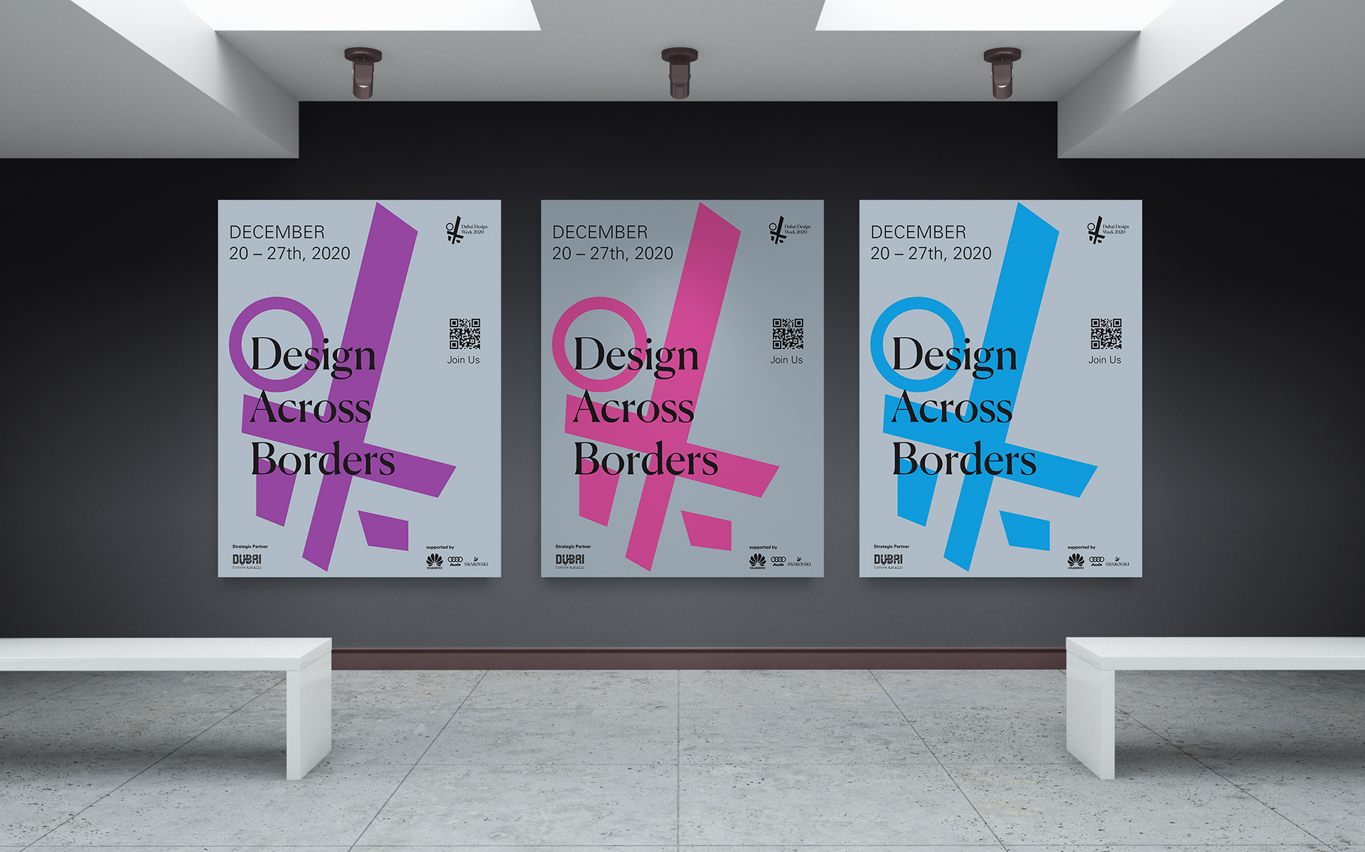
Above: Style/system #1 that I chose for my poster designs
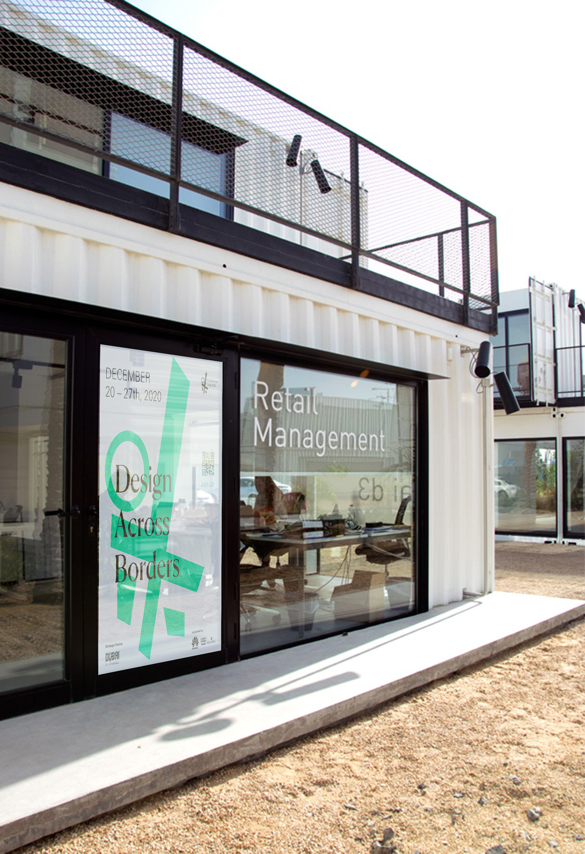

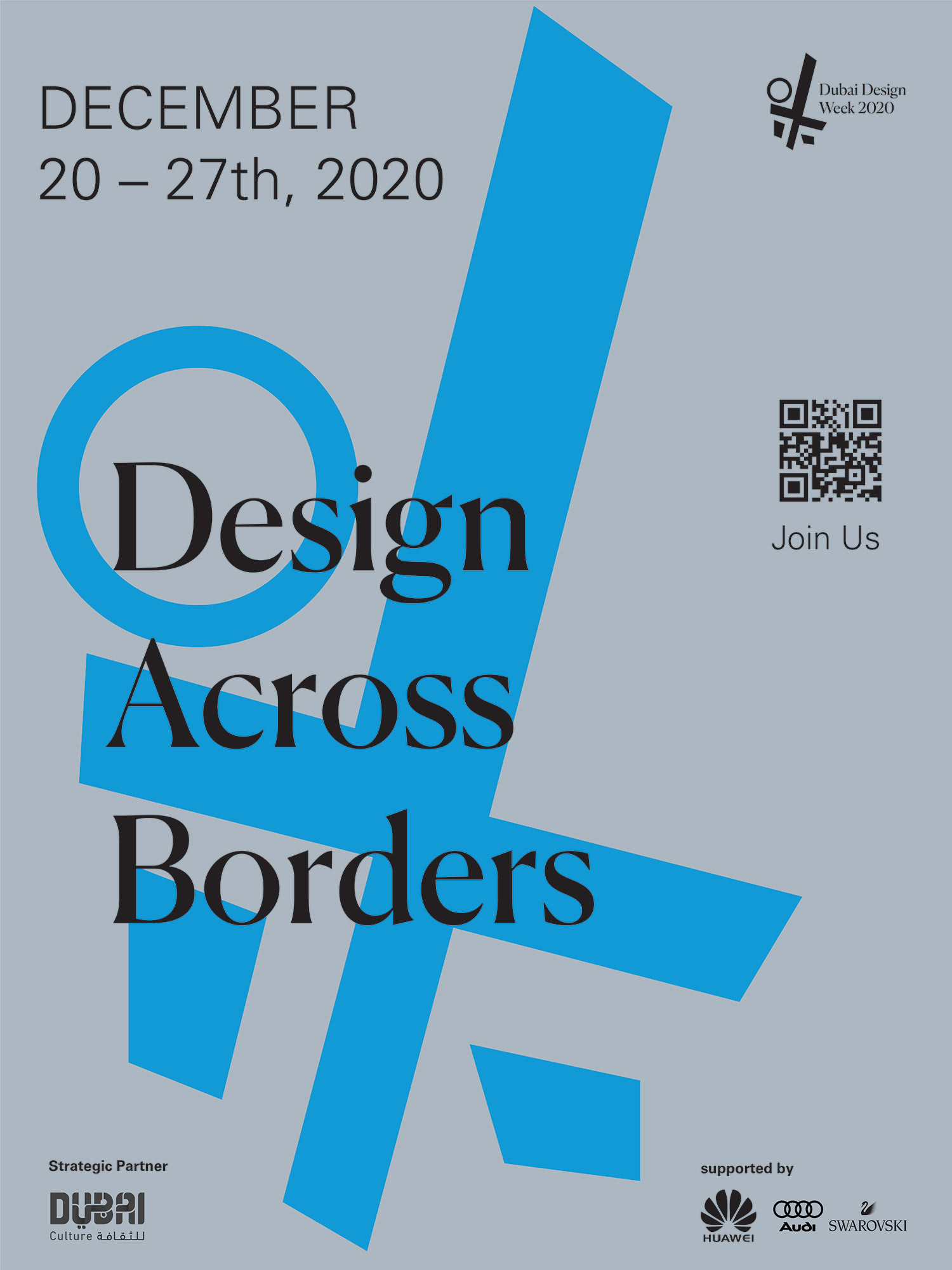

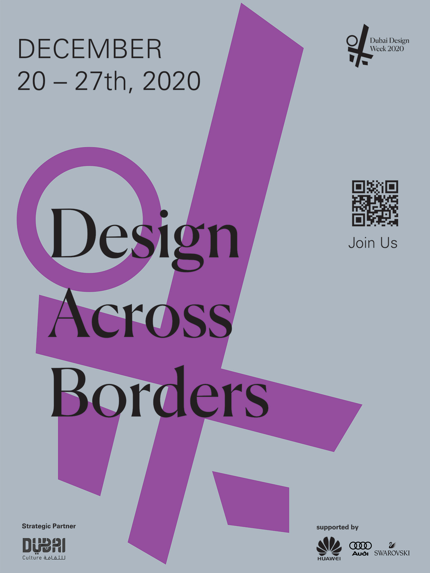

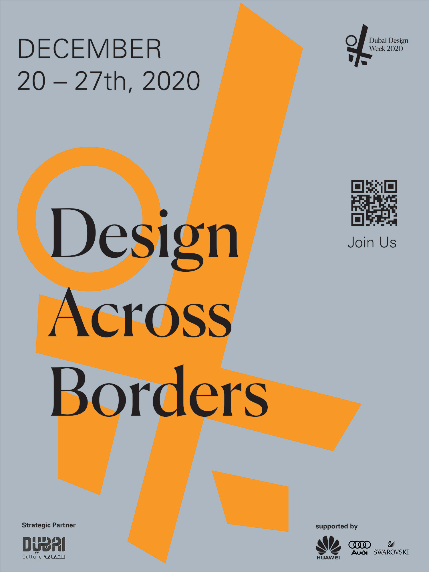
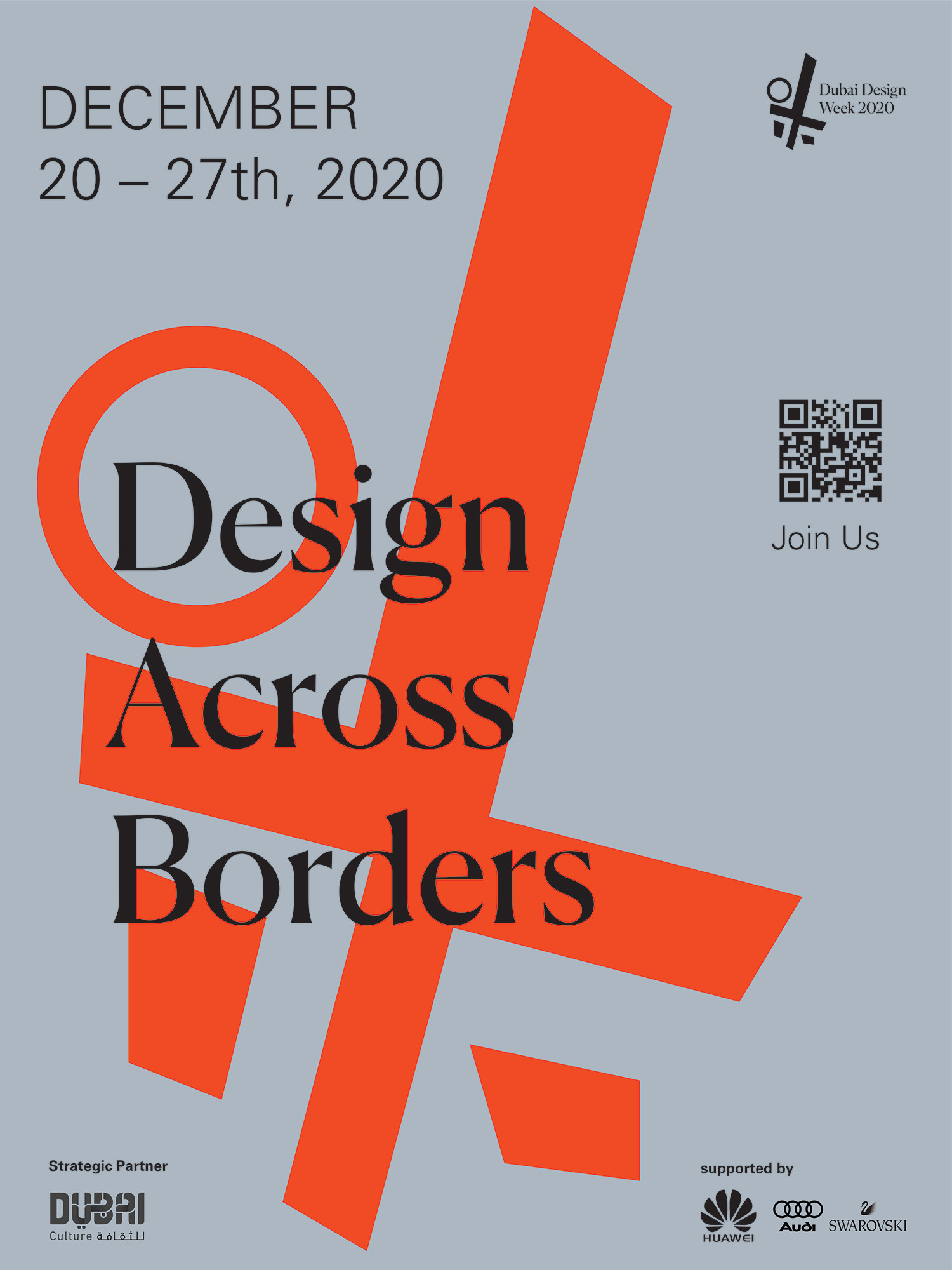
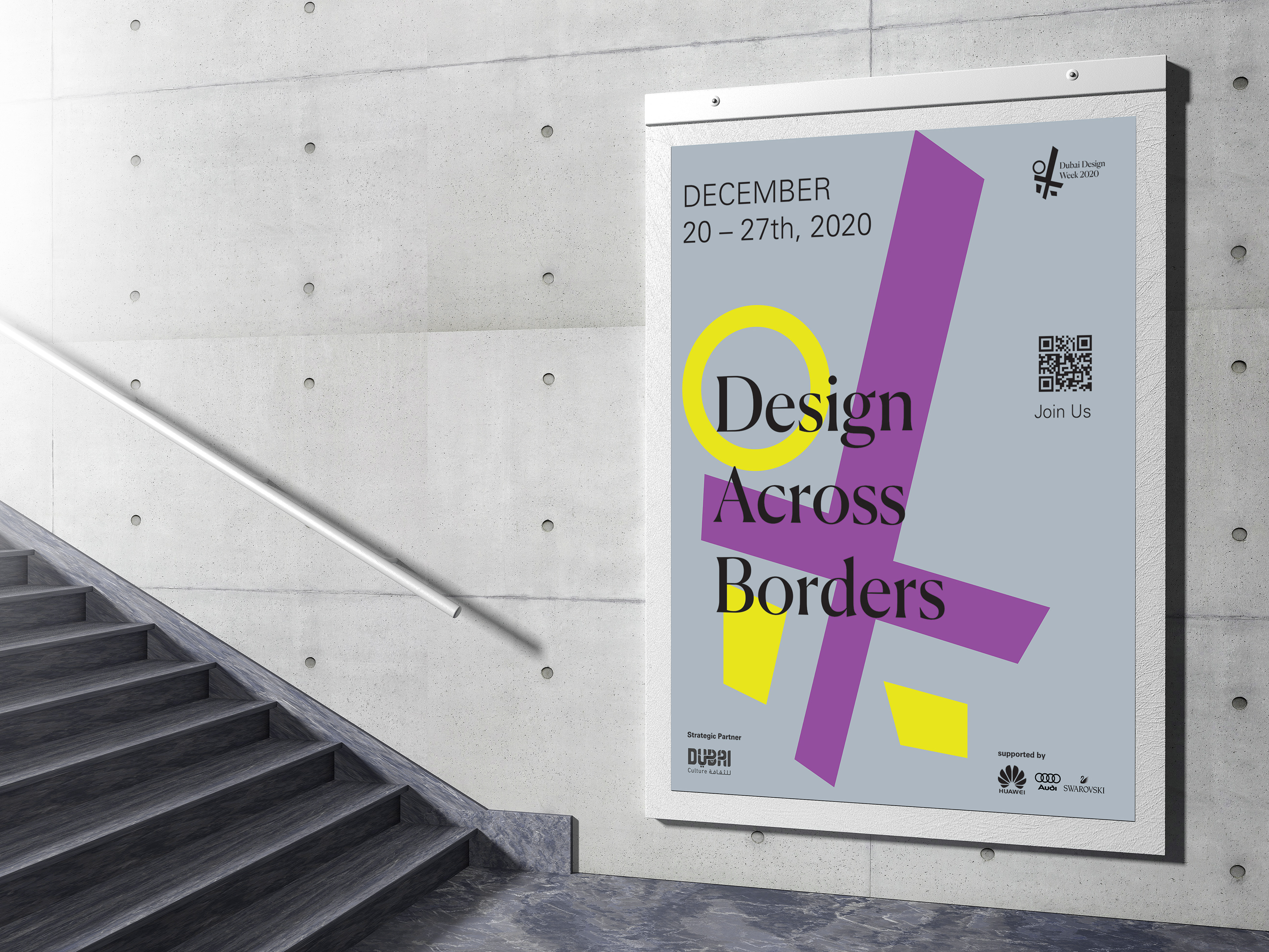
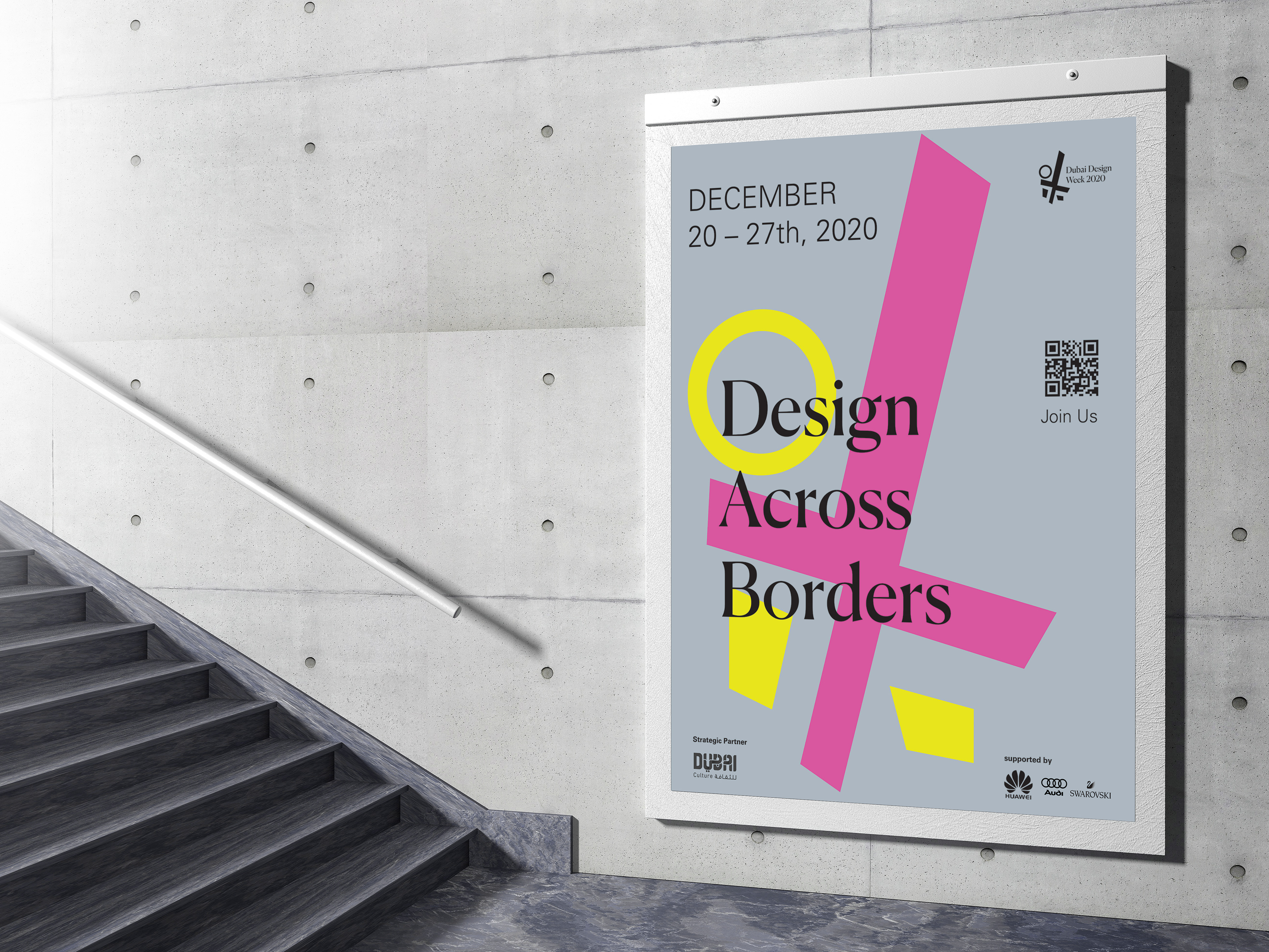
Above: Style/system #2 that I chose for my poster designs
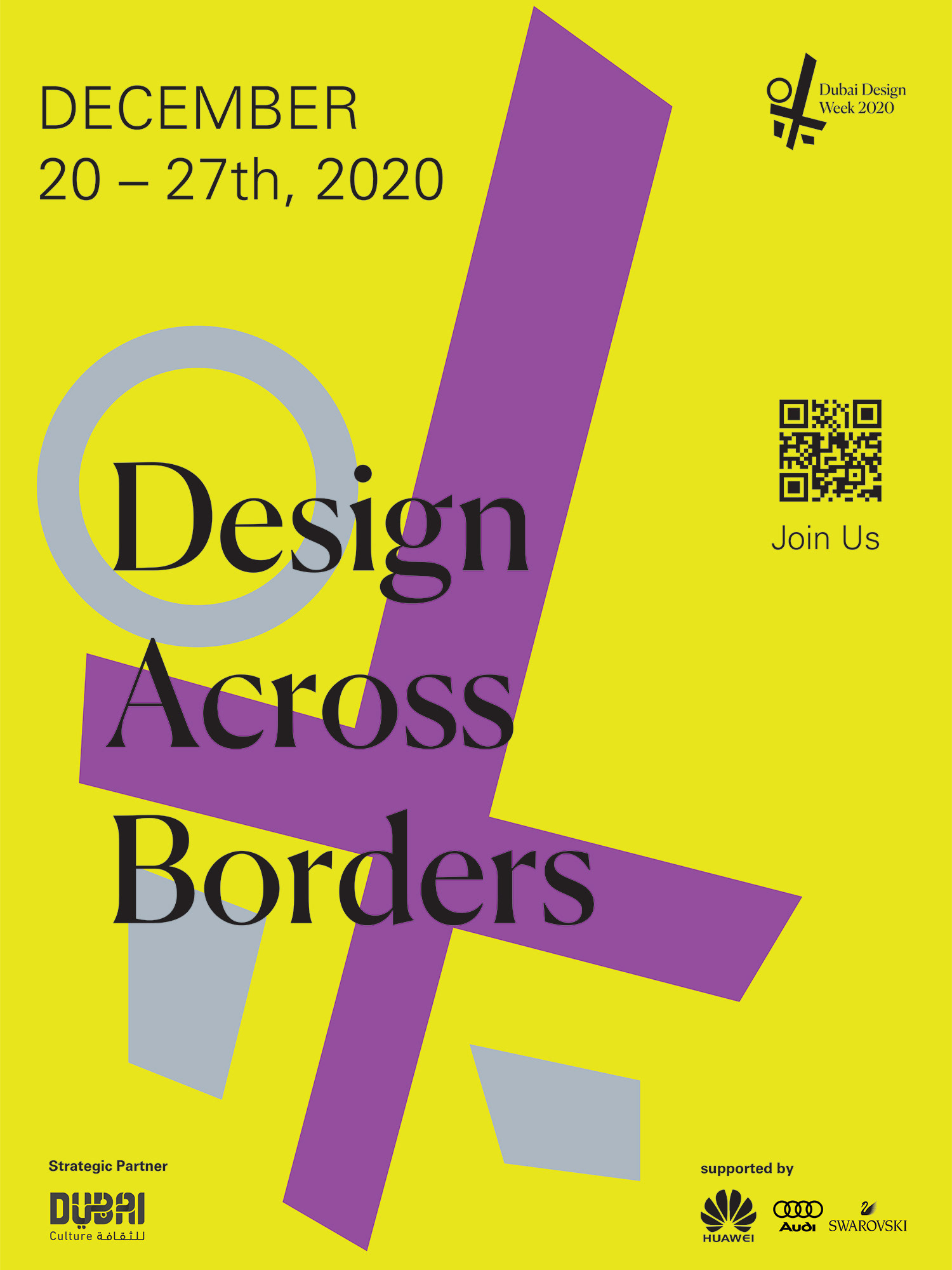
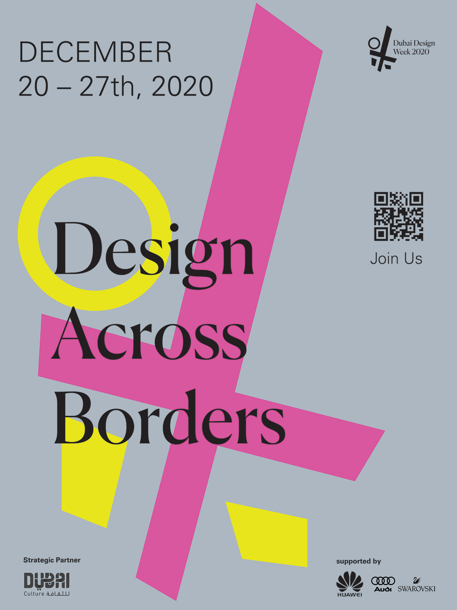
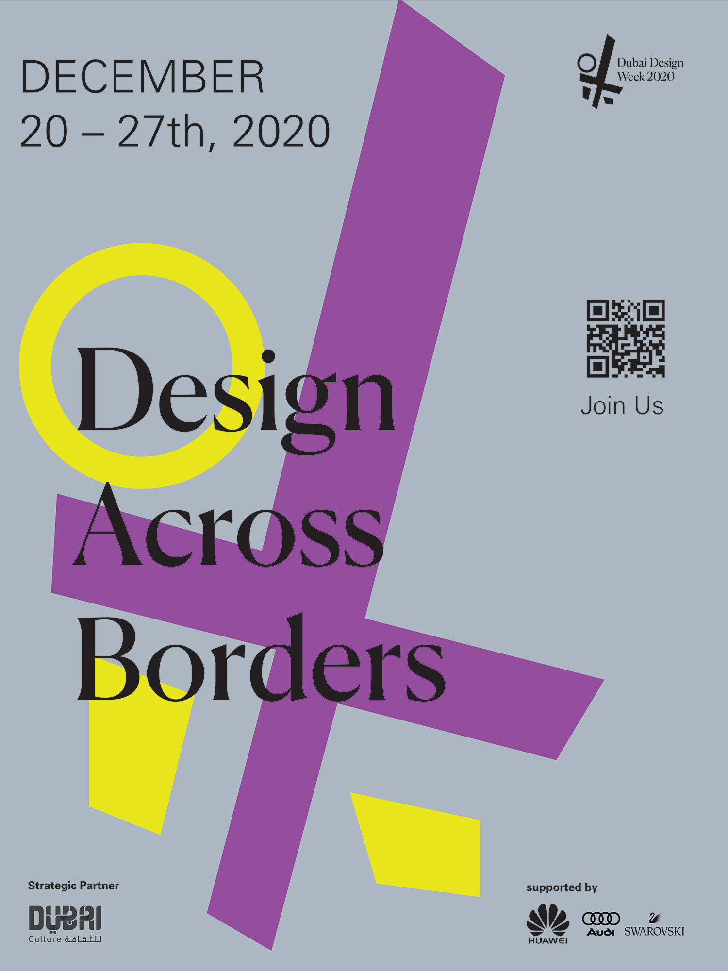
Above: Style/system #2 for my poster design
